Modern Grotesque Body

Scriledge + Saltriver Grotesk
Creates crisp high-hierarchy contrast beneath Scriledge headlines across menus, websites and labels.
Inspect Saltriver Grotesk specimenDisclosure: MakerFileHub may earn a commission from qualifying purchases via paid links on this page. How our links work.
3-layer vintage woodcut poster serif (Regular, Outline & Extrude)
Scriledge is a 3-layer vintage display serif system (Regular, Outline, Extrude) with dropped swash hooks and classic coastal-poster stature.
Paid link
Get this fontProject & layout blueprintsAt-a-glance maker compatibility
Cut solid base, outline, and shadow layers in separate vinyl colors and align on registration marks.
Visual anatomy & craft review
Scriledge is a three-layer woodcut poster serif with a regular cut, an outline cut and an extrude cut on one skeleton, drawn with the rough contours and notched counters of carved wood. The extrude sits behind the letter, so the layers must keep fixed spacing, and the outline is the layer that closes first. It needs roughly 30 mm for the outline rule and the extrude edge to read, and it is best in two inks on a warm uncoated sheet, or one dense ink with the extrude left as bare paper.
Sign-shop · 3-layer · Heritage
Two-font hierarchy recipes
Tested contrast partners — pairing Scriledge with grounded secondary typography.
Scriledge + Saltriver Grotesk
Creates crisp high-hierarchy contrast beneath Scriledge headlines across menus, websites and labels.
Inspect Saltriver Grotesk specimen
Scriledge + Thick Black
Adds a warm human signature touch for 1-to-3-word callouts without competing against structured serif capitals.
Inspect Thick Black specimenPractical applications
Concrete hierarchy, scale and production guidance tailored to Scriledge’s stroke geometry.
A carved woodcut serif reads as a cider press sign rather than a modern label, which is what a small orchard wants on its crates. The extrude gives the brand weight at 40 mm, and two inks print the crate and the label from a single artwork file.
Hierarchy & layout recipe
Crate print 300 x 200 mm, word 70 mm with 10 mm extrude clearance, 20 mm margins. Bottle label 90 x 70 mm, word 18 mm, 5 mm margins. Card 85 x 55 mm, word 14 mm, 5 mm margins.
Pre-production check
On a 90 x 70 mm bottle label at 18 mm the extrude collapses into the letter and the brand prints as a flat slab. Keep the label at 24 mm or use the regular cut, and check one label on the bottle before the run.
A three-layer woodcut serif gives a summer festival the weight of a printed bill rather than a social flyer. The extrude holds at 130 mm across a poster, and two warm inks print the poster, the programme and the tickets as one set for the weekend.
Hierarchy & layout recipe
Poster A2, word 130 mm with 15 mm extrude clearance, details 36 mm, 20 mm margins. Programme cover A5, title 44 pt, 12 mm margins. Ticket 100 x 50 mm, word 12 mm, 4 mm perforation.
Pre-production check
A 100 x 50 mm ticket at 12 mm fills the notched counter and the word prints as a solid carved block. Print tickets from the regular cut and keep the layers for the poster, then check one before the batch.
A woodcut serif gives a feature about craft or land a printed-poster weight rather than an editorial one. The carved counters hold at 60 pt on a matte page, and the extrude adds depth without a photograph on the opener.
Hierarchy & layout recipe
Opener 210 x 297 mm, title 60 pt with 10 mm extrude clearance, standfirst 11/15 pt, body 9/13 pt, 18 mm margins. Pull quote 40 pt. Section rule 180 mm wide.
Pre-production check
At 40 pt on the pull quote the outline layer closes and the quote reads as a heavy slab with no interior line. Keep the face at 52 pt and above for layered use, and proof one spread at 1:1.
Technical & licence verification
Confirm included OTF/TTF/WOFF formats, full glyph tables and licence coverage on the live store page before batch production.
Closest visual alternatives
Matched across letterform anatomy, stroke behaviour and craft applications.
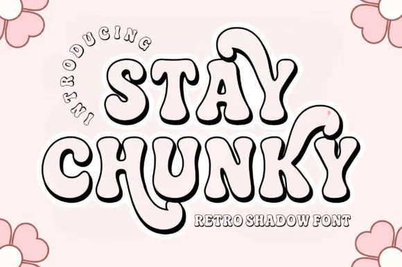
Hollow 3D-extruded 1970s groovy swash shadow display
Stay Chunky Shadow is a nostalgic 1970s groovy outline font featuring built-in 3D extruded ribbon shadows and sweeping 'Y' swashes!
Ideas for this font
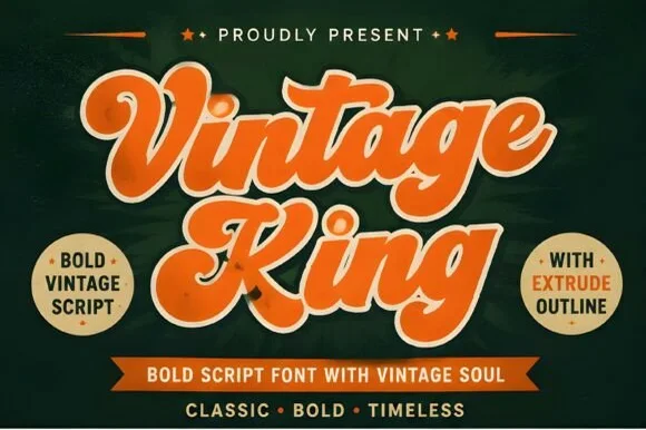
Layered 1950s–70s sign-painter script (Regular, Extrude & Outline)
Vintage King is a thick, creamy retro script family bundled with matched Extrude and Outline cuts plus stylistic swash alternates.
Ideas for this font
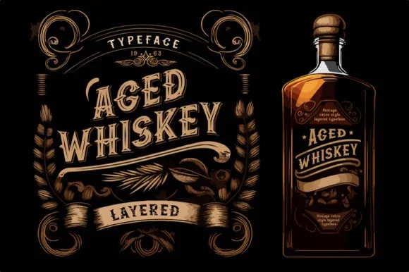
Layered vintage distillery serif with ornate label frames
Aged Whiskey is a classic layered vintage serif system with median-spurred capitals, swash hooks, and bonus ornamental bottle-frame graphics.
Ideas for this font
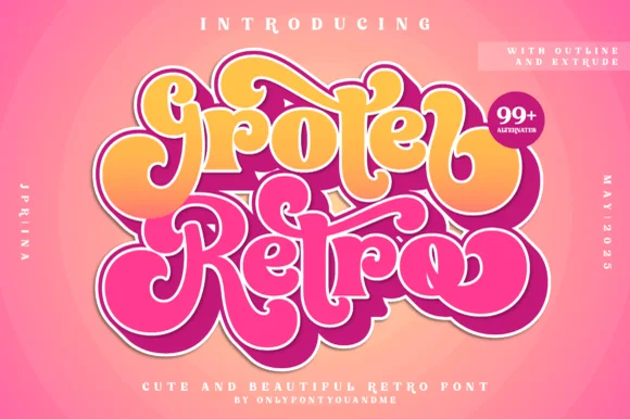
Layered 1970s bubble script family (Outline, Extrude & 99+ alternates)
Groter Retro is a plump, 1970s marshmallow script family bundled with matched Outline and Extrude font layers plus 99+ stylistic alternates.
Ideas for this font
Same independent foundry
Allow optional Google Analytics to measure visits and catalogue actions. Your search words and notes are not included. Privacy & storage



