Editorial Serif Anchor

Last Dream + Kernova
Anchors Last Dream's fluid strokes with crisp Roman proportions on wedding suites, headers and packaging.
Inspect Kernova specimenDisclosure: MakerFileHub may earn a commission from qualifying purchases via paid links on this page. How our links work.
Heavy retro script with an offset shadow layer
Last Dream is a fat seventies script with a pale inner fill, a dark contour and a hard offset shadow that reads as a printed sticker, with letters that touch without closing the word.
Paid link
Get this fontProject & layout blueprintsAt-a-glance maker compatibility
Weld or Unite overlapping script joins into one continuous vector path before sending to the blade.
Visual anatomy & craft review
Letterforms are wide and looping, with thick joining strokes that never fully close the word, so the line stays legible even though the letters touch. The shadow is a solid duplicate pushed down and right rather than a blur, which is what produces the sticker effect and makes the face usable in one flat colour when the layer is dropped. Upstrokes carry most of the weight and the downstrokes pinch thin at the joins, giving a hand-lettered bounce instead of a true italic slant. The gradient sky, sun rays and small sparkles in the preview belong to the artwork; the typeface itself is a single two-layer construction that survives being separated.
Retro · Chunky · Layered
Two-font hierarchy recipes
Tested contrast partners — pairing Last Dream with grounded secondary typography.
Last Dream + Kernova
Anchors Last Dream's fluid strokes with crisp Roman proportions on wedding suites, headers and packaging.
Inspect Kernova specimen
Last Dream + Sailors
Keeps small-scale dates, URLs, nutrition facts and care instructions crisp and legible below script titles.
Inspect Sailors specimenPractical applications
Concrete hierarchy, scale and production guidance tailored to Last Dream’s stroke geometry.
The thick joins hold up at a distance, and the offset shadow gives a printed menu the feel of a hand-painted board above the counter.
Hierarchy & layout recipe
Set the title at 48 pt on A4 with the shadow layer offset 0.08 em down and right, then drop the menu sections to a plain serif at 11 pt with 1.3 line spacing.
Pre-production check
Align the shadow offset before you separate colours, because a half-millimetre slip is clearly visible on a large title.
The retro script carries a venue poster's personality in one line, which leaves room for a long support-act list below it.
Hierarchy & layout recipe
Place the title at 90 pt across the top, keep the line-up in a condensed sans at 14 pt, and hold the shadow inside the trim so it does not clip at the edge.
Pre-production check
The thick joins fill in at small sizes, so use the script for the headline and keep the line-up in a plain face.
Two-layer construction makes a single-colour vinyl decal easy: cut the fill, skip the shadow, and the shapes still read from the street.
Hierarchy & layout recipe
Size the headline to 6-inch width for a window pane, keep the shadow as a second cut only if the material is opaque, and leave 2 inches clear at each side.
Pre-production check
If you drop the shadow layer, weld the overlapping joins first or the decal will lift off the backing in separate pieces.
Technical & licence verification
Confirm included OTF/TTF/WOFF formats, full glyph tables and licence coverage on the live store page before batch production.
Closest visual alternatives
Matched across letterform anatomy, stroke behaviour and craft applications.
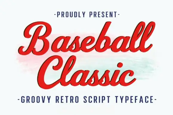
Thick retro sports script with high contrast and a lean
Baseball Classic is a thick retro sports script that leans forward, its downstrokes heavy and its joins thin, with looped capitals on both words and a small ball terminal at the exits.
Ideas for this font
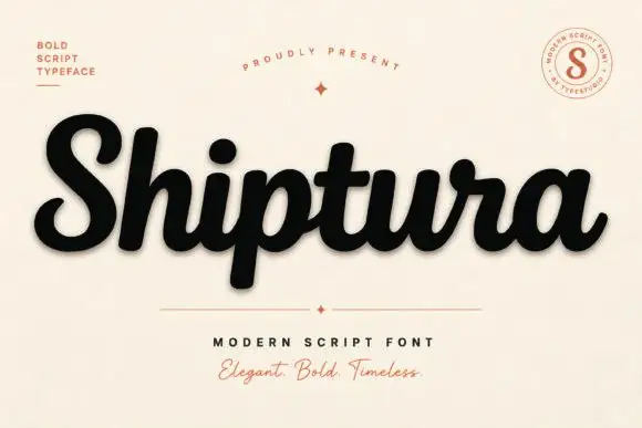
Bold connected script with a slight slant
Shiptura is a bold modern script in black with a soft shadow on cream: thick connected letters with rounded bowls, a slight rightward slant, blunt entry strokes and a small tail on the final letter, presented between two tracked capital lines and a round badge.
Ideas for this font
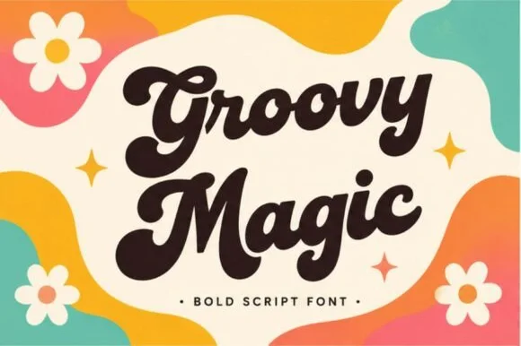
Thick 1970s brush script with swollen bowls and tight connected joins
Groovy Magic is a thick seventies brush script in which the bowls swell, the strokes stay connected and the joins carry the full weight of the stems, so a word reads as one solid painted shape.
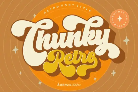
Heavy retro script with fat curled terminals and tight connected loops
Chunky Retro is a heavy script in which the strokes stay thick through every join, the loops close tight and the terminals curl into fat hooks that read as seventies packaging.
Ideas for this font
Allow optional Google Analytics to measure visits and catalogue actions. Your search words and notes are not included. Privacy & storage