Modern Grotesque Body

Baseball College + Memoir Slang
Creates crisp high-hierarchy contrast beneath Baseball College headlines across menus, websites and labels.
Inspect Memoir Slang specimenDisclosure: MakerFileHub may earn a commission from qualifying purchases via paid links on this page. How our links work.
Clean solid collegiate & vintage baseball slab serif
Baseball College is a clean, solid-filled American varsity slab serif built with sturdy rectangular blocks and chamfered athletic corners.
Paid link
Get this fontProject & layout blueprintsAt-a-glance maker compatibility
Weld or Unite overlapping script joins into one continuous vector path before sending to the blade.
Visual anatomy & craft review
Baseball College is a clean collegiate slab serif drawn from the two-colour varsity lettering of vintage baseball: thick unbracketed slabs, a heavy vertical weight, a flat top on the A and a slight upturn on the R leg. The solid construction holds one-colour printing without an outline, and the slabs give the face enough weight for embroidery. It needs roughly 26 mm for the slabs to read as separate, and it is best in navy on cream, or a single dark ink on white and heather grey.
Varsity-solid · Crisp-slab · Classic
Two-font hierarchy recipes
Tested contrast partners — pairing Baseball College with grounded secondary typography.
Baseball College + Memoir Slang
Creates crisp high-hierarchy contrast beneath Baseball College headlines across menus, websites and labels.
Inspect Memoir Slang specimen
Baseball College + Rebel Marks
Adds a warm human signature touch for 1-to-3-word callouts without competing against structured serif capitals.
Inspect Rebel Marks specimenPractical applications
Concrete hierarchy, scale and production guidance tailored to Baseball College’s stroke geometry.
A collegiate slab is the lettering a school team already wears on its jacket, so a patch and a banner in it look authentic rather than bought. The thick slabs hold up to embroidery at 60 mm, and one thread colour covers the patch while the same artwork prints the banner and the yearbook header.
Hierarchy & layout recipe
Jacket patch 90 x 60 mm, word 20 mm with 4 mm edge margin. Banner 1800 x 600 mm, word 180 mm, 40 mm safe edge. Yearbook header 210 x 60 mm, word 44 pt, 15 mm margins.
Pre-production check
At 20 mm on a 90 mm patch the slab serifs stitch into the outline stroke and the letters merge into a bar. Keep patch lettering at 24 mm or above in a single stitch direction, and approve one embroidered patch before the order.
A clean collegiate slab reads as an old sporting-goods label rather than a modern logo, which is what a small apparel brand wants on its cap and card. The solid weight works at 14 mm on a woven label, and one ink prints the card and the tag on the same cream stock.
Hierarchy & layout recipe
Cap mark 60 mm wide, word 18 mm, 5 mm margin from the crown seam. Woven label 50 x 25 mm, word 8 mm, 2 mm margin to the fold. Card 85 x 55 mm, word 16 mm, 5 mm margins. Hang tag 40 x 60 mm, word 9 mm with a 3 mm hole and 5 mm clear.
Pre-production check
A 50 x 25 mm woven label at 8 mm closes the slab gaps and the word reads as a solid weave. Keep the label to a monogram at 12 mm, and approve one woven sample before the run.
A collegiate slab reads as a printed fall-sports schedule rather than a modern flyer, which is what a local club posts on a noticeboard. The heavy weight holds at 90 mm on a poster, and one navy ink prints the poster, the pocket schedule and the bleacher sign in a single order.
Hierarchy & layout recipe
Poster A2, word 120 mm, dates 36 mm, 20 mm margins. Schedule card 100 x 210 mm, header 20 mm, fixtures 9 mm. Bleacher sign 600 x 400 mm, word 90 mm, 20 mm margins.
Pre-production check
On a 100 x 210 mm schedule card the 9 mm fixtures keep the slabs but lose the counters, and the dates read as blocks. Raise fixtures to 11 mm or set them in a companion sans, and print one card before the batch.
Technical & licence verification
Confirm included OTF/TTF/WOFF formats, full glyph tables and licence coverage on the live store page before batch production.
Closest visual alternatives
Matched across letterform anatomy, stroke behaviour and craft applications.
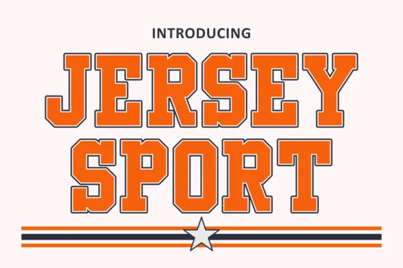
Outlined collegiate sports slab with a flat fill and a thin keyline
Jersey Sport is a collegiate slab alphabet drawn as an outline with a flat fill inside it, so a word reads as a printed athletic front where the keyline does the work and the fill carries the colour.
Ideas for this font
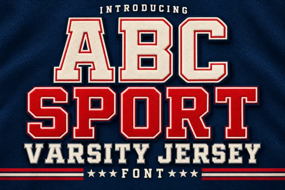
Layered varsity jersey capitals with fill, keyline and offset shadow
ABC Sport is a layered varsity capital alphabet in which each letter carries a fill, a narrow keyline and an offset shadow, so a name reads as the appliqué on a college jersey.
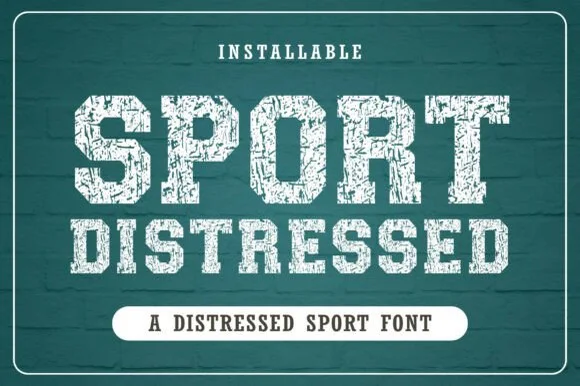
Chalk-weathered athletic slab with hatched wear and square feet
Distressed Sport is an athletic slab alphabet in which the stems are heavy and square, the wear runs as chalk hatching across the fill and the feet stay flat, so a word reads as a print pulled off a worn gym wall.
Ideas for this font
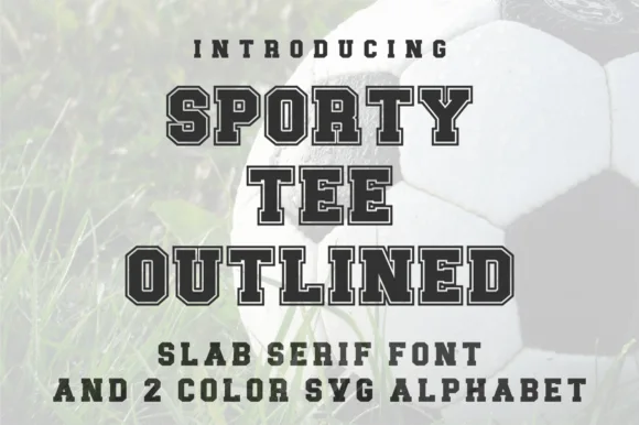
Varsity slab with outline and two-colour alphabet
Sporty Tee Outlined is a varsity slab in dark grey with a light outline: heavy square serifs, wide flat-topped caps, counters cut as rectangles, and an inline gap that separates the fill from the outline, sold with a two-colour SVG alphabet for the same job.
Ideas for this font
Same independent foundry
Allow optional Google Analytics to measure visits and catalogue actions. Your search words and notes are not included. Privacy & storage