Neutral Sans Workhorse

Punk Cyber + Saltriver Grotesk
Lets Punk Cyber own the focal silhouette while handling secondary copy, sizing and subheads cleanly.
Inspect Saltriver Grotesk specimenDisclosure: MakerFileHub may earn a commission from qualifying purchases via paid links on this page. How our links work.
Y2K layered display caps with offset chrome shapes
Punk Cyber is a Y2K display capital alphabet in which the letters carry a rounded tech skeleton, two offset copies sit behind the fill and a highlight runs along the top edge, so a word reads as a chrome badge from a 2001 interface.
Paid link
Get this fontProject & layout blueprintsAt-a-glance maker compatibility
Cut solid base, outline, and shadow layers in separate vinyl colors and align on registration marks.
Visual anatomy & craft review
The P builds a fat bowl on a thick stem, the u keeps two rounded stems, the n repeats the shoulder, the k splays two cut diagonals and the y drops a hooked tail, all at a display weight with clipped corners, two offset layers and a drawn highlight. The layers are the character: the sample builds each word from fill, first offset and second offset in three tones, which is why the face reads as chrome without a gradient mesh. Because the offsets are wide, the face needs 40 pt before they separate, and each layer must be a clean vector. The lilac ground, the cursor arrow, the window frame, the star and the small studio marks are presentation; the pink and blue display words are the face.
Y2K · Layered · Offset
Two-font hierarchy recipes
Tested contrast partners — pairing Punk Cyber with grounded secondary typography.
Punk Cyber + Saltriver Grotesk
Lets Punk Cyber own the focal silhouette while handling secondary copy, sizing and subheads cleanly.
Inspect Saltriver Grotesk specimen
Punk Cyber + Mewah
Grounds bold display lettering with classic typographic authority on posters, badges and apparel.
Inspect Mewah specimenPractical applications
Concrete hierarchy, scale and production guidance tailored to Punk Cyber’s stroke geometry.
The layered offsets give a logo depth without a gradient, and the fat strokes hold a short studio name at 35 mm on vinyl.
Hierarchy & layout recipe
Print a 70 mm round sticker: set the studio name at 35 mm, keep the two offsets at 2 mm each, and leave 5 mm inside the die so the outer layer stays whole.
Pre-production check
A 1 mm offset on a small die merges with the fill; check the sticker sheet and widen the layer rather than the letters.
The Y2K register suits a retro LAN night event, and the three-layer chrome effect still reads at 100 mm under low venue light.
Hierarchy & layout recipe
Print an A2 poster: set the headline at 100 mm with two offsets at 4 mm each, set the details in a 16 pt mono in the lower band, and keep a 30 mm border all round.
Pre-production check
Three layers at poster size multiply registration drift; check the proof and let the lightest layer sit closest to the fill.
The layered offsets give a small card its period look, and the rounded tech letters stay legible at 30 pt in three flat inks.
Hierarchy & layout recipe
Print a 120 mm square card: set the greeting at 30 pt with two offsets at 1.5 mm, set the date in a 9 pt mono beneath, and keep 12 mm of margin for the outer layer.
Pre-production check
Three inks on a small card can drift; check a proof and drop the outer layer if the registration is loose.
Technical & licence verification
Confirm included OTF/TTF/WOFF formats, full glyph tables and licence coverage on the live store page before batch production.
Closest visual alternatives
Matched across letterform anatomy, stroke behaviour and craft applications.
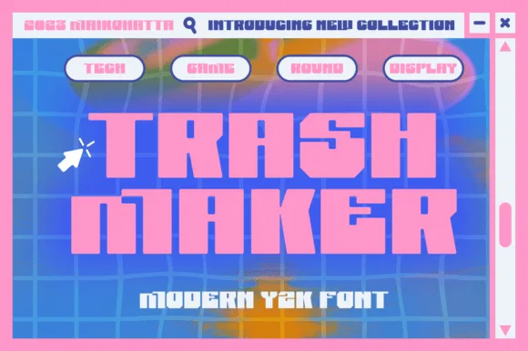
Heavy squared Y2K digital blocks with tiny pixel-notch cutouts
Trash Maker is a heavy squared display in which the letters form thick digital blocks, the counters shrink to slots and tiny pixel notches cut the corners, so a two-word headline reads as early-web graphics.
Ideas for this font
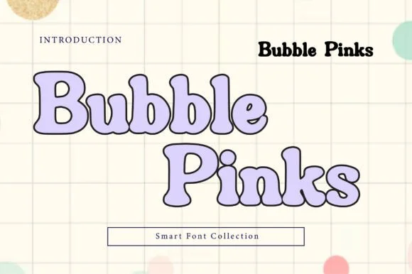
Outlined bubble letters with soft uniform contours in solid and hollow cuts
Bubble Pinks is a bubble display in both solid and hollow cuts in which the counters stay generous, the contours run smooth and the outline keeps an even weight, so a multi-word title stays light and legible rather than turning into a solid mass.
Ideas for this font
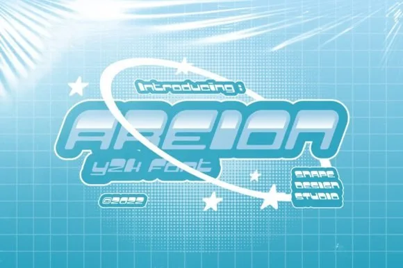
Ultra-wide futuristic Y2K pop-star & sci-fi block display
Areion is an ultra-wide Y2K pop-futuristic display font sculpting rounded capsule blocks with tiny geometric slit counters.
Ideas for this font
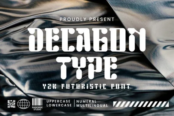
Chrome-era Y2K faceted geometric & organic-cut display
Decagon Type is a chunky Y2K futuristic display font blending ten-sided faceted block outer walls with curvy, liquid-like interior cutouts.
Ideas for this font
Allow optional Google Analytics to measure visits and catalogue actions. Your search words and notes are not included. Privacy & storage