High-Contrast Display Serif

Oscorp + Stanza
Pairs sculptural editorial warmth with Oscorp's clean modern geometry.
Inspect Stanza specimenDisclosure: MakerFileHub may earn a commission from qualifying purchases via paid links on this page. How our links work.
Expanded rounded-square capitals with flat arms and a long diagonal S cut
Oscorp places large white capitals inside an angular frame on black, where broad rectangular bowls with rounded corners form the O, C and P, the S carries long nearly horizontal strokes and the low expanded proportions give a short word a wide footprint.
Paid link
Get this fontProject & layout blueprintsAt-a-glance maker compatibility
Sturdy stroke walls and open counters weed cleanly on adhesive vinyl, HTV apparel film, and cut cardstock.
Visual anatomy & craft review
The bowls turn into rounded rectangles, the arms lie flat, the S stretches sideways and the whole row spreads wide. That footprint is the character: a four-letter word fills a square frame without growing tall, which is why the sample sets it alone inside a border. The frame, scratches and barcode are artwork rather than part of the letters, and the weight legend shows only one treatment, so check the styles in your file and keep 40 pt before the narrow openings close.
Expanded rounded-square capitals with flat arms and a long diagonal S cut
Two-font hierarchy recipes
Tested contrast partners — pairing Oscorp with grounded secondary typography.
Oscorp + Stanza
Pairs sculptural editorial warmth with Oscorp's clean modern geometry.
Inspect Stanza specimen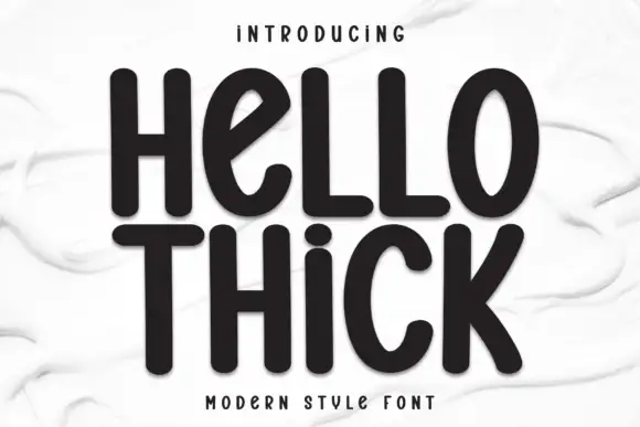
Oscorp + Hello Thick
Introduces organic movement on pull-quotes, signatures and gift tags.
Inspect Hello Thick specimenPractical applications
Concrete hierarchy, scale and production guidance tailored to Oscorp’s stroke geometry.
The expanded caps fill a plate evenly, and the rounded squares hold a two-word name at 34 pt on a 300 mm panel, where the wide footprint balances the frame.
Hierarchy & layout recipe
Print a 300 by 120 mm nameplate: set the name at 34 pt on one row, keep 16 mm of clear ground beneath before the street at 9 pt, and keep 18 mm of margin so the flat arms stay inside the plate.
Pre-production check
The wide row can outgrow the plate; measure the longest word at 34 pt before the panel is ordered and reduce to one word if needed.
The squared caps give a cover a technical block, and the long S cuts across the row at 62 pt on a coated cover, where the wide letters leave the photograph visible around them.
Hierarchy & layout recipe
Print an A4 cover: set the title at 62 pt on one row, keep 26 mm of clear ground beneath before the cover lines at 9 pt, and place the block so the image stays readable behind it.
Pre-production check
A busy photograph behind the wide bowls hides the openings; check the cover and place the block on the calmest area.
The expanded forms read from a car park, and the flat arms hold a short name at 58 mm on a painted panel, where the rounded squares stay legible at distance.
Hierarchy & layout recipe
Paint a 700 by 350 mm panel: set the gym name at 58 mm on one row, keep 24 mm of clear ground beneath before the hours at 15 pt, and keep 26 mm of border so the wide flanks are not cut.
Pre-production check
Painted openings under 4 mm close; check the mask artwork and keep the sign at 50 mm or above.
Technical & licence verification
Confirm included OTF/TTF/WOFF formats, full glyph tables and licence coverage on the live store page before batch production.
Closest visual alternatives
Matched across letterform anatomy, stroke behaviour and craft applications.
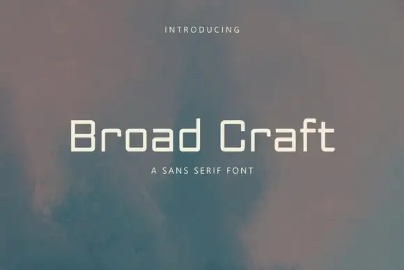
Low wide monoline mixed case with rounded-square bowls and flat short shoulders
Broad Craft is a wide geometric sans in which the bowls are squared off and the joins are chamfered at an angle, so every letter looks milled from a single sheet rather than drawn with a pen.
Ideas for this font

Light geometric capitals with circular O and broad angular diagonals
Modern Heritage shows black capitals in two closely stacked lines on white, where thin nearly even strokes form a circular O, a broad M and N and a large triangular A, while the G keeps an open right side with a short inner bar.
Ideas for this font

Bold modern geometric sans
Olline is a bold geometric sans in red on black: circular counters, a heavy even stroke, a lowercase with a straight-sided o and a dot that floats away from the i, presented at extreme size with small tracked captions in the corners, so the plate reads as a contemporary identity study.
Ideas for this font

Geometric cut-out display sans
Borsen sets a wide geometric wordmark in white over a dark car photograph, where the letters run broad and even, horizontal cuts open parts of the E and N while broad strokes hold the line together, and the whole name sits as one long block above a small credit line.
Same independent foundry
Allow optional Google Analytics to measure visits and catalogue actions. Your search words and notes are not included. Privacy & storage