Neutral Sans Workhorse

Trash Maker + Kohilo
Lets Trash Maker own the focal silhouette while handling secondary copy, sizing and subheads cleanly.
Inspect Kohilo specimenDisclosure: MakerFileHub may earn a commission from qualifying purchases via paid links on this page. How our links work.
Heavy squared Y2K digital blocks with tiny pixel-notch cutouts
Trash Maker is a heavy squared display in which the letters form thick digital blocks, the counters shrink to slots and tiny pixel notches cut the corners, so a two-word headline reads as early-web graphics.
Paid link
Get this fontProject & layout blueprintsAt-a-glance maker compatibility
Sturdy stroke walls and open counters weed cleanly on adhesive vinyl, HTV apparel film, and cut cardstock.
Visual anatomy & craft review
The T spreads a wide flat bar, the r keeps a short shoulder, the a closes a slot-like counter and the k splays two squared arms, with pixel notches taken out of selected corners and an almost solid fill. The digital block is the character: it turns a short phrase into a graphic object, which is why the sample sets two words tight on a dark ground. Because the counters are small, the face wants 36 pt before they stay open and it cuts cleanly from three quarters of an inch of cap height; longer sentences lose the effect. The grid background and the small caption are presentation; the blocky lettering is the face.
Y2K · Block · Digital
Two-font hierarchy recipes
Tested contrast partners — pairing Trash Maker with grounded secondary typography.
Trash Maker + Kohilo
Lets Trash Maker own the focal silhouette while handling secondary copy, sizing and subheads cleanly.
Inspect Kohilo specimen
Trash Maker + Marquis - Elegant Modern Serif
Grounds bold display lettering with classic typographic authority on posters, badges and apparel.
Inspect Marquis - Elegant Modern Serif specimenPractical applications
Concrete hierarchy, scale and production guidance tailored to Trash Maker’s stroke geometry.
The digital blocks suit a zine cover, and the pixel notches give a two-word title texture at 70 pt on a printed sheet. Notches are the only detail, so keep the ground flat behind them.
Hierarchy & layout recipe
Print an A5 cover: set the title at 70 pt on two tight rows, keep 12 mm between the rows so the blocks read as separate lines, and set the issue number in a 7 pt mono in the corner.
Pre-production check
Two rows set flush read as one solid bar; check the cover proof and open the gap by 4 mm. A grey tint behind each row separates them further.
The Y2K mass reads on fabric, and the heavy blocks stay solid at 60 mm across a printed chest in one flat ink. One ink keeps the notches crisp where a gradient would blur them.
Hierarchy & layout recipe
Print a 280 mm chest print: set the title at 60 mm, keep every pixel notch at 4 mm minimum, and keep 45 mm of clear shirt beneath for the date line. Keep the print 90 mm below the collar.
Pre-production check
Notches under 3 mm fill in on a screen print; check the film at full size and thicken the notch rather than the letter.
The blocky forms cut into simple shapes, and the notched corners stay whole at 30 mm on a shaped die with pale backing. Pale backing keeps the notches visible against dark garments.
Hierarchy & layout recipe
Print an A4 sticker sheet: set the word at 30 mm, keep 4 mm of clear vinyl around each block, and leave 6 mm of gap between motifs so the die cuts stay separate. Mirror the sheet for reverse-cut vinyl.
Pre-production check
Two blocks closer than 5 mm share a cut line; check the sheet and open the spacing by 2 mm. Weeding is easier when each block keeps its own outline.
Technical & licence verification
Confirm included OTF/TTF/WOFF formats, full glyph tables and licence coverage on the live store page before batch production.
Closest visual alternatives
Matched across letterform anatomy, stroke behaviour and craft applications.
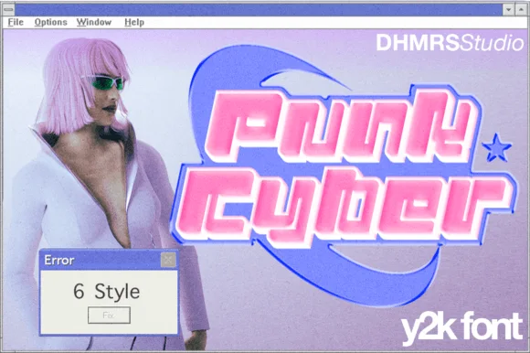
Y2K layered display caps with offset chrome shapes
Punk Cyber is a Y2K display capital alphabet in which the letters carry a rounded tech skeleton, two offset copies sit behind the fill and a highlight runs along the top edge, so a word reads as a chrome badge from a 2001 interface.
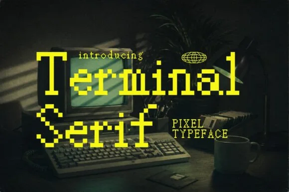
Eight-bit bitmap pixel serif with editorial brackets and terminals
Terminal is an eight-bit pixel serif in which the letterforms keep their editorial brackets and serifs while every curve is rebuilt from square blocks, so a title reads as a literary masthead on a vintage screen.
Ideas for this font
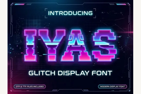
Sliced horizontal glitch pixel caps with displaced rows
Iyas is a pixel capital alphabet in which each letter is sliced into horizontal bands and some bands are displaced sideways, so a word reads as a signal breaking up on a screen.
Ideas for this font
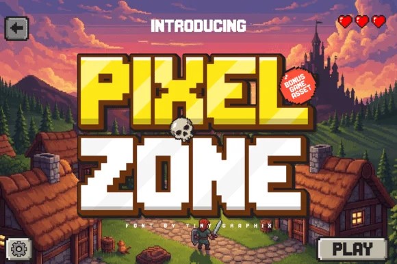
Chunky sixteen-bit pixel lettering with bevelled corners
Pixel Zone is a chunky sixteen-bit display in which every stem is built from square blocks, the corners bevel slightly and the strokes carry mass, so a title reads as an arcade logo rather than as a modern squarish sans.
Ideas for this font
Same independent foundry
Allow optional Google Analytics to measure visits and catalogue actions. Your search words and notes are not included. Privacy & storage