Neutral Sans Workhorse

Nevera + Headline
Lets Nevera own the focal silhouette while handling secondary copy, sizing and subheads cleanly.
Inspect Headline specimenDisclosure: MakerFileHub may earn a commission from qualifying purchases via paid links on this page. How our links work.
Wide angular capitals with open horizontal breaks and an extended diagonal R leg
Nevera is a wide futuristic sans in caps and lowercase: monoline strokes, rounded joins, a single-storey a and a very open skeleton that makes a word look engineered rather than written.
Paid link
Get this fontProject & layout blueprintsAt-a-glance maker compatibility
Sturdy stroke walls and open counters weed cleanly on adhesive vinyl, HTV apparel film, and cut cardstock.
Visual anatomy & craft review
NEVERA spans the card in white over a soft gradient of sand and sky, and the letters are built from wide arcs: the N is drawn with a rounded junction instead of a sharp corner, the E has three equal bars, the V and the A share a rounded vertex, and the whole word sits on a wide even spacing that gives it the look of a logotype. The stroke weight never changes, which keeps the face neutral, and the rounded joins do the work that a chamfer would do in a technical sans. Two small blocks of type below list the character set in a light grotesque, and a caption under the word names the style. It is a futuristic display cut for technology, packaging and titles, and it needs a wide measure: at a narrow column the rounded joins collide and the word loses its openness.
Wide angular capitals with open horizontal breaks and an extended diagonal R leg
Two-font hierarchy recipes
Tested contrast partners — pairing Nevera with grounded secondary typography.
Nevera + Headline
Lets Nevera own the focal silhouette while handling secondary copy, sizing and subheads cleanly.
Inspect Headline specimen
Nevera + Grandeur – Elegant Classic Serif
Grounds bold display lettering with classic typographic authority on posters, badges and apparel.
Inspect Grandeur – Elegant Classic Serif specimenPractical applications
Concrete hierarchy, scale and production guidance tailored to Nevera’s stroke geometry.
The rounded joins give a plain mark a sense of movement, and the wide skeleton fills a business card end at fifteen millimetres without a symbol beside it.
Hierarchy & layout recipe
Print an 85 by 55 mm card: set the wordmark at 15 pt in caps, keep 6 mm of clear ground beneath before the contact block at 6 pt, and hold 5 mm from the widest letter to the card edge.
Pre-production check
The rounded joins close at small reproductions; print one card at the final size and check the N and the A before the order.
The engineered forms suit a spread about hardware, and one wide word fills an opening page that has no photograph on it.
Hierarchy & layout recipe
Print a 230 by 300 mm opener: set the feature title at 120 pt on one row, keep 34 mm of clear ground beneath before the standfirst at 11 pt, and hold 20 mm from the last letter to the right trim.
Pre-production check
Wide letter spacing shows every ink variance; print one opener and check the stems for banding before the issue.
The clean monoline suits a product about purity, and the wide letters fill a short brand name across a bottle that offers little room.
Hierarchy & layout recipe
Print a 50 by 90 mm label: set the brand name at 22 pt on one row, keep 8 mm of clear ground beneath before the volume at 4.5 pt, and hold 5 mm from the letter edge to the die line.
Pre-production check
Condensation softens thin monoline type; print one label, chill the bottle and check the strokes before the run.
Technical & licence verification
Confirm included OTF/TTF/WOFF formats, full glyph tables and licence coverage on the live store page before batch production.
Closest visual alternatives
Matched across letterform anatomy, stroke behaviour and craft applications.
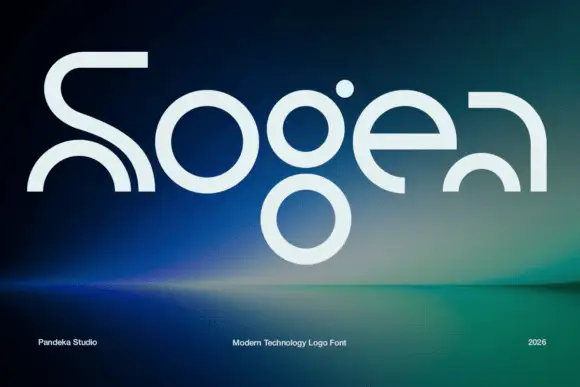
Elegant serif with ink traps
Sogea is an elegant serif in cream on a warm brown field: high contrast, fine hairlines, sharp serifs and small ink traps at the junctions, a tall waist and a wide x-height, set in two lines with a tracked caption beneath and a small ornament above.
Ideas for this font
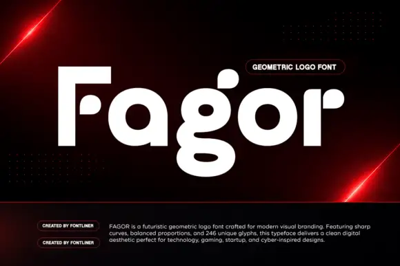
Heavy circular logo letters with detached rounded pieces and a double-bowl g
Fagor builds its letters out of circles and squared stems, so the F is a bar and a stem with no curve, the a is a disc with a short spur and the g drops into a deep round bowl.
Ideas for this font
Angular geometric display
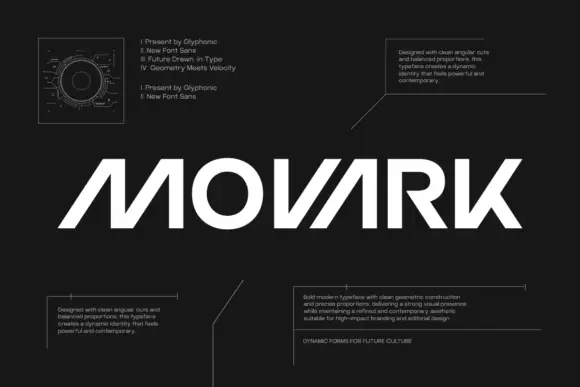
Movark is an angular geometric display in white on black: wide capitals with open diagonal constructions on the M and A, a circular O, flat terminals and a slight forward lean, set as one word between four blocks of small technical copy and a drawn diagram at the upper left.
Angular geometric display
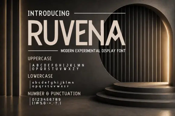
Ruvena is an angular capital display in cream on a dusk-lit interior: wide capitals with a diamond-like A opening, sharply directed middle arms and a squared rhythm, set as one large word with a rule beneath and a full character listing in three blocks at the lower left.
Ideas for this font
Same independent foundry
Allow optional Google Analytics to measure visits and catalogue actions. Your search words and notes are not included. Privacy & storage