Modern Grotesque Body

Moon Creme + Mango Dream
Creates crisp high-hierarchy contrast beneath Moon Creme headlines across menus, websites and labels.
Inspect Mango Dream specimenDisclosure: MakerFileHub may earn a commission from qualifying purchases via paid links on this page. How our links work.
Fine contrasting capitals with overlapping circular bowls
Moon Creme shows tall white serif capitals with fine hairlines and broad round O forms on a muted interior photograph, where the two O letters overlap into a single linked shape and the R leg of the lower row sweeps beneath the following letters before curling away.
Paid link
Get this fontProject & layout blueprintsAt-a-glance maker compatibility
Crisp hairline serifs shine on stationery, foil stamping, and packaging; add slight offset for small decals.
Visual anatomy & craft review
The uprights stay heavy, the hairlines thin sharply, the bowls stay circular and two letters deliberately cross. That overlap is the character: the word reads as a bespoke lockup rather than a plain setting, which is why the sample uses all capitals and a single weight. The interlock and the extended leg may be separate alternates, and that cannot be inferred from the image. Keep 44 pt before the hairlines break, check the alternate mapping in your file and reserve 20 mm for the R leg.
Fine contrasting capitals with overlapping circular bowls
Two-font hierarchy recipes
Tested contrast partners — pairing Moon Creme with grounded secondary typography.
Moon Creme + Mango Dream
Creates crisp high-hierarchy contrast beneath Moon Creme headlines across menus, websites and labels.
Inspect Mango Dream specimen
Moon Creme + Esmeralda
Adds a warm human signature touch for 1-to-3-word callouts without competing against structured serif capitals.
Inspect Esmeralda specimenPractical applications
Concrete hierarchy, scale and production guidance tailored to Moon Creme’s stroke geometry.
The tall caps and the linked bowls give a magazine masthead a bespoke look, where a plain serif would read as a default choice.
Hierarchy & layout recipe
Print a 210 by 280 mm cover: set the masthead at 76 pt on one row, keep 26 mm of clear ground beneath before the issue line at 9 pt, and keep 20 mm of margin at each side.
Pre-production check
The overlapping O needs manual pairing; check the file before promising the interlock to a client.
The fine contrast gives an interiors studio a calm, expensive mark, and the circular bowls suit a monogram built from two letters.
Hierarchy & layout recipe
Print a 90 by 55 mm card: set the wordmark at 24 pt on one row, keep 14 mm of clear ground beneath before the address at 7 pt, and keep 12 mm of margin at each side.
Pre-production check
Hairlines at 24 pt fade on textured card; check a printed proof and go to 28 pt if needed.
The tall caps give a formal invitation real presence, and the rounded bowls keep the pair of names from feeling stiff or overly corporate.
Hierarchy & layout recipe
Print a 130 by 180 mm invitation: set the names at 38 pt across two rows with 14 mm between baselines, keep 20 mm of clear ground beneath before the date at 11 pt, and keep 18 mm of margin.
Pre-production check
The R leg sweeps under the next line; check the card and keep 20 mm of clear ground between the two rows.
Technical & licence verification
Confirm included OTF/TTF/WOFF formats, full glyph tables and licence coverage on the live store page before batch production.
Closest visual alternatives
Matched across letterform anatomy, stroke behaviour and craft applications.
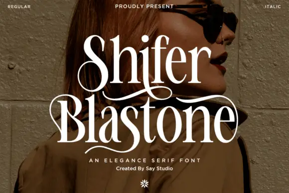
Elegance serif with swashes
Shifer Blastone is an elegance serif in cream over a portrait photograph: high contrast, fine stems, ball terminals and long swashes that leave the first letters and curve under the words, with a small italic beneath and a flower ornament at the foot.
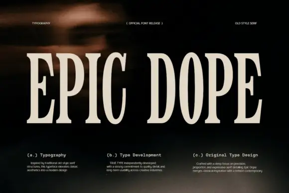
Condensed old-style serif with tall narrow letterspaced capitals
Epic Dope is a condensed old-style serif in which the capitals stretch tall, the serifs finish in small balls and the fit runs narrow, so a two-word title reads as a film credit card rather than as a headline.
Ideas for this font
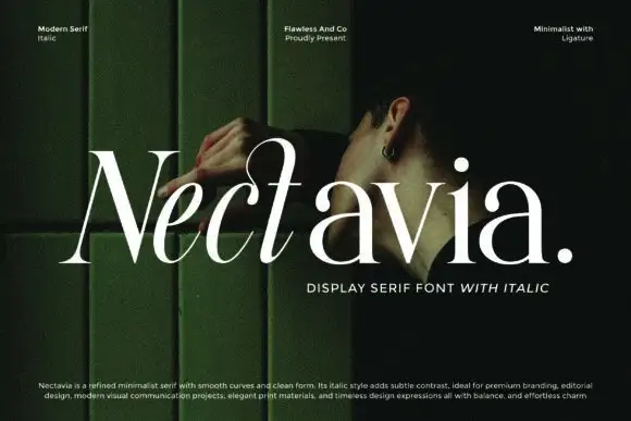
Minimalist display serif with italic
Nectavia is a refined minimalist serif in white over a dark green portrait: moderate contrast, smooth curves, a clean stem and sharp serifs, set in title case on one line with a small italic line beneath and three tracked notes across the top.
Ideas for this font
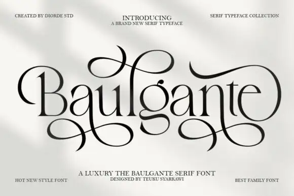
Tall high-contrast serif with looping figure-eight extensions in regular and slant
Baulgante is an elegant high-contrast serif in which the stems stay narrow, the bowls round broadly and repeated figure-eight extensions loop above and below the line, and the family ships in regular and slant so a suite can shift its axis.
Ideas for this font
Same independent foundry
Allow optional Google Analytics to measure visits and catalogue actions. Your search words and notes are not included. Privacy & storage