Neutral Sans Workhorse

Sun and Moon + Bargain Condensed
Lets Sun and Moon own the focal silhouette while handling secondary copy, sizing and subheads cleanly.
Inspect Bargain Condensed specimenDisclosure: MakerFileHub may earn a commission from qualifying purchases via paid links on this page. How our links work.
A looped S within an irregular sun and an M inside a thin crescent with stars
Sun and Moon pairs a rayed sun with a crescent moon, sets one script initial inside each, and draws both in a single fine gold line with a scatter of four-point stars around them.
Paid link
Get this fontProject & layout blueprintsAt-a-glance maker compatibility
Sturdy stroke walls and open counters weed cleanly on adhesive vinyl, HTV apparel film, and cut cardstock.
Visual anatomy & craft review
Two marks share the page: a sun whose rays alternate long and short and radiate from a plain disc that holds a curly script initial; and a moon turned on its back with three stars inside it and a second script initial nested in the curve. Around them a border of thin double rules with corner flourishes frames the composition, and small four-point stars and dots drift through the ground behind the marks. The palette is one warm gold on an off-white paper with a soft grey wash at the edges, so the whole card looks letterpressed rather than printed in colour. The initials are the same playful script, and each sits at a size where one letter reads clearly and two would collide with the rays. The lettering line is fine but never thinner than the smallest star, which is what keeps the set consistent. It is a monogram system for personal stationery, and it holds together because every part is drawn at the same weight.
A looped S within an irregular sun and an M inside a thin crescent with stars
Two-font hierarchy recipes
Tested contrast partners — pairing Sun and Moon with grounded secondary typography.
Sun and Moon + Bargain Condensed
Lets Sun and Moon own the focal silhouette while handling secondary copy, sizing and subheads cleanly.
Inspect Bargain Condensed specimen
Sun and Moon + The Avenue Editorial
Grounds bold display lettering with classic typographic authority on posters, badges and apparel.
Inspect The Avenue Editorial specimenPractical applications
Concrete hierarchy, scale and production guidance tailored to Sun and Moon’s stroke geometry.
The two marks give a couple a symbol each without a crest, and the fine gold line keeps an invitation looking letterpressed rather than printed in flat colour.
Hierarchy & layout recipe
Print a 130 by 180 mm invitation: set each monogram at 42 mm across, keep 18 mm of clear ground between the two marks and 20 mm beneath before the date at 9 pt, and hold 15 mm of margin all round.
Pre-production check
Thin rays fill in on textured card; print one invitation on the real board and look at the sun under a lamp before the run.
The pair gives a small range two labels from one set, and the drawn astronomy suits wax and glass better than a geometric logo would.
Hierarchy & layout recipe
Print a 55 mm round lid sticker: set the monogram at 44 mm across the disc, keep 5 mm of clear ground between the rays and the die edge, and hold the scent name at 4.5 pt along the lower curve.
Pre-production check
Gold ink on white glass shows every bubble; print one sticker on the actual lid and check the line quality before the label run.
The mark is decorative enough to carry the front alone, and the sun reads warm where a wreath or a floral badge would feel borrowed for a simple note.
Hierarchy & layout recipe
Print a 105 by 148 mm note card: set the monogram at 55 mm across at the optical centre, keep 20 mm of open ground beneath before the written area, and hold 14 mm from the outer stars to the card edge.
Pre-production check
Fine stars disappear on a home printer; run one card on the intended stock and check the smallest dots before printing a set.
Technical & licence verification
Confirm included OTF/TTF/WOFF formats, full glyph tables and licence coverage on the live store page before batch production.
Closest visual alternatives
Matched across letterform anatomy, stroke behaviour and craft applications.
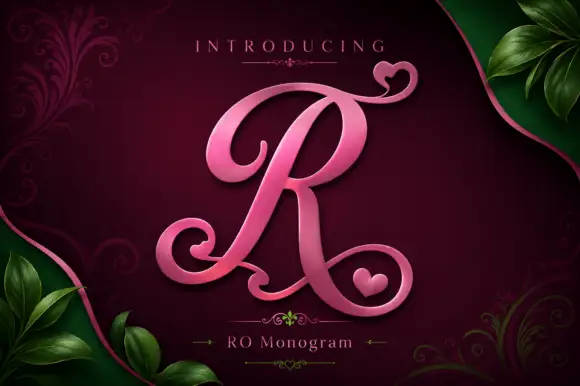
Heart-curled monogram initial
Ro Monogram is a single ornamental initial in pink metal against a deep maroon ground: a sweeping contrast R whose upper and lower stems curl into heart shapes, with a small heart tucked into the lower bowl, framed by green leaves and filigree, with a plain label beneath.
Ideas for this font
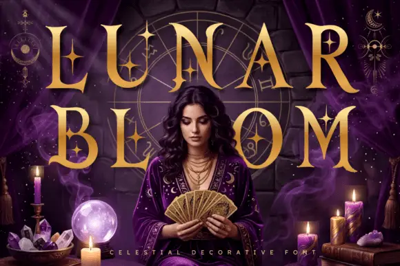
Celestial star-accented display
Lunar Bloom is a decorative display in gold over a purple scene with a figure holding a fan: tall contrast capitals with four-point star accents set inside the strokes and beside them, with crescents and star charts floating in the corners and a tracked line along the foot.
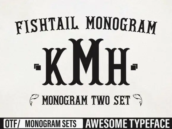
Tall monogram capitals with split fishtail ends
Fishtail Monogram shows a tall central M standing between narrower K and H, where split curved terminals flare at both ends of every upright, small square marks sit beside the outer letters and a fish outline appears at each side of a lower line.
Ideas for this font
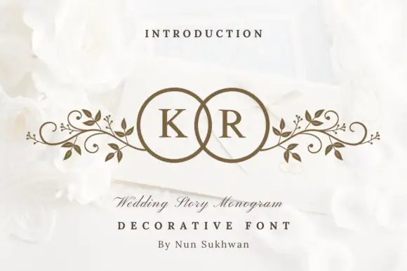
Circle-pair monogram with scrolls
Wedding Story Monogram is a two-initial monogram in bronze on a white still life: two serif capitals set inside two overlapping circles, with mirrored leafy scrolls extending sideways from the rings, staged on an envelope among white roses with a small line above and two lines beneath.
Ideas for this font
Same independent foundry
Allow optional Google Analytics to measure visits and catalogue actions. Your search words and notes are not included. Privacy & storage