Neutral Sans Workhorse

Silveria Magic + Inkora
Lets Silveria Magic own the focal silhouette while handling secondary copy, sizing and subheads cleanly.
Inspect Inkora specimenDisclosure: MakerFileHub may earn a commission from qualifying purchases via paid links on this page. How our links work.
Ornate high-contrast capitals with celestial embellishments
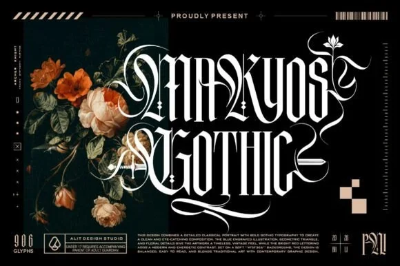
Silveria Magic shows narrow serif capitals in pale gold with fine internal details and sharp contrasting strokes, where long sweeping extensions, crescent curls and star-shaped ornaments frame two rows over a detailed teal fantasy scene and a corner note advertises a glyph count.
Paid link
Get this fontProject & layout blueprintsAt-a-glance maker compatibility
Sturdy stroke walls and open counters weed cleanly on adhesive vinyl, HTV apparel film, and cut cardstock.
Visual anatomy & craft review
The stems stay narrow, the contrast stays sharp, the extensions sweep horizontally and the ornaments sit on the joins as crescents and stars. That ornament frame is the character: the word is designed to be surrounded rather than set in a line, which is why the sample sits on a dense illustration. The advertised glyph count is not verifiable from the image, and the busy ground makes it hard to separate encoded marks from added art. Keep 48 pt, test the ornaments against your own file and avoid this face for any text that must read quickly.
Ornate high-contrast capitals with celestial embellishments
Two-font hierarchy recipes
Tested contrast partners — pairing Silveria Magic with grounded secondary typography.
Silveria Magic + Inkora
Lets Silveria Magic own the focal silhouette while handling secondary copy, sizing and subheads cleanly.
Inspect Inkora specimen
Silveria Magic + Evoire
Grounds bold display lettering with classic typographic authority on posters, badges and apparel.
Inspect Evoire specimenPractical applications
Concrete hierarchy, scale and production guidance tailored to Silveria Magic’s stroke geometry.
The ornamental frame suits a themed poster, where the lettering is the illustration and the event details stay small beneath.
Hierarchy & layout recipe
Print an A2 poster: set the title at 90 pt across two rows with 26 mm between baselines, keep 30 mm of clear ground beneath before the details at 16 pt, and keep 26 mm of border so the star ornaments stay inside.
Pre-production check
The ornaments merge with an illustrated ground; check the proof and place the title on a flat panel.
The narrow serif gives a fantasy line a mystical register, and the star ornaments replace printed decoration on a small label.
Hierarchy & layout recipe
Print a 60 by 90 mm label: set the brand name at 20 pt on one row, keep 10 mm of clear ground beneath before the scent at 7 pt, and keep 6 mm to the die edge for the ornaments.
Pre-production check
The fine internal detail fills under 18 pt; check the plate proof and keep the name at 20 pt.
The ornamental capitals suit a jacket title, where the frame does the decorating and a photographic background is unnecessary.
Hierarchy & layout recipe
Print a 130 by 198 mm jacket: set the title at 54 pt across two rows, keep 24 mm of clear ground beneath before the author line at 10 pt, and keep the ornaments inside a 20 mm margin.
Pre-production check
Gold effects are cover treatment; check the artwork and the print method before promising foil.
Technical & licence verification
Confirm included OTF/TTF/WOFF formats, full glyph tables and licence coverage on the live store page before batch production.
Closest visual alternatives
Matched across letterform anatomy, stroke behaviour and craft applications.
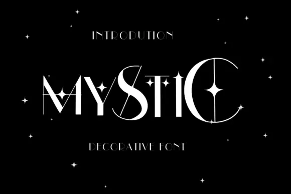
Star-crossed contrast display
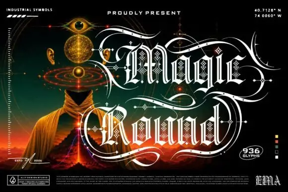
Mystic is a high contrast display in white on black: wide capitals crossed by thin extensions that run past the strokes, with four-point stars placed inside and around the letters, set as one word with a small tracked line above and a plain line beneath.
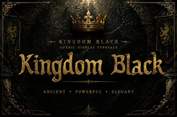
Weighty serif-like Gothic with rounded bowls and tapered sharp tips
Kingdom Black is a gothic display face filled with a textured gold, presented as a royal title plate with a crown above, lion banners at the sides and an ornamental frame.
Ideas for this font
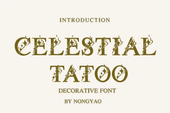
Star-inlaid celestial serif capitals
Celestial Tattoo adorns classic roman capitals with four-point star sparkles and crescent curls, built for tarot decks, astrology brands and apothecary labels, where each uppercase character carries tiny celestial cutouts and curled finials while the underlying letter stays a clean roman capital.
Ideas for this font
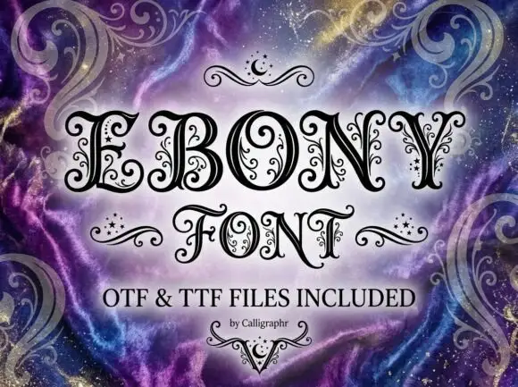
Contrast capitals with curled terminals, fine interior tendrils and small star-like marks
Ebony is an ornate Victorian display face in which every stroke carries a spiral, a dot or a small curl, so a word looks engraved and then hand-decorated on top.
Ideas for this font
Same independent foundry
Allow optional Google Analytics to measure visits and catalogue actions. Your search words and notes are not included. Privacy & storage