Neutral Sans Workhorse

Birthday Girl + Godthem
Lets Birthday Girl own the focal silhouette while handling secondary copy, sizing and subheads cleanly.
Inspect Godthem specimenDisclosure: MakerFileHub may earn a commission from qualifying purchases via paid links on this page. How our links work.
2-style polka-dot inlaid cute kids' display font
Birthday Girl is a cheerful 2-style kids' display font decorating chunky hand-cut letters with sweet interior polka-dot rows!
Paid link
Get this fontProject & layout blueprintsAt-a-glance maker compatibility
Sturdy stroke walls and open counters weed cleanly on adhesive vinyl, HTV apparel film, and cut cardstock.
Visual anatomy & craft review
Birthday Girl is a two-style kids' display whose chunky hand-cut letters carry neat vertical trails of white polka dots down every stem, so a word reads as a decorated paper cut-out rather than as printed type. The dots are interior and regular, which means the face needs size for them to read as dots, and the hand-cut contour gives every letter its own wobble. It needs roughly 26 mm for the dot rows to hold, and it is best in pastel coral or mint on cream or in one ink on kraft.
Polka-dot-inlay · 2-font-style · Birthday-sweet
Two-font hierarchy recipes
Tested contrast partners — pairing Birthday Girl with grounded secondary typography.
Birthday Girl + Godthem
Lets Birthday Girl own the focal silhouette while handling secondary copy, sizing and subheads cleanly.
Inspect Godthem specimen
Birthday Girl + Gorga
Grounds bold display lettering with classic typographic authority on posters, badges and apparel.
Inspect Gorga specimenPractical applications
Concrete hierarchy, scale and production guidance tailored to Birthday Girl’s stroke geometry.
Polka-dotted cut letters read as a children's clothing tag, which is what a small kids' brand prints on a box. The interior dots give the label detail in one ink, and the hand-cut contour keeps the brand from looking corporate.
Hierarchy & layout recipe
Label 60 x 40 mm, name 9 mm, size 4.5 pt, 3 mm die margin. Box 200 x 150 x 80 mm, word 40 mm on the lid, 20 mm margins. Card 85 x 55 mm, name 9 mm, 5 mm margins.
Pre-production check
A 9 mm label closes the dot rows into a solid speckle and the name reads as a smudge. Keep labels at 12 mm or use the plain style, and check one applied label under shop light.
Cute dotted caps read as a child's part in a wedding, which is what a flower-girl thank-you needs. The dots give the label charm at 14 mm, and one pastel ink on cream keeps the favour table coherent.
Hierarchy & layout recipe
Card 105 x 148 mm, greeting 20 mm, message 8/11 pt, 12 mm margins. Label 60 x 90 mm, word 12 mm, 4 mm die margin. Tag 50 x 90 mm, word 10 mm with a 5 mm hole and 6 mm clear card.
Pre-production check
A 10 mm tag turns the polka dots into grey noise on kraft and the word looks dirty. Keep tags at 14 mm or use the clean style, and check one printed tag before the batch.
Hand-cut dotted letters read as a display a teacher made for a class birthday, which is what a primary wall shows. The chunky forms cut easily by hand at 90 mm, and the dots give a name card detail without printing an illustration.
Hierarchy & layout recipe
Display 1200 x 300 mm, letters 180 mm cut from card with 12 mm bridges. Name card 148 x 105 mm, name 30 mm, 8 mm margins. Reward card 105 x 148 mm, heading 18 mm, message 8/11 pt.
Pre-production check
A name card at 30 mm in a dotted style on a home printer shows the dots as banding lines. Print at 600 dpi or use the plain style for name cards, and check one card before the set.
Technical & licence verification
Confirm included OTF/TTF/WOFF formats, full glyph tables and licence coverage on the live store page before batch production.
Closest visual alternatives
Matched across letterform anatomy, stroke behaviour and craft applications.
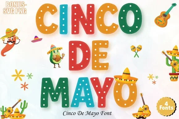
4-font festive fiesta alphabet + bonus SVG/PNGs
Cinco De Mayo (by ProFonts) is a bright 4-font fiesta alphabet family (+ bonus SVG/PNGs) decorating chunky rounded capitals with dots and zigzags.
Ideas for this font
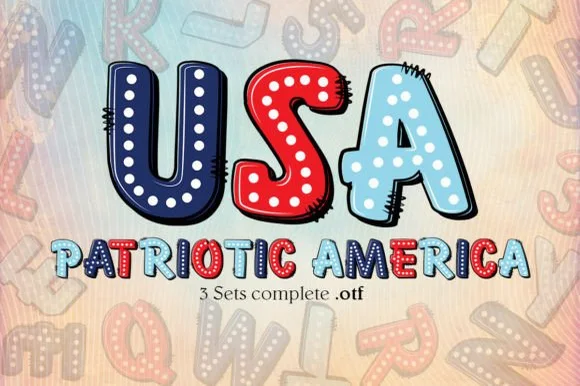
3-set pop-art stitched comic & patriotic color font (OTF)
Patriotic America is a playful 3-set pop-art OTF collection featuring chunky comic-stitched bubble letters decorated with stars and red-white-and-blue fills!
Ideas for this font
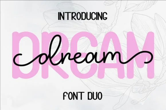
Chunky pastel rounded sans & smooth monoline cursive duo
Dream Duo combines a plump, soft-cornered uppercase sans-serif with a fluid monoline script that threads cleanly across wide titles.
Ideas for this font
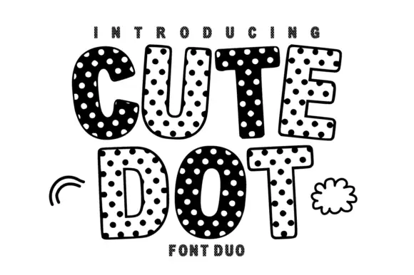
Soft uneven block capitals alternating filled white-dot and hollow dark-dot bodies
Cute Dot is a two-face set in black and white: fat rounded caps packed with dots on a white ground, and a matching face where the dots invert to white on black, both with a hatched shadow.
Ideas for this font
Same independent foundry
Allow optional Google Analytics to measure visits and catalogue actions. Your search words and notes are not included. Privacy & storage