High-Contrast Display Serif

Wild Flower Honey Duo + Evoire
Pairs sculptural editorial warmth with Wild Flower Honey Duo's clean modern geometry.
Inspect Evoire specimenDisclosure: MakerFileHub may earn a commission from qualifying purchases via paid links on this page. How our links work.
Duo
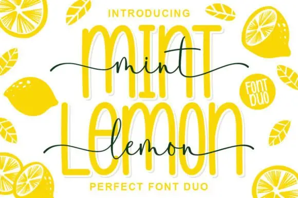
Wild Flower Honey Duo shows very tall rounded sans-like letters behind a fine connected script line, where the script f descends below its low body, long tails extend to both sides and small bees decorate the cover around the two rows.
Paid link
Get this fontProject & layout blueprintsAt-a-glance maker compatibility
Sturdy stroke walls and open counters weed cleanly on adhesive vinyl, HTV apparel film, and cut cardstock.
Visual anatomy & craft review
The cap row rises tall and round, the script stays fine and low, the tails reach wide and one descender drops below the line. That scale gap is the character: a quiet written line sits in front of a tall wall of letters, which is why the sample stacks them tightly. The bees are cover decoration, so plan the tails inside your margin, keep 20 mm between the rows and hold the script at 20 pt so the joins do not close.
Tall light sans and low looping script
Two-font hierarchy recipes
Tested contrast partners — pairing Wild Flower Honey Duo with grounded secondary typography.
Wild Flower Honey Duo + Evoire
Pairs sculptural editorial warmth with Wild Flower Honey Duo's clean modern geometry.
Inspect Evoire specimen
Wild Flower Honey Duo + Bunglon
Introduces organic movement on pull-quotes, signatures and gift tags.
Inspect Bunglon specimenPractical applications
Concrete hierarchy, scale and production guidance tailored to Wild Flower Honey Duo’s stroke geometry.
The tall caps and fine script suit a jar, and the two voices fit at 22 pt and 18 pt on a 50 mm label, where the tails stay inside the circle.
Hierarchy & layout recipe
Print a 50 mm round jar label: set the tall caps at 22 pt, set the script at 18 pt beneath with 10 mm of clear ground, and keep the tails inside a 4 mm safety ring.
Pre-production check
Fine script joins close under 14 pt; check the plate proof and hold the script at 16 pt or above.
The pairing gives a soft invitation, and the tall caps hold the family names at 32 pt while the script carries the date at 22 pt on cream stock.
Hierarchy & layout recipe
Print a 105 by 148 mm card: set the names at 32 pt in the caps, set the date at 22 pt in the script beneath with 20 mm of clear ground, and keep 18 mm of margin for the tails.
Pre-production check
Script tails running into the cap row look like a smudge; check the card and open the gap to 22 mm.
The tall caps read across a table, and the fine script holds the product line at 40 mm on a printed board, where the tails supply the movement.
Hierarchy & layout recipe
Print a 500 by 250 mm board: set the stall name at 40 mm in the caps, set the product line at 26 mm in the script beneath with 22 mm of clear ground, and keep 24 mm of border.
Pre-production check
A thin script at 26 mm disappears at three metres; check the mounted board and raise it to 32 mm.
Technical & licence verification
Confirm included OTF/TTF/WOFF formats, full glyph tables and licence coverage on the live store page before batch production.
Closest visual alternatives
Matched across letterform anatomy, stroke behaviour and craft applications.

Looped handwritten script paired with a bold rounded sans in small caps
Enchanted Bride is a duo of a looped handwritten script with soft rounded stems and a bold rounded sans, arranged so the script carries the names and the sans carries the labels.
Ideas for this font
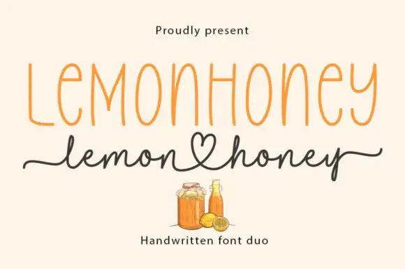
Tall narrow printed caps paired with a heart-tail handwritten script
Lemonhoney Duo pairs a tall narrow printed capital line with a handwritten script whose tail curls into a heart, so one label carries a structured name and a warm signed line beneath it.
Ideas for this font
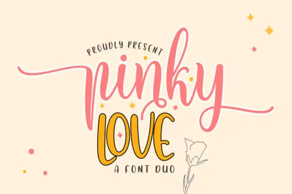
Tall sweeping script with a narrow display companion
Pinky Love is a duo in pink and orange: a tall sweeping script with a white keyline for the first word and a narrow upright display capital for the second, presented on a warm cream ground with drawn sparkles.
Ideas for this font
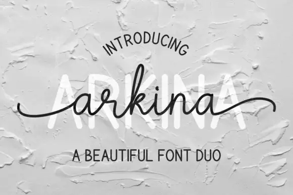
Tall sans capitals with a low looping script duo
Arkina Duo layers a very low looping connected script over tall narrow capitals that read as engraved lettering pressed into plaster, with entry strokes starting well left of the first letter.
Ideas for this font
Same independent foundry
Allow optional Google Analytics to measure visits and catalogue actions. Your search words and notes are not included. Privacy & storage