 #1 · Best Overall
Tiki Tropical Summer
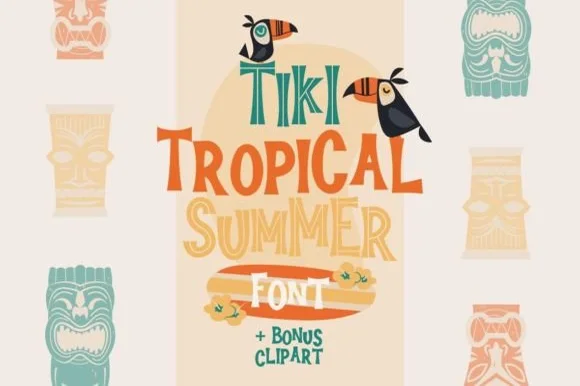
Tropical layered display with tiki figures and wavy outlined forms
Get fontPaid link
Read review ↓Disclosure: MakerFileHub may earn a commission from qualifying purchases via paid links on this page. How our links work.
Carved bamboo, Polynesian totems & beach signage
Tiki type is a carving reference: segmented bamboo stalks, spiral totem eyes and chunky slabs with notched edges. Adan and Luka build the island-pattern and bamboo-stalk ideas into the letterform, Dara and Deya add lashed cane and 3D-ringed culms, and Tiki Tropic and Teenage Marley cover the surf-poster register. Retro Blanche brings the seventies surfboard pennant tail.
Quick verdict
Tiki Tropic is the most convincing carved-wood display for a beach bar, Luka handles bamboo-stalk lettering, and Retro Blanche is the pick for a surf-poster script. Dara works for a full tiki identity.
Quick answer
Short on time? Start with our three highest-rated tropical tiki, bamboo & surf standouts before scrolling the full breakdown.
#1 · Best OverallTropical layered display with tiki figures and wavy outlined forms
 #2 · Runner-Up Pick
 #3 · Editor's Choice
We kept 18 of 127 candidates, a tight pool because the style is narrow. Judged on whether the carve or bamboo segmentation is structural, how the face behaves at 3 inch sign scale, and whether it reads as Polynesian reference rather than generic summer clip art.
Side-by-side summary
Compare specimens, OpenType/PUA traits and primary project roles side by side.
| Rank & Font | Style & File Specs | Best Project Fit | Store Listing |
|---|---|---|---|
| DisplayMid-century | Pool-party welcome sign, aloha tumbler or beach bar coaster | Get fontPaid link | |
| DuoLigatures · Alternates & swashes | Coffee bag label, travel poster or surf-shop tee | Get fontPaid link | |
| DuoAlternates & swashes | Family vacation tee, beach-bag HTV & luggage tag | Get fontPaid link | |
| DuoPUA encoded · Ligatures · Alternates & swashes | A birthday wish-card heading | Get fontPaid link | |
| DuoHeavy retro script and rounded sans | A beach-day event heading | Get fontPaid link |
#1 · Best OverallTiki Tropical Summer is an illustrated display family in which tall condensed caps sit beside wavy script-like forms and a drawn tiki face fills the counters, so a title reads as a travel poster rather than as a typeface.
The T stretches into a tall slab with a carved face inside, the I repeats as a narrow bar, the K splays two thick arms, while a second cut waves its baseline and a third sets an outline with a woodgrain fill. The mix is the character: the family is built to be layered, which is why the sample stacks a carved line, a wavy line and an outlined line in three colours. The carved forms need 50 pt before the faces read and the outlined cut needs 60 pt to keep its inner line open. The cream ground, the toucans, the tiki masks at the edges and the orange banner are presentation; the three coloured lines are the family.
Pool-party welcome sign, aloha tumbler or beach bar coaster — Use the Solid font file for small vinyl decals and the Inline file for large posters.
Clean geometric edges make the Solid file super easy to cut and weed on vinyl!
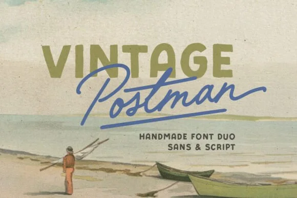
#2 · Runner-Up PickVintage Postman pairs a sturdy retro sans with the look of a soft rubber stamp and a brisk monoline brush script: the olive sans holds a solid horizontal line while the angled script cuts across the baseline with a hand-signed slant.
The sans cut keeps even stems, softly rounded corners and a slightly uneven impression, and the script cut draws a monoline stroke at a steady width with a sharp slant and quick connectors. The pairing of a grounded row and an angled line is the character: one gives structure and the other gives motion, which is why the sample sets the olive words above the blue signature. Because the script slants, keep 18 mm between the rows and 20 mm at the right for the exit; the sans stays readable from 0.35 inches of pen height.
Coffee bag label, travel poster or surf-shop tee — Set the geographical or brand noun in all-caps sans and overlap the descriptor in angled script.
Check light organic edge texture on the sans if cutting decals under 1.5 inches.
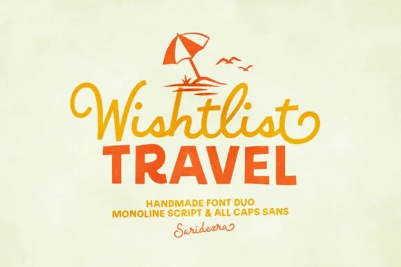
#3 · Editor's ChoiceWishlist Travel pairs a lively, curl-tipped monoline cursive script with a sturdy, slightly bouncy uppercase rounded sans.
Wishlist Travel is a duo of a swashed retro monoline script and a bold rounded sans: the script runs an even stroke with joined letters and long swashes that curl off the first and last characters, while the sans is a heavy rounded block for badges and prices. The swashes need side clearance and are the first thing to be trimmed, and the monoline is the weaker element in print. The script needs roughly 24 mm and the bold sans 26 mm for their detail to read.
Family vacation tee, beach-bag HTV & luggage tag — Top with a simple line-art palm or umbrella icon, set row one in curled script, and anchor row two in bold sans.
Medium-thick strokes on both fonts weed cleanly on HTV and tumbler vinyl down to 0.8 in—weld script joins first.
 #4 · Top Maker Utility
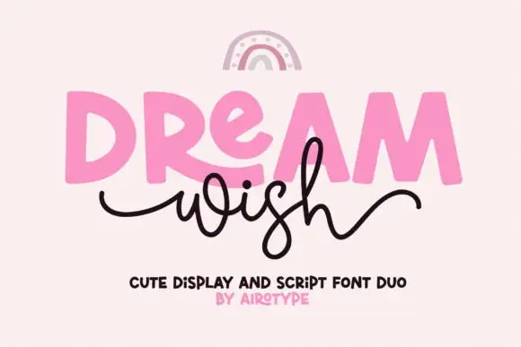
Dream Wish contrasts chunky uneven capitals in a flat pink with a fine black looping script line beneath, where the script w begins in a long entry tail and the h finishes in a high sweeping exit that lifts above the cap height of the lower word.
The caps stay blocky and slightly uneven, the script stays thin and continuous, the entry and exit tails run long and the two rows overlap lightly. That overlap is the character: the script sits close enough to touch the caps, which is why the sample keeps both rows centred with nothing else competing. A rainbow arc above is cover artwork. Keep 46 pt for the caps and 20 pt for the script, leave 16 mm of clear ground between the rows and check the exit tail against your right margin.
A birthday wish-card heading — Place a heavy first word over a short script line, keeping the personal note inside the card.
Confirm members and actual tail joins.
 #5 · Standout Silhouette
Tropical Sunlight is a duo of a heavy retro script with broad loops and a rounded block sans, shown stacked so the script carries the name and the sans shouts the second line.
The script half is a fat connected hand whose capitals open into wide loops, whose joins carry the same weight as the stems and whose ends curl rather than taper, giving the word a painted-sign feel at any size above 30 pt. The sans half is a rounded block with no contrast, short caps and wide letterfit, and in the sample it is set larger than the script so the two lines balance as a single badge. A smaller italic line beneath shows how the pair handles a third register. The script's loops are what let it hold a wide measure without tracking, and the sans supplies the shout. The cream ground, the navy and orange inks, the small beach drawing and the credits are presentation; the duo is the lettering.
A beach-day event heading — Place a short script line above one block title and move dates to a plain strip.
Check the top loop clears the preceding line and verify the two styles.
 #6
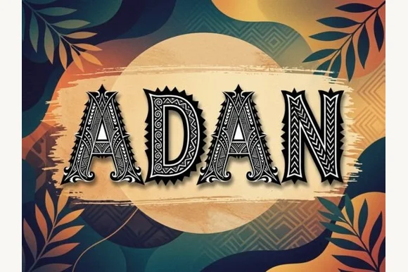
Adan is a decorative capital alphabet in which each letter is drawn as a carved panel with a hatched fill, a patterned border and a spiked crown, so a word reads as a set of tiki carvings.
The A carries a triangular counter and a hatched inner field, the D closes a squared bowl inside a patterned frame, the N keeps two heavy stems joined by a diagonal band and the whole set sits under spiked crowns. The pattern is the character: the hatching and the border repeat at a consistent interval, which is what makes a word read as carved wood rather than as decorated type. Because the detail is fine, the face wants 40 pt minimum on print and works best on a poster or a sign. The painted leaves, the dot-screen circle, the brush swash and the small caption are presentation; the display face is the word shown.
Tiki bar menu header, luau invitation, surf poster or roast bag — Set large (48pt+) in espresso, charcoal or terracotta over warm sand tones.
Detailed internal pattern lines are built for print, laser engraving and DTF — not small vinyl cuts.
 #7
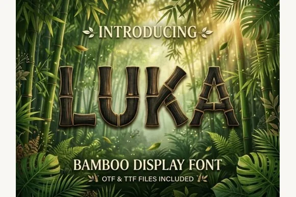
Luka is a display alphabet in which every stem is drawn as a bamboo stalk, complete with joint rings and a slight bend, so a word reads as something assembled from cut canes.
The L turns a corner with a visible joint ring, the U bends along a shallow curve, the K splays into two canes and the A crosses with a ring at the junction, all at a heavy weight with rounded joints and a dry texture along the stalks. That construction is the character: the segment rings sit at a consistent interval across the word, which keeps it reading as one material rather than as separate letters. Because the rings are fine, the face needs 30 pt minimum on print and works best on a poster or a menu where the texture can be read at arm's length. The jungle photograph, the leaves and ferns, the gold ink are presentation; the display face is the word shown.
Jungle safari birthday banner, tiki hut sign or summer camp tee — Verify flat silhouette vs shaded layer in OTF/TTF; prints vividly via Print-Then-Cut and sublimation.
Segmented stalk gaps cut fine at large banner sizes (3"+); use print/sublimation for full wood shading.
 #8
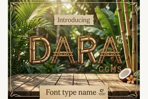
Dara is an illustrated tropical display font constructing every uppercase letter from segmented bamboo stalks lashed together at the joints!
Dara is an illustrated tropical display in which every capital is built from segmented bamboo culms lashed at the joints with cord, so a word reads as a tiki-bar sign assembled from canes rather than as type. The segmentation and the lashings are the whole design, which means the face needs size for the cord to read as cord, and the joints repeat across every letter. It needs roughly 35 mm for the lashings to hold, and it is best in tan and green with a dark keyline on cream or over a timber-panel background.
Backyard tiki-bar sign, luau party invite & rum-punch menu — Set 1 uppercase title huge (72–140 pt) in warm golden bamboo tones over dark tropical palm photography.
Detailed internal bamboo-joint lines mean you MUST use print, Print-Then-Cut, sublimation, DTF, or laser wood engraving—never weed vinyl!
 #9
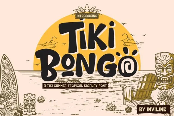
Tiki Bongo is a lively Polynesian-inspired display font embedding spiral tribal swirls inside 'O' bowls and bouncy carved strokes.
Tiki Bongo is a chunky Polynesian-inspired display whose O bowls enclose spiral wave motifs, whose i stems carry curved carved ticks and whose stroke ends are rounded as though cut from soft wood. The letters are wide and bouncy, with uneven cap heights that give a totem rhythm, and the detail is coarse enough to survive carving, vinyl cutting and screen printing. Because the swirls sit inside the counters, the face needs about 20 mm before they resolve, and it should carry a short phrase on a sign or a cup rather than a label.
Backyard luau invite, tiki-cocktail cup & pool-bar sign — Stack 2 mixed/uppercase words centered against a warm golden sun circle across balanced outer margins.
Chunky solid strokes cut on 1.1 in+ Cricut vinyl and HTV—just weed the spiral 'O' center channel gently with tweezers!
 #10
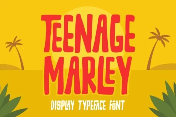
Teenage Marley is a tall, upbeat hand-cut display typeface with dancing tropical stems, tapered brush curves, and breezy island poster rhythm.
Teenage Marley is a tall hand-cut tropical display drawn from tiki and surf posters: narrow letters with uneven scissor-cut edges, a slight lean, blunt terminals and small notch cuts where the blade changed direction. The hand-cut edge is the texture, and the tall proportions stack a long word in a narrow panel. It needs roughly 30 mm for the cut edge and the notch to read, and it is best in one saturated ink on sand and cream, or two flat colours on a dark ground where the cut edge stays visible.
Beach-bar surfboard sign, smoothie cup & vacation shirt — Stack 2 or 3 uppercase words centered in coral, turquoise, or sun-yellow with tight 0.92 line spacing.
Solid chunky strokes with zero interior specks weed quickly and cleanly on HTV, permanent outdoor vinyl, and cardstock.
 #11
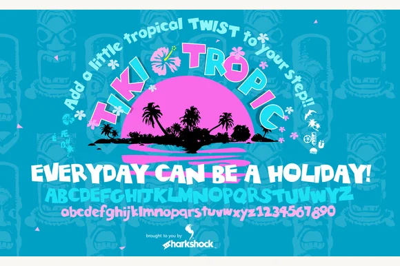
Tiki Tropic (by Sharkshock) is a full-featured tropical wood-carved display font covering A–Z, playful lowercase, and 0–9 numerals.
Tiki Tropic is a wood-carved display with a full character set: uppercase, a distinct bouncy lowercase and numerals, all cut with the chatter marks of a chisel. The strokes are chunky with notched edges, which makes the face read as signage rather than as decoration applied to type, and the lowercase is genuinely usable rather than an afterthought. It needs roughly 20 mm for the carve marks to read as carving, and it works best in one warm colour on a natural ground, or reversed out of dark timber.
Hawaiian shirt tag, surf-camp banner & tiki-mug decal — Arch the main title (+20%) in hot pink and cyan above straight white subheaders.
100% solid, chunky carved blocks cut and weed fast on Cricut Oracal 651, HTV, and cardstock banners down to 0.65 in!
 #12
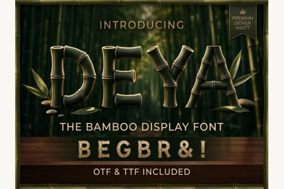
Deya is a serene tropical decorative font forming clean geometric capitals and symbols ('&', '!') out of ringed bamboo stalks (OTF & TTF).
Deya is a bamboo-style display face whose strokes are built from straight segments with hard elbow joints and cut ends, so a word reads as a lattice made of sticks rather than as a drawn letter. The joints are the character: each corner is a visible overlap, which means the face holds its look at any size but needs space between letters for the sticks to separate. It needs roughly 30 mm for the joints to read, and it is best in a natural green or a single dark ink on pale plaster, or in white on a deep ground.
Zen spa menu, bamboo-sheet packaging & matcha tin — Center 1 uppercase word at 60–115 pt with +8 tracking above clean geometric sans subcopy.
Subtle horizontal bamboo-node slits require print, DTF, sublimation, or laser wood engraving—avoid small blade-cut vinyl.
 #13
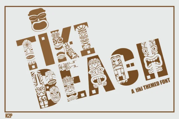
Tiki Beach is an illustrated tropical display font whose chunky block capitals are filled with carved tiki faces, palm-frond chevrons, and tribal motifs.
Tiki Beach is a Polynesian carved-totem and tiki mask display: heavy block letters carved with stacked horizontal grooves, small mask faces set into some counters and a rounded top edge that reads as a carved post. The mask faces are the design and they fill into the stroke once the face is reduced, and the grooves add a carved texture. It needs roughly 34 mm for the mask and the groove to read, and it is best in one dense ink on timber-toned stock, or a routed cut where the grooves become real channels.
Luau party invitation, tiki-bar menu & pool-deck poster — Set 1 or 2 short words large (64–110 pt) in warm teak brown, terracotta, or teal on clean sand-cream cardstock.
Contains dozens of tiny interior pattern cutouts per letter—use Print-Then-Cut, sublimation, or flat print, NOT blade-cut vinyl weeding.
 #14
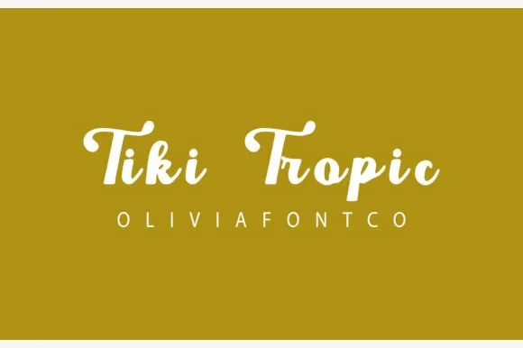
Tiki Tropic (by OliviaFontCo) is a bold, vintage sign-painter brush script (not a carved block font) with thick loops and warm mid-century charm.
A chunky retro brush script centred in cream white on warm olive mustard: curled vintage capitals pair with plump, loosely spaced lowercase, so the word reads as a nineteen-sixties resort sign rather than as a modern brush script. The strokes are thick and the spacing is generous, which is what keeps a two-word line from turning into a knot, and the brush edges carry a soft dry quality rather than a sharp vector finish. The weight is even enough to cut and weed. The mustard ground is staging. Uses are surf, motel, beach-club and food packaging, where a friendly vintage voice is the whole point.
Retro surf-motel keychain, beach-club towel & rum label — Set 2 title-case words on 1 horizontal line at 52–92 pt above ultra-wide-tracked (+400) clean sans caps.
Plump, sturdy brush shapes cut and weed cleanly on Cricut HTV and permanent vinyl down to 0.8 in (weld any touching joins!).
 #15
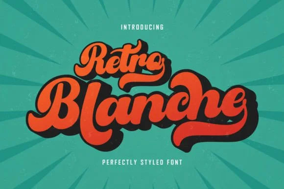
Retro Blanche is a fat retro script in orange on a teal sunburst: heavy connected strokes, a strong slope, small loops and a solid dark extrusion behind every letter, so the pair reads as a painted sign from a mid-century diner.
The two words are stacked on an arc and the drawing is a brush script at maximum weight: the strokes swell, the joins are thick, and the terminals roll into small curls, while a hard extrusion steps down and left behind each letter, which gives the block depth without a gradient. Because the extrusion is solid and consistent, the lockup reads as one object rather than as a set of shadows, and the counters stay open enough that the word survives at a distance. The composition sits on a teal ground with a radiating sunburst, which pushes the eye to the centre, and two tracked captions above and below are set in a light grotesque. The palette is three flat colours, which is what a painted sign would use.
Surf-shop tee, camper-van decal, beach towel & koozie — Tuck a smaller script eyebrow ('Retro', 54 pt) right into the upper-left pocket above the main hero word ('Blanche', 115 pt)!
Ultra-thick brush strokes cut and weed fast on Cricut HTV, 3D puff vinyl, and automotive Oracal 651 (Weld joins!).
 #16
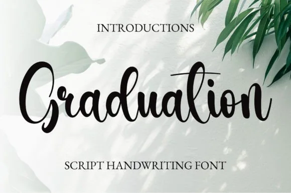
Graduation (by 21Design) is a crisp, bouncy modern brush calligraphy script (NOT a slab serif!) with PUA access and smooth custom ligatures.
Graduation is a bouncy modern brush script with genuine thick-and-thin shading, tall d and t loops, PUA access for alternates and custom ligatures that smooth difficult letter pairs. The connections are drawn rather than simulated, so a phrase keeps its rhythm at 20 mm and above, and the bouncy baseline gives a short greeting movement without tipping into illegibility. It is a keepsake face for cards, toppers and apparel, and it wants a single colour on a soft ground so the shading reads clearly.
Acrylic graduation welcome sign, champagne flute & stole — Center 1–2 title-case words at 68–135 pt above clean tracked Roman serif caps ('SCRIPT HANDWRITING FONT').
Click Weld in Cricut Design Space to fuse cursive joins—cuts cleanly on vinyl and HTV above 0.95 inches!
 #17
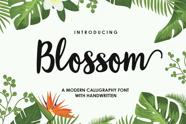
Blossom Script is a broad connected brush script with tall B and l forms, open rounded middles and an exit stroke that rises instead of trailing flat.
The letters are wider than they are tall in the lower-case, and the connections sit at mid-height, so a word holds together as one buoyant shape rather than a row of separate forms. The B carries a large upper loop and the l rises well above the x-height; the final m turns upward into a long curve that finishes above the baseline, which is the gesture the whole sample is built around. Weight is even, with soft brushy ends rather than sharp entry points, so the script stays friendly at large sizes. Tropical foliage at the corners of the preview is separate artwork, and the sub-line naming the style sits in a smaller hand-printed face.
A florist collection heading — Place the title in a clear band above a plain care note, with flowers outside the lettering.
Confirm the exact end swash for the actual word.
 #18
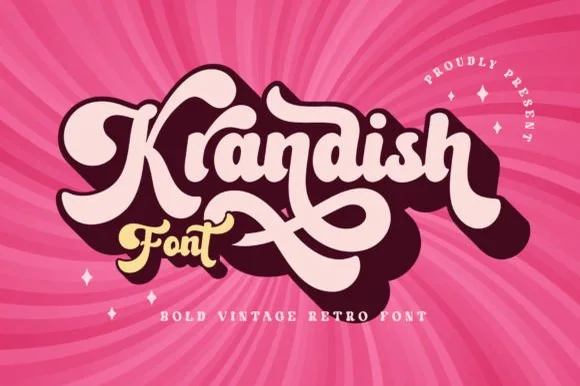
Krandish is a heavy, cream-smooth 1970s retro script featuring dramatic looping swash capitals and thick figure-eight underline tails.
Krandish is a chunky nineteen-seventies retro brush script with swash tails: a very heavy loaded stroke, a firm slant and tails that extend straight off the first and last letters before curling up at the tip. The tails widen the word and are the first thing trimmed, and the heavy weight closes the counters early. It needs roughly 30 mm for the tail and the heavy stroke to read, and it is best in two warm inks on cream, or one burnt orange on white where the tails still read as drawn lines.
Retro roller-skate tee, beach tote & iced-coffee wrap — Tilt a 1-to-2-word phrase upward 8 degrees and duplicate a dark offset layer behind it in Illustrator or Cricut for a 3D retro shadow.
Weld connected lowercase strokes into one path before cutting, and check the tight loops inside 'a', 'd', and 'o'.
Practical buyer checklist
Key cutting, printing and pairing answers before choosing a tropical tiki, bamboo & surf typeface.
Yes, at 3 inches or more where the notch depth clears 2 mm. Below that the carving detail burns away. Use a downcut bit on a router or reduce power on a laser so the segmented outlines stay crisp.
Mixing it with unrelated tropical clichés such as palm trees and cartoon pineapples. The style is already specific, and stacking references turns a considered venue identity into a party-supply look.
Some ship capitals only, because the reference is signage. Check before planning prices or a phone number in the same face, and keep numerals in a plain sans if the tiki set lacks them.
As one accent, yes. Pair a carved wordmark with a clean neutral sans and a restrained palette, and the reference reads as deliberate rather than as a costume from a specific decade.
Keep exploring
Explore adjacent maker roundups or check our practical pre-production checklists.
27 curated fonts · Previews & pairings
31 curated fonts · Previews & pairings
25 curated fonts · Previews & pairings
35 curated fonts · Previews & pairings
Guides: Invitation font checklist · Vinyl & cutting checklist · How to pair script & sans fonts
Allow optional Google Analytics to measure visits and catalogue actions. Your search words and notes are not included. Privacy & storage