Neutral Sans Workhorse

Luka + One More
Lets Luka own the focal silhouette while handling secondary copy, sizing and subheads cleanly.
Inspect One More specimenDisclosure: MakerFileHub may earn a commission from qualifying purchases via paid links on this page. How our links work.
Segmented bamboo-stalk display with jointed stems and a tropical finish
Luka is a display alphabet in which every stem is drawn as a bamboo stalk, complete with joint rings and a slight bend, so a word reads as something assembled from cut canes.
Paid link
Get this fontProject & layout blueprintsAt-a-glance maker compatibility
Sturdy stroke walls and open counters weed cleanly on adhesive vinyl, HTV apparel film, and cut cardstock.
Visual anatomy & craft review
The L turns a corner with a visible joint ring, the U bends along a shallow curve, the K splays into two canes and the A crosses with a ring at the junction, all at a heavy weight with rounded joints and a dry texture along the stalks. That construction is the character: the segment rings sit at a consistent interval across the word, which keeps it reading as one material rather than as separate letters. Because the rings are fine, the face needs 30 pt minimum on print and works best on a poster or a menu where the texture can be read at arm's length. The jungle photograph, the leaves and ferns, the gold ink are presentation; the display face is the word shown.
Bamboo · Segmented · Tropical
Two-font hierarchy recipes
Tested contrast partners — pairing Luka with grounded secondary typography.
Luka + One More
Lets Luka own the focal silhouette while handling secondary copy, sizing and subheads cleanly.
Inspect One More specimen
Luka + Mewah
Grounds bold display lettering with classic typographic authority on posters, badges and apparel.
Inspect Mewah specimenPractical applications
Concrete hierarchy, scale and production guidance tailored to Luka’s stroke geometry.
The bamboo stems give a venue sign its material at 12 cm, and the joint rings read at a distance where a flat face would look generic.
Hierarchy & layout recipe
Print a 700 by 400 mm panel: set the venue name at 12 cm across the upper half, set the hours in a 4 cm sans below, and keep 9 cm of border so the canes are not cropped by the frame.
Pre-production check
A matte panel flattens the stalk texture; check the sign in place and choose a satin stock so the joints still read.
The segmented letters carry a menu cover at 34 pt, and the tropical material ties the piece to the theme without a printed illustration.
Hierarchy & layout recipe
Print an A5 menu: set the header at 34 pt across the upper third, set the drinks in a 9 pt sans at 14 pt leading, and hold 14 mm between the canes and the first line so the joints are not lost in the list.
Pre-production check
A heavy textured face over a list can look busy; check the cover at final size and keep the header to one short word.
The segmented stalks screen-print as a single shape at 55 mm, and the joints hold on coarse canvas where a thin display face would sink in.
Hierarchy & layout recipe
Screen a 380 by 420 mm tote: print the word at 55 mm through a 110-thread mesh, keep the joint rings at 1.5 mm, and stay 40 mm below the handle seam so the print does not distort in the press.
Pre-production check
A joint ring under 1 mm closes on a coarse weave; check a pull on the actual bag and print the rings as a separate screen or simplify them.
Technical & licence verification
Confirm included OTF/TTF/WOFF formats, full glyph tables and licence coverage on the live store page before batch production.
Closest visual alternatives
Matched across letterform anatomy, stroke behaviour and craft applications.
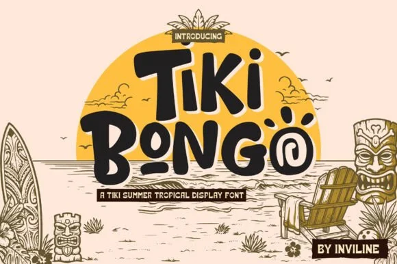
Playful Polynesian tiki-totem & spiral-swirl island display
Tiki Bongo is a lively Polynesian-inspired display font embedding spiral tribal swirls inside 'O' bowls and bouncy carved strokes.
Ideas for this font
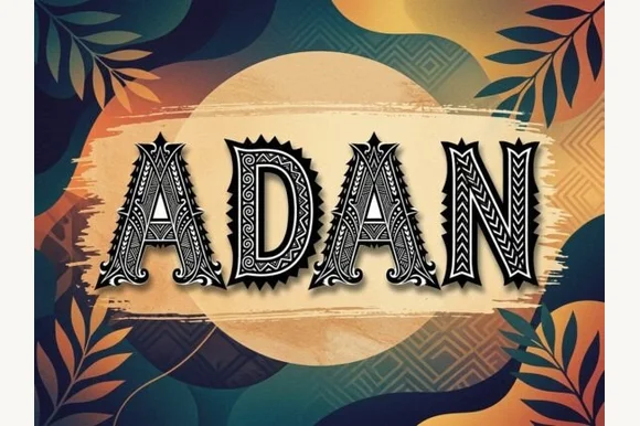
Carved geometric island-pattern capitals with hatch fills and spiked frames
Adan is a decorative capital alphabet in which each letter is drawn as a carved panel with a hatched fill, a patterned border and a spiked crown, so a word reads as a set of tiki carvings.
Ideas for this font
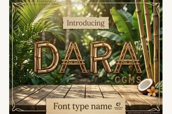
Lashed tropical bamboo-cane & tiki-bar display font
Dara is an illustrated tropical display font constructing every uppercase letter from segmented bamboo stalks lashed together at the joints!
Ideas for this font
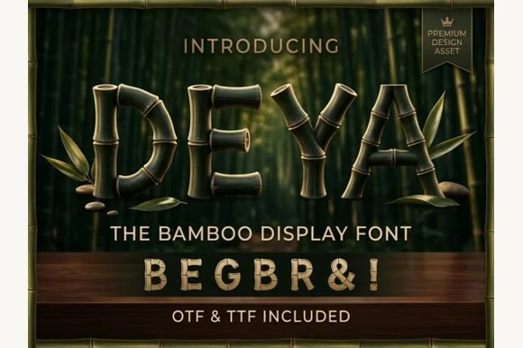
3D-ringed natural bamboo-culm alphabet + symbols (OTF & TTF)
Deya is a serene tropical decorative font forming clean geometric capitals and symbols ('&', '!') out of ringed bamboo stalks (OTF & TTF).
Ideas for this font
Same independent foundry
Allow optional Google Analytics to measure visits and catalogue actions. Your search words and notes are not included. Privacy & storage