Neutral Sans Workhorse

Dara + One More
Lets Dara own the focal silhouette while handling secondary copy, sizing and subheads cleanly.
Inspect One More specimenDisclosure: MakerFileHub may earn a commission from qualifying purchases via paid links on this page. How our links work.
Lashed tropical bamboo-cane & tiki-bar display font
Dara is an illustrated tropical display font constructing every uppercase letter from segmented bamboo stalks lashed together at the joints!
Paid link
Get this fontProject & layout blueprintsAt-a-glance maker compatibility
Sturdy stroke walls and open counters weed cleanly on adhesive vinyl, HTV apparel film, and cut cardstock.
Visual anatomy & craft review
Dara is an illustrated tropical display in which every capital is built from segmented bamboo culms lashed at the joints with cord, so a word reads as a tiki-bar sign assembled from canes rather than as type. The segmentation and the lashings are the whole design, which means the face needs size for the cord to read as cord, and the joints repeat across every letter. It needs roughly 35 mm for the lashings to hold, and it is best in tan and green with a dark keyline on cream or over a timber-panel background.
Tiki-bamboo · Island-craft · Detailed
Two-font hierarchy recipes
Tested contrast partners — pairing Dara with grounded secondary typography.
Dara + One More
Lets Dara own the focal silhouette while handling secondary copy, sizing and subheads cleanly.
Inspect One More specimen
Dara + Amor Hadena
Grounds bold display lettering with classic typographic authority on posters, badges and apparel.
Inspect Amor Hadena specimenPractical applications
Concrete hierarchy, scale and production guidance tailored to Dara’s stroke geometry.
Bamboo-culm lettering reads as a beach bar built from whatever the island had, which is what a tiki patio sells. The lashings give the word texture at 160 mm, and the segmented construction holds in one ink on a timber panel where a thin face would disappear.
Hierarchy & layout recipe
Sign 900 x 400 mm, word 160 mm, 60 mm margins and 25 mm frame clearance. Menu 210 x 297 mm, sections 20 mm, items 9/12 pt, 15 mm margins. Banner 1500 x 400 mm, word 240 mm, 100 mm margins.
Pre-production check
A sign printed on a timber-grained panel puts the culm lines against the wood grain and the letters read as texture rather than shapes. Print on flat white board, and check one mounted sign in daylight before opening.
Segmented bamboo lettering reads as a tropical spirit brand, which is what a small rum producer prints on a front label. The lashing detail survives a 20 mm label height, and the illustrated construction gives the bottle a story without a second graphic.
Hierarchy & layout recipe
Label 70 x 40 mm, name 14 mm, weight 4.5 pt, 4 mm die margin. Coaster 90 mm round, word 10 mm, 4 mm die margin. Napkin 200 x 200 mm, word 30 mm, 20 mm margins.
Pre-production check
A 14 mm label name closes the joint between two culms in flexo and the letter reads as a solid bar. Print labels digitally or keep the name at 18 mm, and check one applied label on a filled bottle.
Illustrated bamboo lettering reads as a themed party, which is what a summer birthday borrows from the bar down the road. The heavy segmented forms cut cleanly at 50 mm with wide bridges, and the lashings give the invite its character without a printed photograph.
Hierarchy & layout recipe
Invite A6, word 40 mm, details 8/11 pt, 12 mm margins. Topper 130 x 110 mm, word 50 mm with an 8 mm slot and 12 mm clear. Garland 300 x 200 mm per flag, word 90 mm, 20 mm margins.
Pre-production check
A laser-cut topper drops the cord lashings as separate fragments that fall out of the cake. Bridge the lashings to the culm at 1.5 mm on the cut file, and cut one prototype before the batch.
Technical & licence verification
Confirm included OTF/TTF/WOFF formats, full glyph tables and licence coverage on the live store page before batch production.
Closest visual alternatives
Matched across letterform anatomy, stroke behaviour and craft applications.
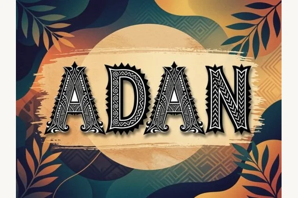
Carved geometric island-pattern capitals with hatch fills and spiked frames
Adan is a decorative capital alphabet in which each letter is drawn as a carved panel with a hatched fill, a patterned border and a spiked crown, so a word reads as a set of tiki carvings.
Ideas for this font
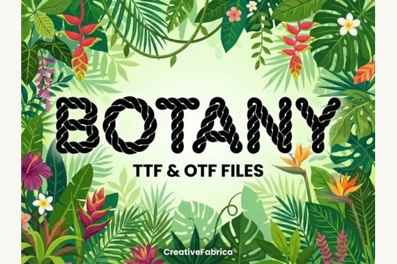
Twisted nautical-rope & macramé cord alphabet (TTF & OTF)
Botany is a crisp decorative display font twisting realistic multi-strand nautical rope into bold, clean uppercase letters (TTF & OTF).
Ideas for this font
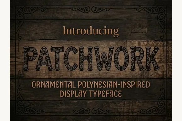
Ornamental display with carved pattern fills
Patchwork is an ornamental display face in dark ink on wood: heavy capitals filled with carved patterns of dots, hatching and curls, outlined and set inside a drawn frame, with a condensed capital caption beneath.
Ideas for this font
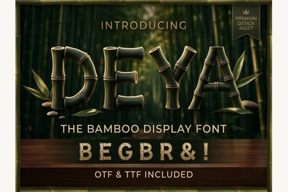
3D-ringed natural bamboo-culm alphabet + symbols (OTF & TTF)
Deya is a serene tropical decorative font forming clean geometric capitals and symbols ('&', '!') out of ringed bamboo stalks (OTF & TTF).
Ideas for this font
Same independent foundry
Allow optional Google Analytics to measure visits and catalogue actions. Your search words and notes are not included. Privacy & storage