Neutral Sans Workhorse

Adan + Cenura
Lets Adan own the focal silhouette while handling secondary copy, sizing and subheads cleanly.
Inspect Cenura specimenDisclosure: MakerFileHub may earn a commission from qualifying purchases via paid links on this page. How our links work.
Carved geometric island-pattern capitals with hatch fills and spiked frames
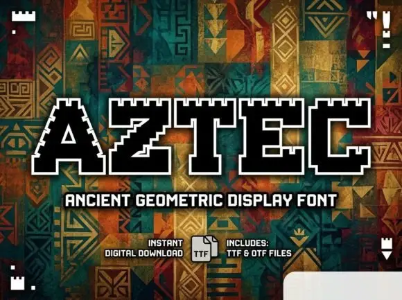
Adan is a decorative capital alphabet in which each letter is drawn as a carved panel with a hatched fill, a patterned border and a spiked crown, so a word reads as a set of tiki carvings.
Paid link
Get this fontProject & layout blueprintsAt-a-glance maker compatibility
Sturdy stroke walls and open counters weed cleanly on adhesive vinyl, HTV apparel film, and cut cardstock.
Visual anatomy & craft review
The A carries a triangular counter and a hatched inner field, the D closes a squared bowl inside a patterned frame, the N keeps two heavy stems joined by a diagonal band and the whole set sits under spiked crowns. The pattern is the character: the hatching and the border repeat at a consistent interval, which is what makes a word read as carved wood rather than as decorated type. Because the detail is fine, the face wants 40 pt minimum on print and works best on a poster or a sign. The painted leaves, the dot-screen circle, the brush swash and the small caption are presentation; the display face is the word shown.
Carved · Patterned · Tiki
Two-font hierarchy recipes
Tested contrast partners — pairing Adan with grounded secondary typography.
Adan + Cenura
Lets Adan own the focal silhouette while handling secondary copy, sizing and subheads cleanly.
Inspect Cenura specimen
Adan + Stanza
Grounds bold display lettering with classic typographic authority on posters, badges and apparel.
Inspect Stanza specimenPractical applications
Concrete hierarchy, scale and production guidance tailored to Adan’s stroke geometry.
The carved panels read at 12 cm on a printed or painted sign, and the hatching gives a venue the tropical material without an illustration.
Hierarchy & layout recipe
Print a 700 by 400 mm panel: set the venue name at 12 cm, set the hours in a 4 cm sans beneath, and keep 9 cm of border so the spiked crowns stay inside the frame.
Pre-production check
A hatch fill under 1 mm at 12 cm reads as a texture fault; check the panel at two metres and widen the hatching rather than the stems.
The carved capitals read at 14 pt on a bottle label, and the pattern gives a small product the look of a carved tag at retail distance.
Hierarchy & layout recipe
Print a 55 by 80 mm label: set the drink at 14 pt, set the volume in a 5 pt caps sans beneath, and keep 6 mm of margin so the patterned border is not cut where the label wraps the bottle.
Pre-production check
A pattern at 14 pt can fill in on a curved label; check one labelled bottle and use the plain cut below that size.
The carved letters carry a poster at 90 pt, and the spiked crowns give the title a silhouette that reads across a crowded wall.
Hierarchy & layout recipe
Print an A2 poster: set the event name at 90 pt across the middle, set the details in a 14 pt caps sans beneath, and keep 25 mm of margin so the crowns stay inside the bleed.
Pre-production check
A patterned face over a painted background becomes unreadable; check the poster and keep the lettering on the plain sand-coloured field.
Technical & licence verification
Confirm included OTF/TTF/WOFF formats, full glyph tables and licence coverage on the live store page before batch production.
Closest visual alternatives
Matched across letterform anatomy, stroke behaviour and craft applications.
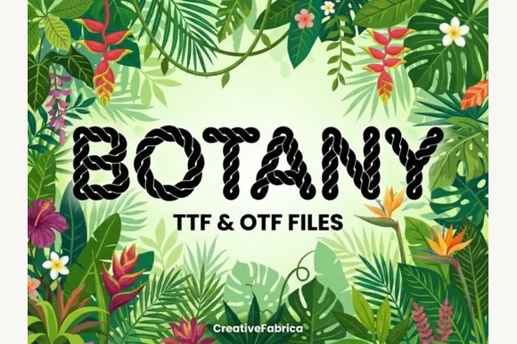
Twisted nautical-rope & macramé cord alphabet (TTF & OTF)
Botany is a crisp decorative display font twisting realistic multi-strand nautical rope into bold, clean uppercase letters (TTF & OTF).
Ideas for this font
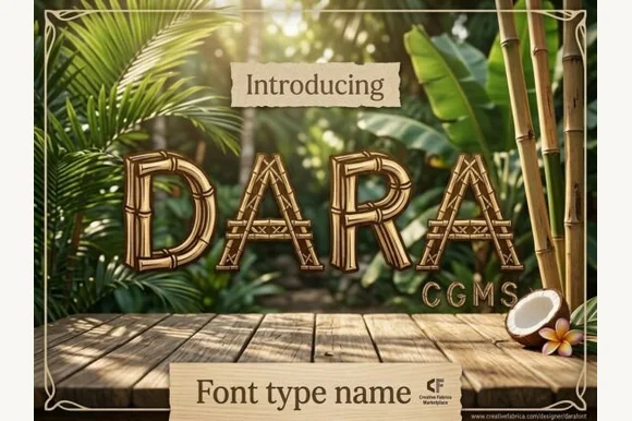
Lashed tropical bamboo-cane & tiki-bar display font
Dara is an illustrated tropical display font constructing every uppercase letter from segmented bamboo stalks lashed together at the joints!
Ideas for this font
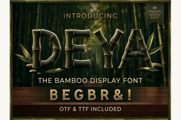
3D-ringed natural bamboo-culm alphabet + symbols (OTF & TTF)
Deya is a serene tropical decorative font forming clean geometric capitals and symbols ('&', '!') out of ringed bamboo stalks (OTF & TTF).
Ideas for this font
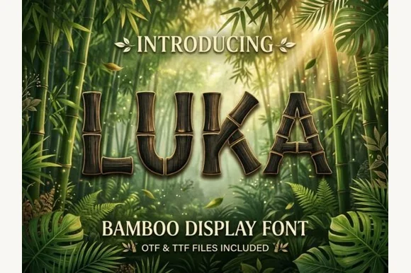
Segmented bamboo-stalk display with jointed stems and a tropical finish
Luka is a display alphabet in which every stem is drawn as a bamboo stalk, complete with joint rings and a slight bend, so a word reads as something assembled from cut canes.
Same independent foundry
Allow optional Google Analytics to measure visits and catalogue actions. Your search words and notes are not included. Privacy & storage