Neutral Sans Workhorse

Rakan + Kohilo
Lets Rakan own the focal silhouette while handling secondary copy, sizing and subheads cleanly.
Inspect Kohilo specimenDisclosure: MakerFileHub may earn a commission from qualifying purchases via paid links on this page. How our links work.
1980s multi-line concentric ribbon & arcade display
Rakan is an energetic 1980s multi-line display font constructed from five parallel concentric tracks wrapping bold geometric capitals.
Paid link
Get this fontProject & layout blueprintsAt-a-glance maker compatibility
Cut solid base, outline, and shadow layers in separate vinyl colors and align on registration marks.
Visual anatomy & craft review
Rakan is a nineteen-eighties arcade display of stacked concentric ribbons: every stem is three or four parallel bands that curve into arcs at the corners, and the bands wrap around the whole word so the letters share one continuous ribbon. The band gaps are the design, and they close when the face is small or the ink spreads. It needs roughly 40 mm for the bands to stay separate, and it is best in two bright inks on black, or one metallic on a dark ground where the arcs read as light strips.
Arcade · Multi-line · Nostalgic
Two-font hierarchy recipes
Tested contrast partners — pairing Rakan with grounded secondary typography.
Rakan + Kohilo
Lets Rakan own the focal silhouette while handling secondary copy, sizing and subheads cleanly.
Inspect Kohilo specimen
Rakan + Svara
Grounds bold display lettering with classic typographic authority on posters, badges and apparel.
Inspect Svara specimenPractical applications
Concrete hierarchy, scale and production guidance tailored to Rakan’s stroke geometry.
A stacked-ribbon arcade display announces a retro games party in the lettering itself, and the ribbons read as cabinet trim at 40 mm. The arcs hold on an invite, and two bright inks print the invite and the banner as one set on black card.
Hierarchy & layout recipe
Invite A6, word 40 mm with 10 mm band clearance, details 8/11 pt, 12 mm margins. Topper 130 x 110 mm, word 44 mm with a 6 mm stick slot and 12 mm clear. Banner 1500 x 400 mm, word 150 mm, 30 mm safe edge.
Pre-production check
A 130 mm laser-cut topper drops the inner bands under 1 mm and they fall out, leaving gaps in the word. Cut the topper to the outer silhouette only, and test one before the set.
A ribbon arcade display reads as a cabinet marquee rather than a styled headline, which is what a feature about arcade design wants. The stacked bands give the title depth at 72 pt on a dark page, and one metallic ink keeps the arcs as thin lights.
Hierarchy & layout recipe
Opener 210 x 297 mm, title 72 pt with 12 mm band clearance, standfirst 11/15 pt, body 9/13 pt, 18 mm margins. Cover band 210 x 70 mm, word 44 pt. Pull quote 40 pt.
Pre-production check
At 44 pt on the cover band the 0.8 mm gaps fill and the title prints as a solid slab with white specks. Keep bands at 56 pt and above, and proof one cover at 1:1.
A stacked ribbon display suits a summer neon night because the bands read as tube lights at distance. The arcs hold at 150 mm on a poster, and two bright inks on black print the poster, the menu and the wristbands in one order.
Hierarchy & layout recipe
Poster A2, word 150 mm with 18 mm band clearance, details 40 mm, 20 mm margins. Menu 150 x 300 mm, header 44 mm, drinks 12 mm. Wristband 250 x 25 mm, word 8 mm, 3 mm margins.
Pre-production check
On a 250 x 25 mm wristband the four bands collapse into one and the word reads as a grey stripe. Use a single-line cut on the band and keep the display for the poster, then check one printed band before the night.
Technical & licence verification
Confirm included OTF/TTF/WOFF formats, full glyph tables and licence coverage on the live store page before batch production.
Closest visual alternatives
Matched across letterform anatomy, stroke behaviour and craft applications.
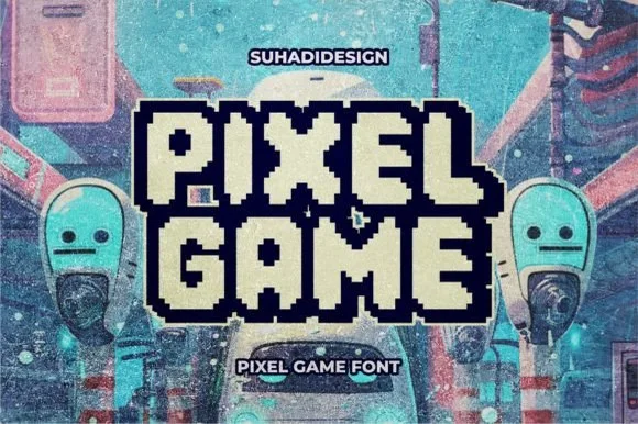
Double-outlined retro pixel arcade alphabet with a filled inner core
Pixel Game is an arcade alphabet in which every letter carries two outlines and a filled core, so a word reads as an eight-bit game logo rendered as a sticker.
Ideas for this font
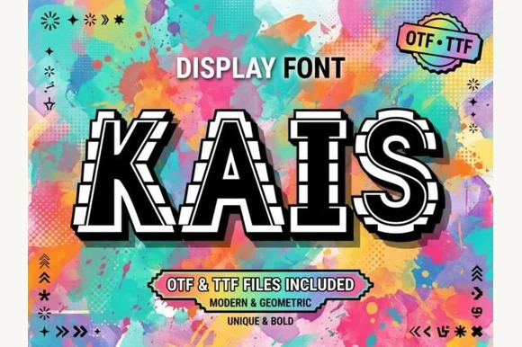
Bold geometric sans framed in perforated film-strip / arcade borders (OTF & TTF)
Kais is an eye-catching geometric display font wrapping solid white-and-black capitals inside dashed film-strip / marquee border tracks (OTF & TTF).
Ideas for this font
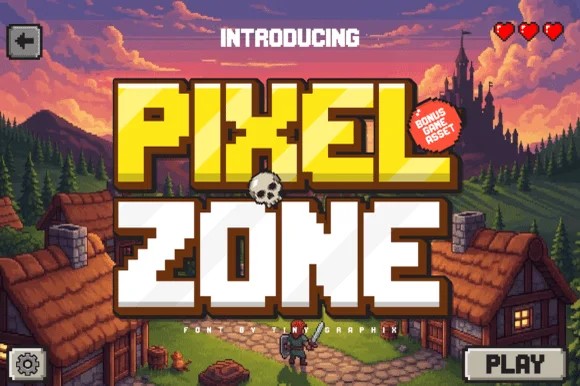
Chunky sixteen-bit pixel lettering with bevelled corners
Pixel Zone is a chunky sixteen-bit display in which every stem is built from square blocks, the corners bevel slightly and the strokes carry mass, so a title reads as an arcade logo rather than as a modern squarish sans.
Ideas for this font
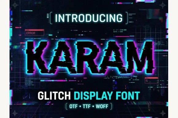
Horizontal pixel-sliced digital glitch slab display
Karam is a cybernetic glitch display font that slices bold serif/slab capitals with horizontal scan-tear offsets and pixel blocks.
Ideas for this font
Same independent foundry
Allow optional Google Analytics to measure visits and catalogue actions. Your search words and notes are not included. Privacy & storage