Neutral Sans Workhorse

Retro Rush + Montreal
Lets Retro Rush own the focal silhouette while handling secondary copy, sizing and subheads cleanly.
Inspect Montreal specimenDisclosure: MakerFileHub may earn a commission from qualifying purchases via paid links on this page. How our links work.
Geometric capitals built from parallel lines with a rounded inner counter
Retro Rush is a geometric capital alphabet in which every stroke is drawn as several parallel lines, so a word reads as a neon tube sign or a striped poster from the late seventies.
Paid link
Get this fontProject & layout blueprintsAt-a-glance maker compatibility
Cut solid base, outline, and shadow layers in separate vinyl colors and align on registration marks.
Visual anatomy & craft review
The R keeps a squared bowl and a straight leg, the E carries three arms, the T holds a wide bar and the O closes a round counter with a filled dot at its centre, all at a heavy overall footprint with the weight distributed across four or five parallel strokes. That construction is the character: the letters read as outlines, which means they can be printed hollow, filled between the lines, or used as a mask. Alignment across letters matters — the line count has to stay constant or the word looks broken. Because the strokes are thin individually, the face needs 40 pt minimum and a smooth stock, and it fails at 16 pt where the lines merge. The dark ground, the city lights behind, the warm glow and the two caption lines are presentation; the typeface is the two words.
Multi-line · Geometric · Retro
Two-font hierarchy recipes
Tested contrast partners — pairing Retro Rush with grounded secondary typography.
Retro Rush + Montreal
Lets Retro Rush own the focal silhouette while handling secondary copy, sizing and subheads cleanly.
Inspect Montreal specimen
Retro Rush + Papillon Serif – Elegant Modern Luxury
Grounds bold display lettering with classic typographic authority on posters, badges and apparel.
Inspect Papillon Serif – Elegant Modern Luxury specimenPractical applications
Concrete hierarchy, scale and production guidance tailored to Retro Rush’s stroke geometry.
The parallel lines read as neon at 90 pt, and the geometric construction ties the poster to the decade without an illustration.
Hierarchy & layout recipe
Print an A2 poster: set the event name at 90 pt across the middle in two lines, set the date in a 16 pt caps sans beneath, and keep 25 mm of margin so the outer line of every letter stays clear of the trim.
Pre-production check
Parallel lines under 1.5 mm apart merge on a matte stock; check the proof at final size and drop to three lines below 60 pt.
The multi-line construction gives a reissue cover its period mark, and the hollow result lets the background through the letters at 70 pt.
Hierarchy & layout recipe
Print a 120 mm square sleeve: set the title at 70 pt on the upper half, set the artist in a 9 pt caps sans below, and keep 12 mm of margin so the striped strokes survive the sleeve trim.
Pre-production check
A hollow letter over a busy photograph becomes unreadable; check the cover with the image in place and lay a plain band behind the title.
The striped capitals give a ticket a period look at 16 pt, and the hollow construction keeps a small print legible without a fill.
Hierarchy & layout recipe
Print a 100 by 50 mm ticket: set the event name at 16 pt, set the door time in a 6 pt caps sans beneath, and keep 6 mm clear of the perforation so the parallel lines never cross the tear line.
Pre-production check
A striped letter crossing a perforation tears at the gaps; check the artwork against the tear position and keep the title on one side.
Technical & licence verification
Confirm included OTF/TTF/WOFF formats, full glyph tables and licence coverage on the live store page before batch production.
Closest visual alternatives
Matched across letterform anatomy, stroke behaviour and craft applications.
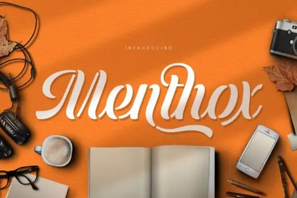
Broken-stroke stencil script
Menthox is a broken-stroke script in cream on orange: each letter is drawn as a continuous ribbon with the joins cut away, so the word reads as a stencil or a paper cut.
Ideas for this font
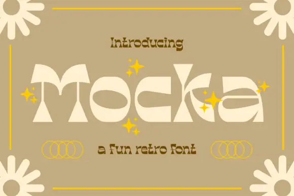
Geometric retro display
Mocka is a high-contrast geometric retro display in cream on tan: wide letters built from thin arcs and heavy wedges, oversized oval counters, a cut-out bowl on the k and a detached crossbar, set as one word with yellow sparkles, four-petal flowers at the corners and a small retro subtitle beneath.
Ideas for this font
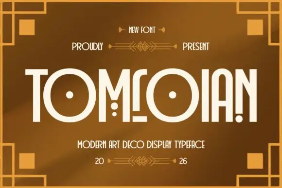
Art deco geometric condensed display
Tomrolan is an art deco display in cream on bronze: tall geometric capitals with high waists, circular counters, hairline crossbars and a stepped ornament frame, so the word reads as a nineteen-twenties cinema title.
Ideas for this font
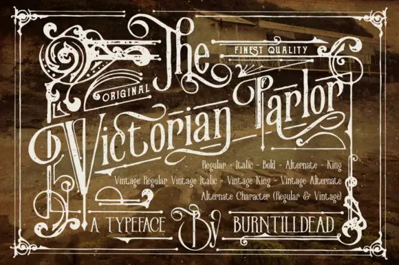
Victorian ornamental lettering
Victorian Parlor is a dense Victorian display in white on a sepia engraved ground: letters built from thin inner lines, curls and spurs, with swashes on the capitals, an inline running the length of each stroke and a frame of scrollwork around the whole plate.
Ideas for this font
Same independent foundry
Allow optional Google Analytics to measure visits and catalogue actions. Your search words and notes are not included. Privacy & storage