Editorial Serif Anchor

Shadenia + Auretha
Anchors Shadenia's fluid strokes with crisp Roman proportions on wedding suites, headers and packaging.
Inspect Auretha specimenDisclosure: MakerFileHub may earn a commission from qualifying purchases via paid links on this page. How our links work.
Bold vintage baseball & neon-signage monoline script
Shadenia is a thick, sturdy vintage monoline script inspired by mid-century neon diner signs, classic car badges, and retro athletic jerseys.
Paid link
Get this fontProject & layout blueprintsAt-a-glance maker compatibility
Set Cricut or Silhouette operation to Pen, Foil Quill, or Laser Score — not Basic Blade Cut.
Visual anatomy & craft review
Shadenia is a bold vintage monoline script with heavy tubular strokes, a retro S and a smooth curled exit hook, drawn from mid-century neon diner signs and athletic jerseys, so a name reads as a painted sign rather than a modern script. The monoline weight is what makes it safe for cutting, plotting and neon conversion, and the exit hook adds width at the end of a word. It needs roughly 24 mm for the tubular stroke to read, and it is best in mustard or warm white on a dark ground, or one ink on cream.
Vintage-sign · Chunky-monoline · Retro
Two-font hierarchy recipes
Tested contrast partners — pairing Shadenia with grounded secondary typography.
Shadenia + Auretha
Anchors Shadenia's fluid strokes with crisp Roman proportions on wedding suites, headers and packaging.
Inspect Auretha specimen
Shadenia + Godthem
Keeps small-scale dates, URLs, nutrition facts and care instructions crisp and legible below script titles.
Inspect Godthem specimenPractical applications
Concrete hierarchy, scale and production guidance tailored to Shadenia’s stroke geometry.
Tubular monoline script reads as a painted diner sign, which is what a retro café is selling. The even weight converts to neon and to vinyl, and the exit hook gives the name a finished end on a 900 mm fascia.
Hierarchy & layout recipe
Sign 1200 x 400 mm, word 220 mm, 80 mm margins and 40 mm clear of the transformer box. Cup print 200 x 90 mm, word 22 mm, 12 mm from the rim. Menu header 210 x 60 mm, word 30 mm, 15 mm margins.
Pre-production check
A bent-neon version needs each letter as a continuous tube and the exit hook reverses too tightly at glass. Round the hook to an 8 mm radius on the sign drawing, and approve a paper template on the fascia first.
Monoline sign script reads as a period bill, which is what a mid-century music feature wants. The heavy tube holds at 90 pt in one ink on board, and the curled exit gives the headline a sweep without an illustration.
Hierarchy & layout recipe
Cover 210 x 297 mm, title 90 pt, cover lines 9/12 pt, 18 mm margins. Poster A2, word 280 mm, details 22/28 pt, 30 mm margins. Sleeve 312 x 312 mm, word 200 mm, credits 7 pt.
Pre-production check
A 90 pt monoline printed on uncoated board mottles across the heavy tube and the script looks dirty. Print on coated stock or add a 20 percent underlay, and check one pulled sheet before the run.
Vintage neon script reads as a summer car show or drive-in, which is what a seasonal venue is. The tube holds at 240 mm on a banner in one vinyl colour, and the exit hook gives the name a retro finish at the far end of a long sign.
Hierarchy & layout recipe
Sign 1500 x 400 mm, word 260 mm, 100 mm margins and 25 mm clear of each eyelet. Cup print 200 x 90 mm, word 22 mm, 12 mm from the rim on a 120 mm band. Banner 2400 x 800 mm, word 380 mm, 150 mm margins.
Pre-production check
A cup print wraps a taper and a long script with an exit hook pinches at both ends of the arc. Use the wrap template and keep the word inside a 120 mm band, and check one printed cup before the event.
Technical & licence verification
Confirm included OTF/TTF/WOFF formats, full glyph tables and licence coverage on the live store page before batch production.
Closest visual alternatives
Matched across letterform anatomy, stroke behaviour and craft applications.
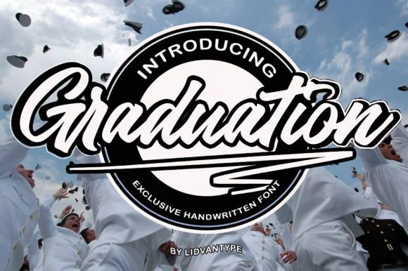
Bold baseball-pennant & sticker-badge brush script
Graduation (by LidvanType) is a punchy slanted brush script (NOT a slab serif!) sweeping a bold zig-zag pennant tail underneath the word!
Ideas for this font
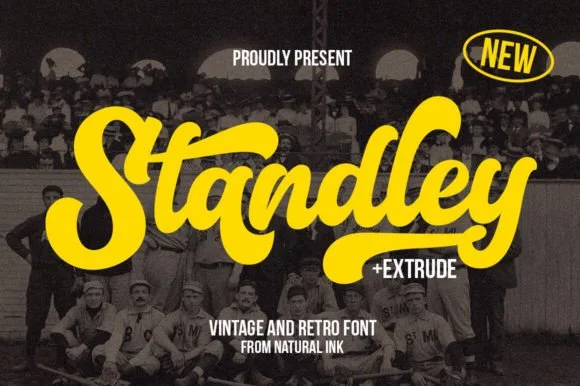
Layered vintage baseball & varsity brush script (+ Extrude)
Standley is a chunky vintage ballpark script bundled with a matched Extrude shadow font and extra swash glyphs.
Ideas for this font
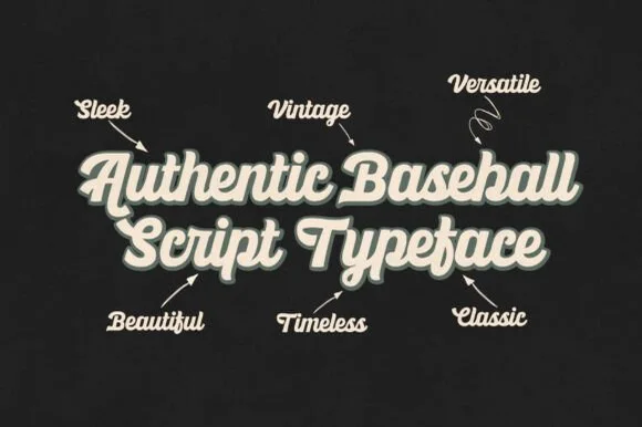
Heavy vintage stadium baseball & athletic jersey script
Ballpark Beauty is an authentic, heavy-stroke vintage baseball script (NOT a block display!) built for arched jersey chests, brewery cans, and retro merch!
Ideas for this font
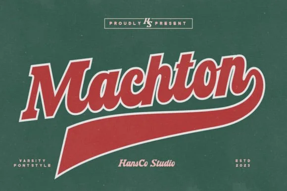
Varsity baseball script with tail
Machton is a varsity baseball script in red with a cream outline on green: heavy connected lowercase, an oversized capital with a long entry, and a thick underline tail that sweeps under the word to a point, so the plate reads as a team mark from the fifties.
Ideas for this font
Same independent foundry
Allow optional Google Analytics to measure visits and catalogue actions. Your search words and notes are not included. Privacy & storage