Neutral Sans Workhorse

Kira + Godthem
Lets Kira own the focal silhouette while handling secondary copy, sizing and subheads cleanly.
Inspect Godthem specimenDisclosure: MakerFileHub may earn a commission from qualifying purchases via paid links on this page. How our links work.
Shattered starburst & crystal-spike sci-fi display
Kira is an aggressive futuristic display font bursting with jagged starburst shards and crystalline spikes erupting from bold letter cores.
Paid link
Get this fontProject & layout blueprintsAt-a-glance maker compatibility
Sturdy stroke walls and open counters weed cleanly on adhesive vinyl, HTV apparel film, and cut cardstock.
Visual anatomy & craft review
Kira is a wide futuristic display built from starburst and sci-fi geometry: extended caps, chamfered corners, a small ray or spike on some terminals and a heavy even stroke that reads as signage from a distance. The extensions make every word long, so a centred block needs side room, and the spikes are the detail that closes at small sizes. It needs roughly 30 mm for the spike and the chamfer to read, and it is best in one bright ink on a dark ground, or black on a pale technical tone.
Explosive · Spiky · Cybernetic
Two-font hierarchy recipes
Tested contrast partners — pairing Kira with grounded secondary typography.
Kira + Godthem
Lets Kira own the focal silhouette while handling secondary copy, sizing and subheads cleanly.
Inspect Godthem specimen
Kira + Lumera Editorial
Grounds bold display lettering with classic typographic authority on posters, badges and apparel.
Inspect Lumera Editorial specimenPractical applications
Concrete hierarchy, scale and production guidance tailored to Kira’s stroke geometry.
A wide starburst display reads as a title beamed from a control panel, which is what a science or technology issue wants above a diagram. The extended caps fill a 210 mm measure at 60 pt, and the chamfered corners line up with the grid lines of the data below.
Hierarchy & layout recipe
Opener 210 x 297 mm, title 60 pt with 8 mm spike clearance, standfirst 11/15 pt, charts 90 mm wide, 18 mm margins. Section tab 40 x 120 mm, word 10 mm, 4 mm margins.
Pre-production check
At 10 mm on the section tab the spike merges into the stem and the tab reads as a plain extended block. Keep tabs at 14 mm or use the spike-free alternate, and proof one tab sheet at 1:1.
A starburst display gives a space-themed birthday its own lettering rather than a licensed logo, and the spikes read as stars at party size. The extended caps hold a long name at 40 mm on an invite, and one bright ink prints the invite, the topper and the banner on dark stock where the chamfers read as light.
Hierarchy & layout recipe
Invite A6, word 40 mm with 8 mm spike clearance, details 8/11 pt, 12 mm margins. Topper 130 x 110 mm, word 44 mm with a 6 mm stick slot and 12 mm clear. Banner 1500 x 400 mm, word 150 mm, 30 mm safe edge.
Pre-production check
A 130 mm laser-cut topper drops the terminal spike under 1 mm and it snaps before the cake is cut. Cut toppers to the silhouette only, and test one topper on a stick before the set.
A wide futuristic display reads as a midnight countdown rather than a seasonal greeting, which is what a New Year party wants on the door. The chamfered caps hold at 120 mm in low light, and one metallic ink on black prints the poster, the menu and the countdown cards in a single pass.
Hierarchy & layout recipe
Poster A2, word 130 mm with 12 mm spike clearance, times 40 mm, 20 mm margins. Bar menu 150 x 300 mm, header 40 mm, drinks 10 mm. Countdown cards 150 x 150 mm, digit 90 mm, 15 mm margins.
Pre-production check
A metallic ink on matte black sinks into the coating and the 0.8 mm chamfer reads as a soft grey edge. Print on a gloss stock or use flat white for the word, and check one poster under venue lighting before the night.
Technical & licence verification
Confirm included OTF/TTF/WOFF formats, full glyph tables and licence coverage on the live store page before batch production.
Closest visual alternatives
Matched across letterform anatomy, stroke behaviour and craft applications.
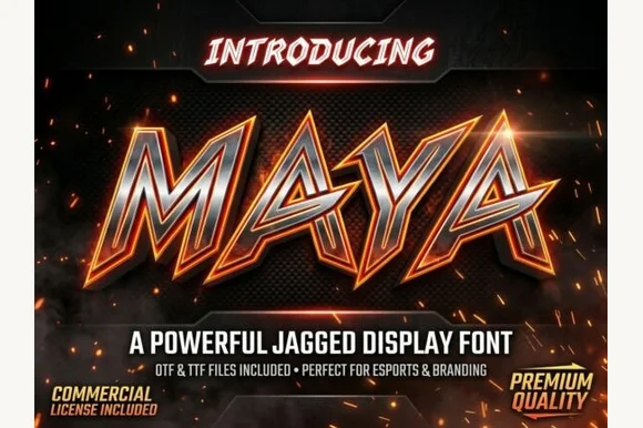
Razor-spurred slanted esports & mecha display
Maya is a fierce, forward-slanted esports display typeface armed with swept-back blade spurs and wide, angular athletic stances.
Ideas for this font
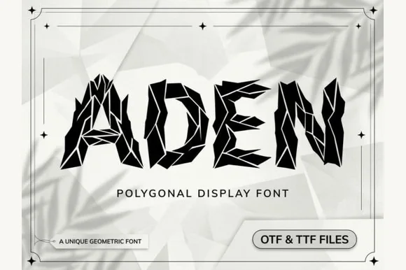
Faceted low-poly crystal & shattered-origami geometric display (OTF & TTF)
Aden is a sharp, polygonal display font built from faceted geometric crystal shards separated by crisp white origami crease lines (OTF & TTF).
Ideas for this font
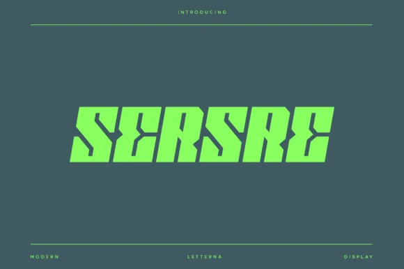
Slanted cyberpunk speed-sliced futuristic sci-fi block sans
Sersre is an aggressive, forward-slanted cyberpunk display typeface slicing razor-sharp horizontal speed notches into monolithic futuristic blocks!
Ideas for this font
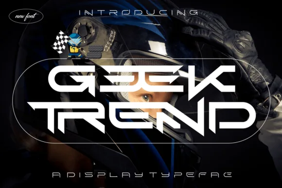
Wide interlocking cyber-racing & sci-fi helmet display
Geek Trend is an edgy, wide-stance cyberpunk display font fusing horizontal 'EE' and 'TR' bars into futuristic racing visor geometry!
Ideas for this font
Same independent foundry
Allow optional Google Analytics to measure visits and catalogue actions. Your search words and notes are not included. Privacy & storage