Neutral Sans Workhorse

Ruzana + Noar
Lets Ruzana own the focal silhouette while handling secondary copy, sizing and subheads cleanly.
Inspect Noar specimenDisclosure: MakerFileHub may earn a commission from qualifying purchases via paid links on this page. How our links work.
Multi-line Art-Deco & retrowave inline sans (+ Bonus Swashes, OTF & TTF)
Ruzana is a sleek multi-line inline display font channeling 1930s Art-Deco neon marquees and 1980s Miami retrowave (+ Bonus Swashes in OTF & TTF)!
Paid link
Get this fontProject & layout blueprintsAt-a-glance maker compatibility
Cut solid base, outline, and shadow layers in separate vinyl colors and align on registration marks.
Visual anatomy & craft review
Ruzana is a multi-line inline display in caps, with parallel neon-like lines running through each stem, chamfered geometric corners and bonus swashes, drawn in the language of Art-Deco marquees and retrowave signage. The parallel lines are the face's only detail, so it needs roughly 28 mm before they stay separate, and the letter reads as a lit panel at poster size. It is a title and signage face, best in two tones on a dark ground or as white lines on a saturated one.
Multiline-Art-Deco · Retrowave-inline · Bonus-swashes
Two-font hierarchy recipes
Tested contrast partners — pairing Ruzana with grounded secondary typography.
Ruzana + Noar
Lets Ruzana own the focal silhouette while handling secondary copy, sizing and subheads cleanly.
Inspect Noar specimen
Ruzana + Stanza
Grounds bold display lettering with classic typographic authority on posters, badges and apparel.
Inspect Stanza specimenPractical applications
Concrete hierarchy, scale and production guidance tailored to Ruzana’s stroke geometry.
Parallel inlines read as a neon marquee, which is the reference a retrowave event wants. Chamfered corners keep the letters geometric at poster scale.
Hierarchy & layout recipe
Poster A2, word 280 mm, details 22/28 pt, 30 mm margins. Sleeve 312 x 312 mm plus 3 mm bleed, word 200 mm, credits 7 pt. Banner 2400 x 800 px, word 900 px.
Pre-production check
Parallel lines under 1 mm at 200 mm merge into a solid fill on a digital press. Keep the line gap at 1.5 mm, and check one 1:1 proof before the sleeve goes on press.
Marquee lettering reads as a venue sign, which is what a cinema or cocktail bar wants over its door. The inline gives a two-tone effect from one plate.
Hierarchy & layout recipe
Sign 1200 x 400 mm, word 240 mm, 80 mm margins. Menu 148 x 210 mm, heading 24 mm, drinks 8.5/12 pt. Shirt print 260 x 140 mm, word 50 mm, 40 mm margins.
Pre-production check
Signs near an entrance are backlit or lit from below, and a light inline on a dark ground can look patchy. Check one 1:1 print in the venue, and use a solid cut if the lines fill.
Retrowave lettering reads as a coastal venue sign, and the inline survives glare better than a solid fill. Chamfered geometry holds on a die-cut sticker.
Hierarchy & layout recipe
Sign 900 x 400 mm, word 180 mm, 60 mm margins and 20 mm clear of the frame. Banner 2000 x 600 mm, word 340 mm, 120 mm margins with eyelets every 500 mm. Sticker 80 x 50 mm, word 16 mm, 3 mm die margin.
Pre-production check
Outdoor stickers are printed on vinyl and the inline under 1 mm fills when the laminate is applied over wet ink. Let the print cure fully, and check one sticker after lamination.
Technical & licence verification
Confirm included OTF/TTF/WOFF formats, full glyph tables and licence coverage on the live store page before batch production.
Closest visual alternatives
Matched across letterform anatomy, stroke behaviour and craft applications.
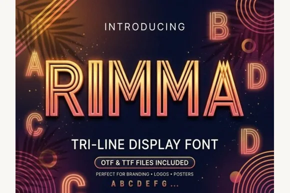
Geometric three-line inline Art Deco & retrowave sans
Rimma is a clean, geometric three-line parallel display typeface merging 1920s Art Deco symmetry with glowing 1980s neon tube lines.
Ideas for this font
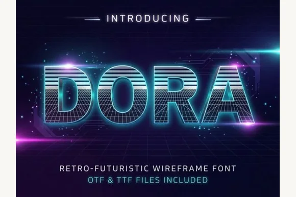
1980s synthwave scanline & 3D wireframe display
Dora is a retro-futuristic 1980s display font combining horizontal CRT scanline faces with built-in 3D wireframe perspective grids.
Ideas for this font
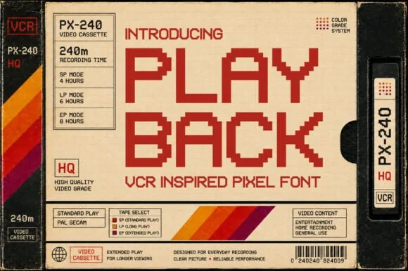
Blocky pixel sans modelled on VHS cassette labelling
Playback is a blocky pixel alphabet modelled on the lettering printed on VHS cassettes, with square pixels, wide spacing and no diagonal or curved detail at all.
Ideas for this font
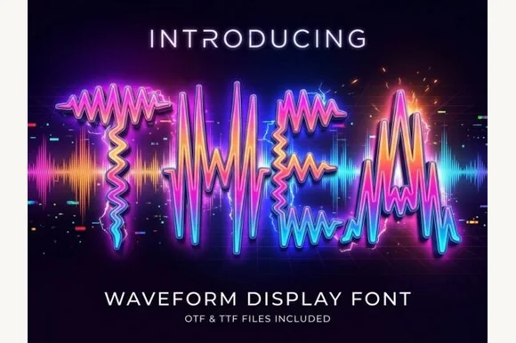
Letters drawn as oscillating audio waveforms with a bright glow along each stroke
Thea is a display alphabet in which every stroke is drawn as an oscillating audio waveform, so a word reads as a signal trace rather than as lettering, with the shape still legible from the amplitude envelope.
Ideas for this font
Same independent foundry
Allow optional Google Analytics to measure visits and catalogue actions. Your search words and notes are not included. Privacy & storage