Editorial Serif Anchor

Whatcha Doing + Raffined
Anchors Whatcha Doing's fluid strokes with crisp Roman proportions on wedding suites, headers and packaging.
Inspect Raffined specimenDisclosure: MakerFileHub may earn a commission from qualifying purchases via paid links on this page. How our links work.
Loose rounded handwriting with loops and shaded rainbow colours
Whatcha Doing is a playful curled script in which each letter carries a decorative loop or tail, and the sample sets the set's name plus a colour word in each of eight colour variants.
Paid link
Get this fontProject & layout blueprintsAt-a-glance maker compatibility
Weld or Unite overlapping script joins into one continuous vector path before sending to the blade.
Visual anatomy & craft review
WHATCHA DOING runs across the top in mixed colours, and each letter is a single-stroke script with exaggerated loops — an O that spirals into a ball, a D with a curl on its tail, a G with a hooked descender — drawn with a slight thickness variation and no fill. Below, the colour names are set in the same construction one per colour: Purple, Yellow, Green, Orange, Blue, Red, Cyan, Pink. The point of the sample is the palette: the same face appears in eight inks, which is how a hand-lettered alphabet is actually sold, and each colour keeps the lightness needed for a script to stay legible. The face is for names, quotes and labels, and it needs generous spacing because the loops of neighbouring letters will otherwise tangle.
Loose rounded handwriting with loops and shaded rainbow colours
Two-font hierarchy recipes
Tested contrast partners — pairing Whatcha Doing with grounded secondary typography.
Whatcha Doing + Raffined
Anchors Whatcha Doing's fluid strokes with crisp Roman proportions on wedding suites, headers and packaging.
Inspect Raffined specimen
Whatcha Doing + Homies
Keeps small-scale dates, URLs, nutrition facts and care instructions crisp and legible below script titles.
Inspect Homies specimenPractical applications
Concrete hierarchy, scale and production guidance tailored to Whatcha Doing’s stroke geometry.
The loops give a name the bounce of a hand-lettered sign, and one word in a single bright colour is enough on a card that will be kept.
Hierarchy & layout recipe
Print a 105 by 148 mm card: set the name at 40 pt on one row, keep 14 mm of clear ground beneath before the message at 9 pt, and hold 12 mm of margin so the loops are not clipped.
Pre-production check
Loops of adjacent letters tangle below 24 pt; print one card at the finished size and check the D before the batch.
The face suits a shop built around stories, and a single colour on a plain label keeps the printed cost down while still reading as a designed mark.
Hierarchy & layout recipe
Print a 55 by 45 mm label: set the shop name at 14 pt on one row, keep 5 mm of clear ground beneath before the street at 4.5 pt, and hold 4 mm from the lowest loop to the die line.
Pre-production check
Loops run close to a die line and the lowest curl is the first thing lost; print one label at the real size and cut it before the order.
The lettering looks painted on site, which suits a camp where the signs are made by staff, and a bright colour reads from the field.
Hierarchy & layout recipe
Print a 600 by 400 mm board: set the camp name at 100 pt across two rows, keep 26 mm of clear ground beneath before the week at 16 pt, and hold 24 mm of margin at both sides.
Pre-production check
Loops fill with paint at large sizes; print one board at the final size and check the S before the set.
Technical & licence verification
Confirm included OTF/TTF/WOFF formats, full glyph tables and licence coverage on the live store page before batch production.
Closest visual alternatives
Matched across letterform anatomy, stroke behaviour and craft applications.
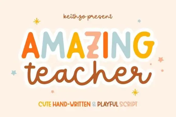
Mixed handwritten display
Amazing Teacher places broad separate capitals in mixed warm colours above a connected lowercase sample in brown, where the top line has blunt rounded ends and the lower t and h rise above the joined rhythm on a cream field with small star marks around the words.
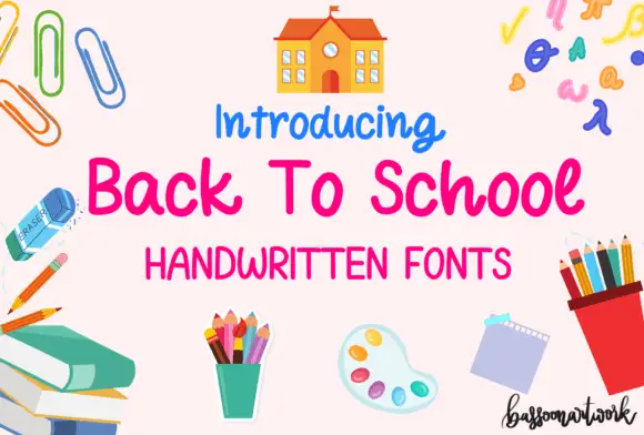
Rounded informal school handwriting with soft curved terminals
Back to School Handwritten is a rounded informal hand in which the letters stay unjoined, the terminals curve softly and the weight sits between a pen and a marker, so a note reads as written on lined paper rather than as a script.
Ideas for this font
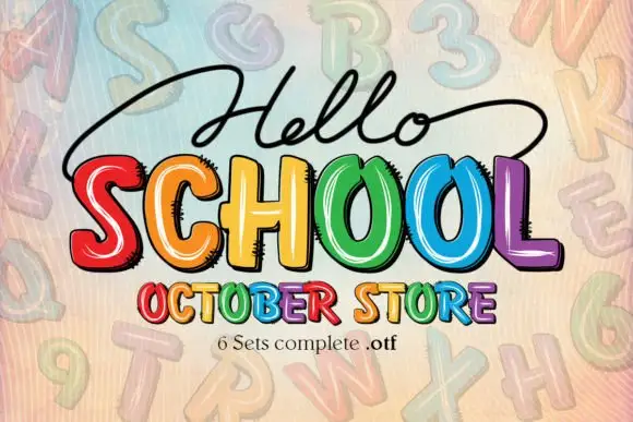
Bright irregular capitals with pale curved highlights and rough dark offsets
Hello School shows chunky irregular capitals in red, orange, yellow, green, blue and violet, where pale curved strokes sit inside the faces, dark rough-edged offsets create a drawn shadow and the large SCHOOL row has tall open counters with uneven widths.
Ideas for this font
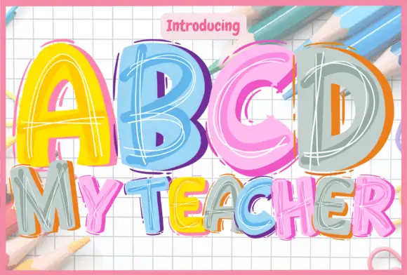
Bright block letters with loose pale sketch lines and offset colour edges
ABCD My Teacher draws fat capitals in bright colour and fills each one with loose white scribbles, so a word looks written with a marker on squared paper during a lesson.
Ideas for this font
Same independent foundry
Allow optional Google Analytics to measure visits and catalogue actions. Your search words and notes are not included. Privacy & storage