Neutral Sans Workhorse

Nurse + Taught
Lets Nurse own the focal silhouette while handling secondary copy, sizing and subheads cleanly.
Inspect Taught specimenDisclosure: MakerFileHub may earn a commission from qualifying purchases via paid links on this page. How our links work.
Silhouette cut-out display
Nurse is a decorative silhouette face in black and white over a photograph of a nurse holding a red heart: each capital is a solid block with a medical figure cut out of it — a nurse with a stethoscope, a wheelchair, a heartbeat, a caduceus — with a white keyline around every letter.
Paid link
Get this fontProject & layout blueprintsAt-a-glance maker compatibility
Sturdy stroke walls and open counters weed cleanly on adhesive vinyl, HTV apparel film, and cut cardstock.
Visual anatomy & craft review
The two words are stacked and the face is a picture alphabet: the counters and the negative space inside each letter are drawn as figures rather than as shapes, so the word reads as a set of icons at a glance and as letterforms at a second look. The white keyline is what keeps the black blocks separate against a photograph, and it is part of the design rather than a workaround. Because the figures carry the meaning, the face is a display cut for a specific subject, and the plate sets it large enough that each silhouette is recognisable. The red heart in the photograph repeats the only warm colour in the image, and the teal scrubs give the black something to sit against.
Decorative, silhouette, themed, bold
Two-font hierarchy recipes
Tested contrast partners — pairing Nurse with grounded secondary typography.
Nurse + Taught
Lets Nurse own the focal silhouette while handling secondary copy, sizing and subheads cleanly.
Inspect Taught specimen
Nurse + The Bilstein Editorial
Grounds bold display lettering with classic typographic authority on posters, badges and apparel.
Inspect The Bilstein Editorial specimenPractical applications
Concrete hierarchy, scale and production guidance tailored to Nurse’s stroke geometry.
A silhouette face names the profession in the letterforms themselves, which is faster to read at a hospital entrance than a plain headline.
Hierarchy & layout recipe
A2 poster: the word at 110 mm cap height, the details in a 16 mm sans, and a 2 mm white keyline. Keep 30 mm margins and print two colours on a light stock with the figures reversed out.
Pre-production check
Check the poster at five metres, where a small figure can close to a dot; keep the cut-outs above 6 mm. Confirm the 16 mm details read at three metres and that the keyline stays even.
A themed display marks a training room instantly, and the block letters stay legible on a door where a script would not read at a glance.
Hierarchy & layout recipe
Print a 400 by 250 mm plate: the course at 50 mm cap height, the room in a 12 mm sans, and a 1.5 mm keyline. Keep 18 mm margins and laminate for a corridor that is cleaned daily.
Pre-production check
Check the plate at three metres, where the thin cuts can fill with ink; keep them above 2 mm. Confirm the 12 mm room reads at arm's length and that the laminate does not yellow.
A silhouette face marks the profession on a gift shirt, and the solid blocks print in one screen without registration problems.
Hierarchy & layout recipe
Print a 240 mm chest graphic: the word at 60 mm cap height, the year at 30 mm, and one ink on a light shirt. Keep the smallest cut at 4 mm and place the graphic 80 mm below the collar.
Pre-production check
Check the screen at actual mesh, where a 4 mm cut can fill; thicken the keyline. Wash-test one shirt and confirm the figures stay open after five cycles.
Technical & licence verification
Confirm included OTF/TTF/WOFF formats, full glyph tables and licence coverage on the live store page before batch production.
Closest visual alternatives
Matched across letterform anatomy, stroke behaviour and craft applications.
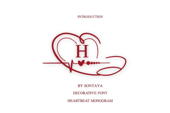
Stethoscope-looped heart & EKG healthcare monogram
Love Heart Monogram wraps classic serif initials in a sweeping heart-and-EKG ribbon that loops around like a medical stethoscope.
Ideas for this font
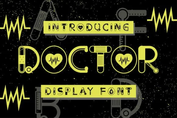
Medical-instrument & bandage illustrated display alphabet
Doctor is a clever medical novelty display font constructing bold geometric capitals out of stethoscopes, bandages, EKG pulses, and syringes.
Ideas for this font
Dainty monoline slab serif with curled swash legs
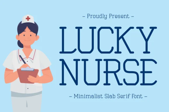
Lucky Nurse is a slender, minimalist uppercase slab serif accented with delicate curled hooks on diagonals and R/K legs.
Ideas for this font
Full-color illustrated medical & nurse monogram alphabet (OTF & SVG)
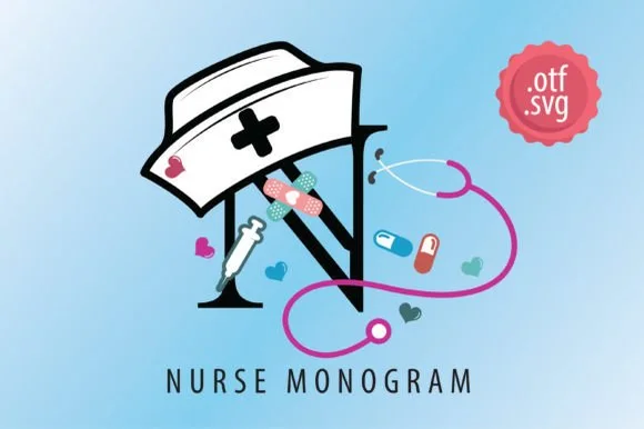
Nurse Monogram is an illustrated color decorative alphabet wrapping bold initials in nurse caps, stethoscopes, syringes, bandages, and pills.
Ideas for this font
Same independent foundry
Allow optional Google Analytics to measure visits and catalogue actions. Your search words and notes are not included. Privacy & storage