Neutral Sans Workhorse

Reach for the Stars + Montreal
Lets Reach for the Stars own the focal silhouette while handling secondary copy, sizing and subheads cleanly.
Inspect Montreal specimenDisclosure: MakerFileHub may earn a commission from qualifying purchases via paid links on this page. How our links work.
Thin playful typed letters combined with pinned-note and doodle motifs
Reach for the Stars shows thin mixed-case letters in many colours on a dark navy field, where two letters sit on white pinned notes, a rounded o holds a smile, small stars tuck beside the strokes and the rows stay deliberately uneven on a typed lattice.
Paid link
Get this fontProject & layout blueprintsAt-a-glance maker compatibility
Sturdy stroke walls and open counters weed cleanly on adhesive vinyl, HTV apparel film, and cut cardstock.
Visual anatomy & craft review
The strokes stay thin and even, the colours change per letter, the heights drift and two letters are replaced by pinned paper. Those pinned notes are the character, because the sample reads as a pinned-up message board rather than a designed headline. The cover also labels the face a colour SVG font with doodles, which matters before any print is planned, since colour glyphs need a pipeline that supports them. Check that your output survives a PDF or a cutting machine, keep 40 pt and do not rely on the smile in a single-colour job.
Thin playful typed letters combined with pinned-note and doodle motifs
Two-font hierarchy recipes
Tested contrast partners — pairing Reach for the Stars with grounded secondary typography.
Reach for the Stars + Montreal
Lets Reach for the Stars own the focal silhouette while handling secondary copy, sizing and subheads cleanly.
Inspect Montreal specimen
Reach for the Stars + The Lumina Awesome
Grounds bold display lettering with classic typographic authority on posters, badges and apparel.
Inspect The Lumina Awesome specimenPractical applications
Concrete hierarchy, scale and production guidance tailored to Reach for the Stars’s stroke geometry.
The pinned-note look suits a classroom board, and the uneven rows keep a short message from reading like a printed rule.
Hierarchy & layout recipe
Print a 400 by 250 mm board: set the message at 44 pt across two rows with 20 mm between baselines, keep 22 mm of clear ground beneath before the name at 12 pt, and keep 24 mm of border.
Pre-production check
Colour glyphs flatten in some print workflows; check the exported PDF before the board is ordered.
The mixed colours and the smile give a small card its cheer, and the thin strokes leave room for the rest of the layout.
Hierarchy & layout recipe
Print a 105 by 148 mm card: set the greeting at 34 pt across two rows with 14 mm between baselines, keep 18 mm of clear ground beneath, and keep 15 mm of margin at each side.
Pre-production check
The smile sits in one letter only; check that your greeting includes it before promising the face.
The colour-per-letter look reads across a hall and the thin strokes keep a busy summer sign from feeling heavy on the wall.
Hierarchy & layout recipe
Print a 700 by 300 mm panel: set the camp name at 66 pt across two rows with 24 mm between baselines, keep 26 mm of clear ground beneath before the dates at 16 pt, and keep 28 mm of border.
Pre-production check
Vinyl cutting needs one colour per layer; check the artwork time before quoting a rainbow panel.
Technical & licence verification
Confirm included OTF/TTF/WOFF formats, full glyph tables and licence coverage on the live store page before batch production.
Closest visual alternatives
Matched across letterform anatomy, stroke behaviour and craft applications.
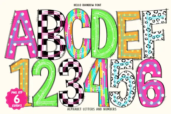
Tall narrow hand-drawn capitals mixing checks, dots and scribbled panels
Hello Rainbow is a colour font that turns every letter and numeral into a different pattern: leopard print, checkerboard, rainbow stripes, polka dots, colour blocks and a spotted blue, all outlined in black.
Ideas for this font
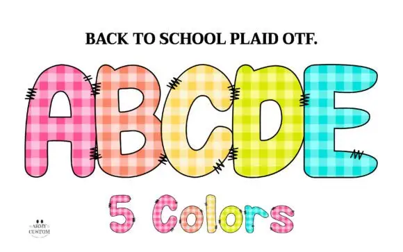
Gingham-filled rounded capitals
School Plaid is a colour display on a white ground: five soft rounded capitals in pink, orange, yellow, lime and blue, each filled with a square gingham check and marked with short seam-like hatches, with a plain header above and a count line beneath.
Ideas for this font
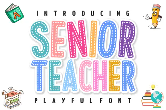
Layered stitched capitals in colour
Senior Teacher is a layered decorative display: fat capitals with a thick white outline and a dashed stitched line inside each letter, each one in a different bright colour, with drawn school objects around them.
Ideas for this font
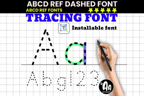
Dashed upright letter paths shown in large A and d with smaller letters and numerals
ABCD Ref Dashed and Dotted are tracing faces: the same letterforms drawn as a dashed outline for tracing and as a dotted form for dot-to-dot practice, meant to sit on ruled paper for handwriting drills.
Ideas for this font
Same independent foundry
Allow optional Google Analytics to measure visits and catalogue actions. Your search words and notes are not included. Privacy & storage