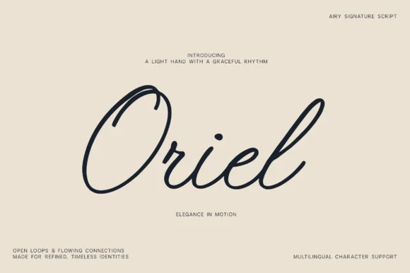
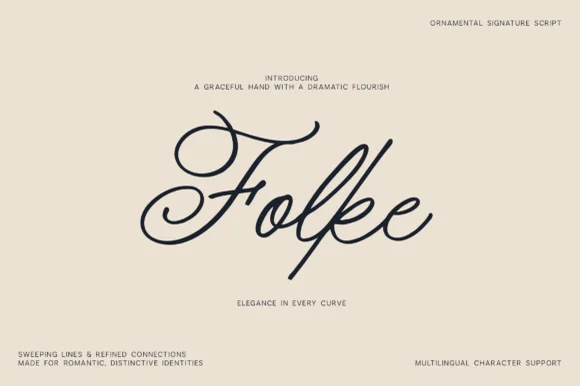
Editorial Serif Anchor

Typeful + Evoire
Anchors Typeful's fluid strokes with crisp Roman proportions on wedding suites, headers and packaging.
Inspect Evoire specimenDisclosure: MakerFileHub may earn a commission from qualifying purchases via paid links on this page. How our links work.
Dark connected script with long loops above and below the word
Typeful is shown alone on cream, using a right-slanted connected script with strong thick-to-thin movement, where the initial T extends into a broad looping top stroke, the closing letter ends in a long flourish and the joins run continuous beneath both.
Paid link
Get this fontProject & layout blueprintsAt-a-glance maker compatibility
Weld or Unite overlapping script joins into one continuous vector path before sending to the blade.
Visual anatomy & craft review
The slant stays consistent, the strokes swell and thin, the loops grow far past the body and the exits travel wide. That opening flourish is the character: a short word gains a frame from its own first letter, which is why the sample leaves cream space all round. The large flourishes appear in this one specimen only, so check alternate access and the bounds of your own word, keep 28 pt for the hairlines and allow 24 mm at each end.
Dark connected script with long loops above and below the word
Two-font hierarchy recipes
Tested contrast partners — pairing Typeful with grounded secondary typography.
Typeful + Evoire
Anchors Typeful's fluid strokes with crisp Roman proportions on wedding suites, headers and packaging.
Inspect Evoire specimen
Typeful + Corven
Keeps small-scale dates, URLs, nutrition facts and care instructions crisp and legible below script titles.
Inspect Corven specimenPractical applications
Concrete hierarchy, scale and production guidance tailored to Typeful’s stroke geometry.
The looping script suits a soft invitation, and the connected joins hold a pair of names at 30 pt on cream stock, where the top loop frames the row.
Hierarchy & layout recipe
Print a 105 by 148 mm card: set the names at 30 pt on one row, keep 24 mm of clear ground at each end for the loops, and keep the date at 9 pt in a roman face beneath with 14 mm of air.
Pre-production check
Loops colliding with the date line look tangled; check the card and keep 18 mm below the script.
The script gives a candle a signature, and the even joins hold a short brand at 22 pt on a 50 by 60 mm label, where the thick-to-thin strokes survive on matte paper.
Hierarchy & layout recipe
Print a 50 by 60 mm label: set the brand at 22 pt on one row, keep 12 mm of clear ground beneath for the exit stroke, and keep the scent at 6 pt in a plain caps so the script stays alone.
Pre-production check
Hairline joins printed at 14 pt break on textured stock; check the plate proof and hold the brand at 20 pt.
The long loops give a note softness, and the connected rhythm holds a short line at 28 pt on an A6 sheet, where the closing flourish finishes the message.
Hierarchy & layout recipe
Print an A6 card: set the line at 28 pt across the upper half, keep 22 mm of clear ground beneath for the lower loop, and leave the bottom third blank for handwriting.
Pre-production check
The flourishes may not appear on every word; check the alternate map before the design is fixed.
Technical & licence verification
Confirm included OTF/TTF/WOFF formats, full glyph tables and licence coverage on the live store page before batch production.
Closest visual alternatives
Matched across letterform anatomy, stroke behaviour and craft applications.
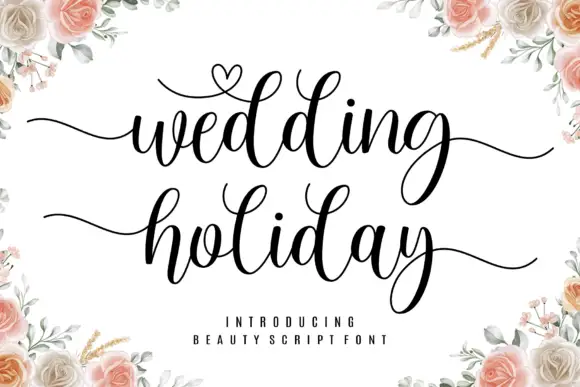
Brush script with a heart flourish
Wedding Holiday is a brush script in black on white: thick connected letters with high contrast at the joins, tall loops on the ascenders and a small heart drawn into the flourish above the first word, framed by peach roses.
Ideas for this font
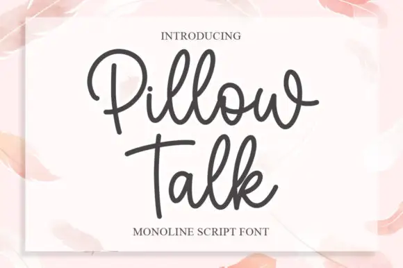
Monoline script with plump rounded bowls
Pillow Talk is a monoline script in charcoal on a soft pink page: plump rounded bowls, a single even stroke, looped ascenders and a tight fit, printed on a white card that sits on a watercolour ground.
Ideas for this font
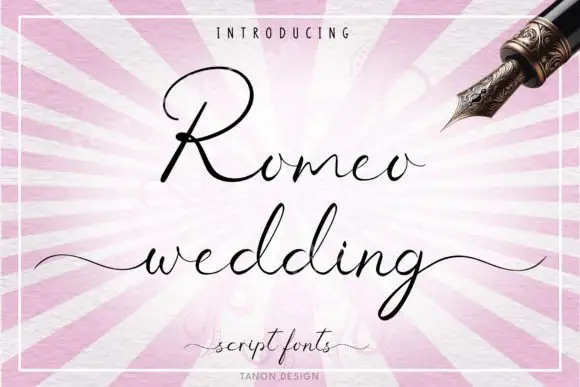
Fine connected wedding script
Romeo Wedding is a fine connected script in black on a striped pink ground: tall loops, long horizontal swashes, a fine consistent connector and a light weight, set in two lines with a small introducing line above, a script descriptor beneath and a credit at the foot, inside a fine rule.
Ideas for this font
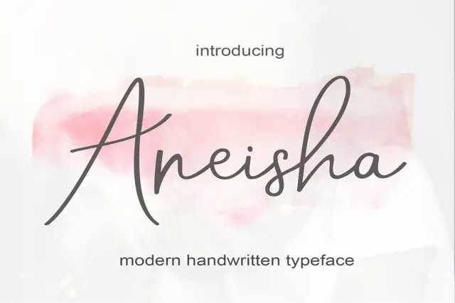
Fine joined script with an open triangular capital
Aneisha is a fine joined script whose capital A opens into a wide triangle and hands the rest of the word to even, thin, connected strokes that stay level on the line.
Same independent foundry
Allow optional Google Analytics to measure visits and catalogue actions. Your search words and notes are not included. Privacy & storage