Neutral Sans Workhorse

Machine Embroidery + Godthem
Lets Machine Embroidery own the focal silhouette while handling secondary copy, sizing and subheads cleanly.
Inspect Godthem specimenDisclosure: MakerFileHub may earn a commission from qualifying purchases via paid links on this page. How our links work.
Tall condensed brushed capitals with dry, uneven edges
Machine Embroidery is a tall condensed capital alphabet in which the strokes stretch upward, the edges stay dry and uneven, and the weight changes across each letter, so a word reads as something brushed onto a notebook cover.
Paid link
Get this fontProject & layout blueprintsAt-a-glance maker compatibility
Sturdy stroke walls and open counters weed cleanly on adhesive vinyl, HTV apparel film, and cut cardstock.
Visual anatomy & craft review
The M keeps three tall stems with uneven joins, the A pinches a narrow apex, the C cuts a long crescent, the H sets a low bar, the E stacks three short arms and the R turns a blunt leg, all at a brush weight with ragged contours and a compressed fit. The dry edge is the character: the brush runs out of ink at the stroke ends, which is why the sample sets one short word per line at large size. Because the strokes carry texture, the face needs 40 pt before the rag reads as a brush mark rather than as dirt, and it prints best in one dark colour. The cream notebook, the spiral binding and the small plant stem are presentation; the black brushed words are the face.
Condensed · Brushed · Tall
Two-font hierarchy recipes
Tested contrast partners — pairing Machine Embroidery with grounded secondary typography.
Machine Embroidery + Godthem
Lets Machine Embroidery own the focal silhouette while handling secondary copy, sizing and subheads cleanly.
Inspect Godthem specimen
Machine Embroidery + Aureline
Grounds bold display lettering with classic typographic authority on posters, badges and apparel.
Inspect Aureline specimenPractical applications
Concrete hierarchy, scale and production guidance tailored to Machine Embroidery’s stroke geometry.
The brushed caps give a printed workbook a handmade cover, and the condensed fit keeps a long workshop title on two lines at 44 pt.
Hierarchy & layout recipe
Print an A5 cover: set the title at 44 pt on two lines, keep 18 mm of margin at each side, and set the date in a 9 pt sans at the foot with 20 mm of clearance.
Pre-production check
Dry edges printed close together look like a smudge; check the cover proof and open the leading to 1.3 times the size.
The brushed strokes suit a hand-dyed thread product, and the tall fit keeps a long colour name on a narrow label at 20 pt.
Hierarchy & layout recipe
Print a 40 by 90 mm label: set the colour name at 20 pt running up the label, set the batch number in a 6 pt sans at the foot, and keep 4 mm from the die so the ragged edges are not clipped.
Pre-production check
A dry edge cut by the die looks like a printing fault; check the label and keep 3 mm of white around the word.
The brushed capitals read from the end of an aisle, and the condensed fit lets a long stall name sit on one line at 90 mm.
Hierarchy & layout recipe
Print an A2 board: set the stall name at 90 mm, keep a 30 mm border all round, and set the price list in a 16 pt sans beneath with 20 mm of clearance above it.
Pre-production check
A condensed brush word set with tight tracking closes into a block; check the board and add 1 percent tracking rather than reducing the size.
Technical & licence verification
Confirm included OTF/TTF/WOFF formats, full glyph tables and licence coverage on the live store page before batch production.
Closest visual alternatives
Matched across letterform anatomy, stroke behaviour and craft applications.
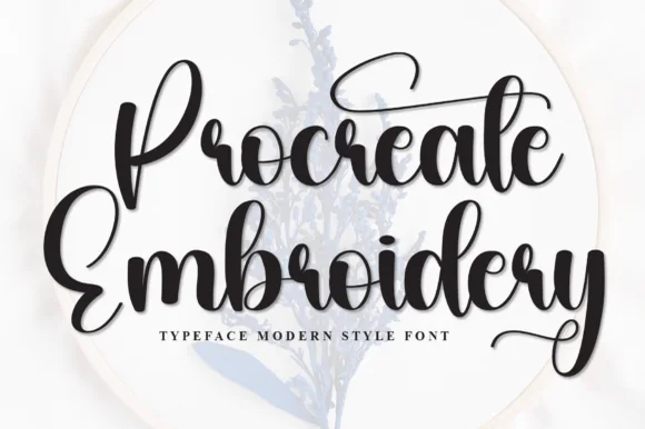
Thick bouncy brush-hoop calligraphy
Procreate Embroidery is a thick bouncy brush script in black on a pale hoop: fat rounded strokes, tight loops, a capital P drawn with a long entry and a capital E whose top arm lifts into a curl, sold for digitised embroidery and craft lettering.
Ideas for this font
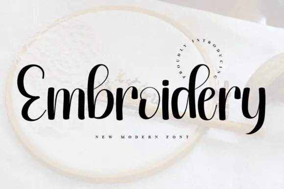
Bold sturdy upright brush script for hoops, HTV & crafts
Embroidery (by ABBAsalam) is the boldest, sturdiest of the three 'Embroidery' scripts—featuring thick upright brush strokes and clean open counters!
Ideas for this font
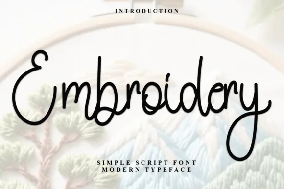
Smooth rounded monoline marker cursive
Embroidery (by Inermedia Studio) is a clean, medium-weight monoline cursive script—smooth solid ink rather than faux stitch dashes.
Ideas for this font
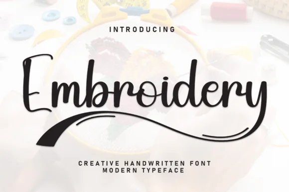
Bouncy marker script with tapered brush underline swoosh
Embroidery (by william jhordy) is a cheerful medium-weight handwritten script accented with a bold tapered brush swoosh underneath.
Ideas for this font
Same independent foundry
Allow optional Google Analytics to measure visits and catalogue actions. Your search words and notes are not included. Privacy & storage