Editorial Serif Anchor

Embroidery + Stanza
Anchors Embroidery's fluid strokes with crisp Roman proportions on wedding suites, headers and packaging.
Inspect Stanza specimenDisclosure: MakerFileHub may earn a commission from qualifying purchases via paid links on this page. How our links work.
Flourished craft calligraphy with tall loops and a sweeping terminal swash
Embroidery is a flourished calligraphic script in which the ascenders rise into tall loops, the capital opens with a wide curve and the word ends in a swash that sweeps below the line and curls back.
Paid link
Get this fontProject & layout blueprintsAt-a-glance maker compatibility
Weld or Unite overlapping script joins into one continuous vector path before sending to the blade.
Visual anatomy & craft review
The capital E opens as a broad crescent that crosses the baseline, and the letters after it keep a calligraphic contrast: the m and the b hold thick stems, the r and the o close small bowls, the i dot sits high and the d rises into a loop. The terminal swash is the character — it leaves the last letter, travels under the word and hooks upward, which is what fills the bottom of a composition and makes the face suit tags and labels rather than running text. Weight is heavy in the stems with fine joins, so the face wants 22 pt minimum and a smooth stock. The photograph of hands stitching, the black ink, the two credit lines are presentation; the script is the word shown.
Flourished · Looped · Craft
Two-font hierarchy recipes
Tested contrast partners — pairing Embroidery with grounded secondary typography.
Embroidery + Stanza
Anchors Embroidery's fluid strokes with crisp Roman proportions on wedding suites, headers and packaging.
Inspect Stanza specimen
Embroidery + Bargain Condensed
Keeps small-scale dates, URLs, nutrition facts and care instructions crisp and legible below script titles.
Inspect Bargain Condensed specimenPractical applications
Concrete hierarchy, scale and production guidance tailored to Embroidery’s stroke geometry.
The terminal swash gives a small tag a finished gesture, and the calligraphic contrast reads at 16 pt on a printed kraft tag where a light hand would vanish.
Hierarchy & layout recipe
Print a 45 by 80 mm kraft tag: set the brand at 16 pt with the swash running below it, keep the size in a 5 pt sans at the foot, and leave 12 mm clear at the top so the punched hole and string do not cross the swash.
Pre-production check
Kraft absorbs ink and closes the fine joins; check a printed tag on the actual stock and keep the face above 14 pt.
The craft calligraphy gives a card its hand-made register, and the tall loops fill the upper half at 28 pt without extra ornament.
Hierarchy & layout recipe
Print a 148 by 105 mm card: set the greeting at 28 pt across the centre, set the names in an 8 pt caps serif beneath, and keep 16 mm of margin so the swash stays inside the trim at the lower right.
Pre-production check
A swash printed close to a card corner looks cut; check the proof at final size and shorten the hook rather than moving the whole line.
The loops and swash tie the mark to the craft, and the heavy stems stay readable at 13 pt on a small woven or printed label.
Hierarchy & layout recipe
Print a 50 by 30 mm label: set the studio name at 13 pt, set the town in a 4.5 pt caps sans beneath, and keep 4 mm of margin so the swash is not clipped by the label corner or the stitched edge.
Pre-production check
A woven label breaks a swash into a dotted line; check a woven sample and replace the swash with a straight tail on that item.
Technical & licence verification
Confirm included OTF/TTF/WOFF formats, full glyph tables and licence coverage on the live store page before batch production.
Closest visual alternatives
Matched across letterform anatomy, stroke behaviour and craft applications.
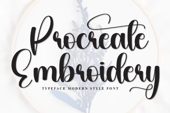
Thick bouncy brush-hoop calligraphy
Procreate Embroidery is a thick bouncy brush script in black on a pale hoop: fat rounded strokes, tight loops, a capital P drawn with a long entry and a capital E whose top arm lifts into a curl, sold for digitised embroidery and craft lettering.
Ideas for this font
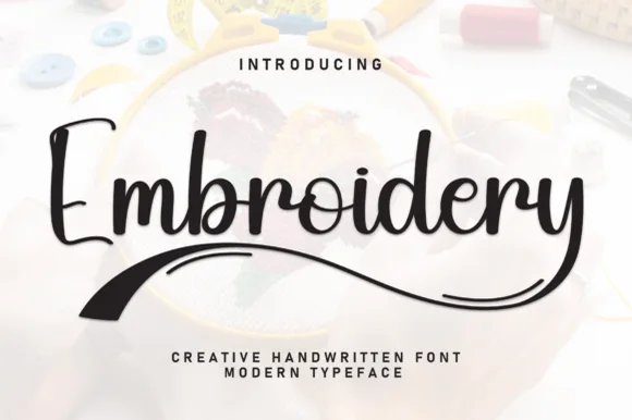
Bouncy marker script with tapered brush underline swoosh
Embroidery (by william jhordy) is a cheerful medium-weight handwritten script accented with a bold tapered brush swoosh underneath.
Ideas for this font
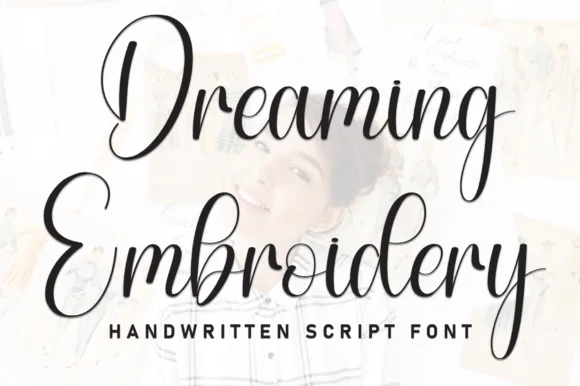
Brush script with heavy downstrokes and tall looped capitals
Dreaming Embroidery is a brush script in which the downstrokes run heavy, the upstrokes thin out and the capitals climb into tall loops, so a two-word title reads as handwriting made with a loaded brush pen.
Ideas for this font
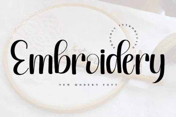
Bold sturdy upright brush script for hoops, HTV & crafts
Embroidery (by ABBAsalam) is the boldest, sturdiest of the three 'Embroidery' scripts—featuring thick upright brush strokes and clean open counters!
Ideas for this font
Same independent foundry
Allow optional Google Analytics to measure visits and catalogue actions. Your search words and notes are not included. Privacy & storage