Editorial Serif Anchor

Goodbye Christmas + Mewah
Anchors Goodbye Christmas's fluid strokes with crisp Roman proportions on wedding suites, headers and packaging.
Inspect Mewah specimenDisclosure: MakerFileHub may earn a commission from qualifying purchases via paid links on this page. How our links work.
Light rounded separate handwriting with tall open forms
Goodbye Christmas is light rounded handwriting in which every letter stands apart, the stems are tall and open, and the weight is even enough to read as a hand-written sign rather than a script.
Paid link
Get this fontProject & layout blueprintsAt-a-glance maker compatibility
Weld or Unite overlapping script joins into one continuous vector path before sending to the blade.
Visual anatomy & craft review
Nothing connects. Each letter is a thin rounded monoline: the capital G closes a wide open bowl with a short bar, the o and the d keep circular counters, the b and the y rise and fall in straight stems, the C opens wide and the h and the r carry simple shoulders. The strokes are very light, so the face depends on the size of the counters and the spacing between letters rather than on ink. Terminals are rounded, nothing tapers, and the baseline is level across both words. Because the letters are separate, a phrase can be set with wide tracking without looking broken. The cream ground and the three small caption lines are presentation; the handwriting is the two words.
Light · Rounded · Open
Two-font hierarchy recipes
Tested contrast partners — pairing Goodbye Christmas with grounded secondary typography.
Goodbye Christmas + Mewah
Anchors Goodbye Christmas's fluid strokes with crisp Roman proportions on wedding suites, headers and packaging.
Inspect Mewah specimen
Goodbye Christmas + Nyxar
Keeps small-scale dates, URLs, nutrition facts and care instructions crisp and legible below script titles.
Inspect Nyxar specimenPractical applications
Concrete hierarchy, scale and production guidance tailored to Goodbye Christmas’s stroke geometry.
A light open hand keeps a farewell card calm, and the separated letters stay readable when the card is printed small and handled.
Hierarchy & layout recipe
Set the greeting at 18 pt at the head of a 105 by 148 mm card, keep the reopening date in a 7 pt sans, and leave the middle of the card clear for a handwritten line.
Pre-production check
A very light stroke on a textured card breaks up; print one card on the actual stock and raise the size to 20 pt if the fine joins vanish.
The light even weight makes a quiet sign-off at the end of a feature, and the open counters keep it legible at a modest size beside body text.
Hierarchy & layout recipe
Set the sign-off at 22 pt at the foot of the final page, keep the credits in a 8 pt serif, and hold 16 mm above so the tall ascenders do not crowd the last column.
Pre-production check
A light face on newsprint can look like a printing fault at 22 pt; check the page proof and hold the sign-off at 26 pt if it stops reading as lettering.
Open rounded letters are easy for children to recognise, and the light weight keeps a label from feeling heavy on a folder that gets handled all season.
Hierarchy & layout recipe
Set the club name at 16 pt on a 60 by 30 mm label, keep the dates in a 7 pt sans, and leave 4 mm of margin so the tall ascenders stay inside the trim.
Pre-production check
A light stroke on a laser-printed label can fade with handling; print a test sheet and check the ascenders after a week on a real folder.
Technical & licence verification
Confirm included OTF/TTF/WOFF formats, full glyph tables and licence coverage on the live store page before batch production.
Closest visual alternatives
Matched across letterform anatomy, stroke behaviour and craft applications.
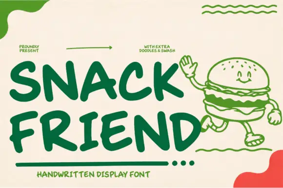
Heavy rounded hand display capitals
Snack Friend is a heavy rounded display hand in forest green on cream: fat uppercase letters with rounded ends, a slight lean and a companion set of drawn food doodles and swashes.
Ideas for this font
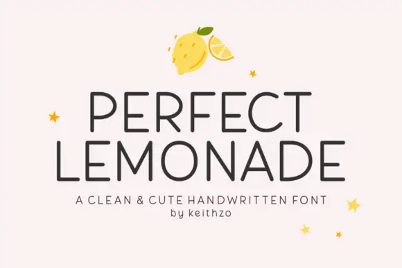
Clean cute handwritten caps
Perfect Lemonade is a clean handwritten display in charcoal on pink: light even strokes, tall open caps with rounded corners, a slightly irregular rhythm and a small star or lemon ornament, set in two lines with a tracked caption beneath, so the plate reads as a cheerful label rather than a script.
Ideas for this font
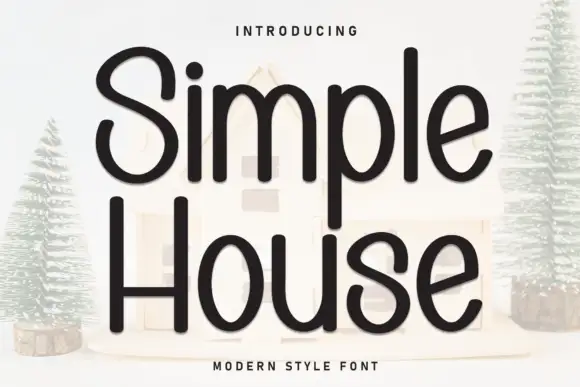
Rounded monoline handwritten sans
Simple House is a rounded monoline handwritten sans in near-black on a pale ground: wide geometric letters with fully rounded ends, an open counters and a light bounce that keeps a plain phrase from looking mechanical.
Ideas for this font
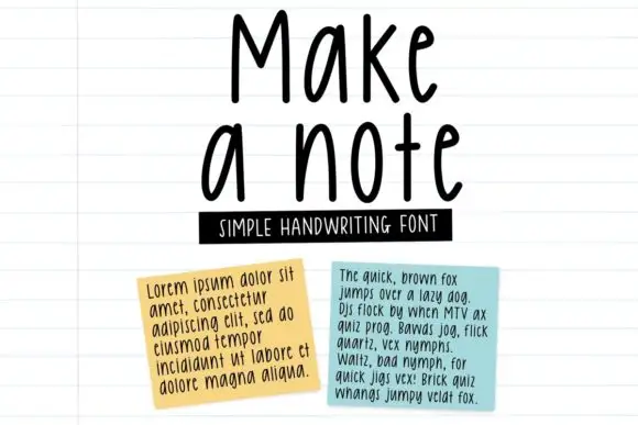
Tall neat monoline handwriting
Make a Note is a tall neat monoline handwriting in black on lined paper: high narrow letters, a small x-height, rounded terminals and an even spacing that keeps a paragraph legible at text size.
Ideas for this font
Same independent foundry
Allow optional Google Analytics to measure visits and catalogue actions. Your search words and notes are not included. Privacy & storage