Neutral Sans Workhorse

Brick Stacked + Swaraga
Lets Brick Stacked own the focal silhouette while handling secondary copy, sizing and subheads cleanly.
Inspect Swaraga specimenDisclosure: MakerFileHub may earn a commission from qualifying purchases via paid links on this page. How our links work.
Narrow stacked lettering with sweeping crossbars
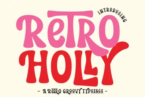
Brick Stacked shows slim orange strokes with rounded ends and exaggerated curves: a broad T crossbar reaches over its neighbours and a large C curve wraps around adjacent forms in the lower row.
Paid link
Get this fontProject & layout blueprintsAt-a-glance maker compatibility
Sturdy stroke walls and open counters weed cleanly on adhesive vinyl, HTV apparel film, and cut cardstock.
Visual anatomy & craft review
The strokes stay narrow with rounded ends, the crossbars travel well past their letters and the big C encloses the shape next to it. The wrapped curve is the character: the letters interlock into a composition rather than a line, which is why the sample stacks two rows on cream. Because the bars and the C reach across, keep 24 mm between rows and 20 mm at each end from 30 pt, and expect other words to need very different spacing since the lockup depends on specific letters.
Narrow · Stacked · Sweeping bars
Two-font hierarchy recipes
Tested contrast partners — pairing Brick Stacked with grounded secondary typography.
Brick Stacked + Swaraga
Lets Brick Stacked own the focal silhouette while handling secondary copy, sizing and subheads cleanly.
Inspect Swaraga specimen
Brick Stacked + Brenco
Grounds bold display lettering with classic typographic authority on posters, badges and apparel.
Inspect Brenco specimenPractical applications
Concrete hierarchy, scale and production guidance tailored to Brick Stacked’s stroke geometry.
The interlocking rows make an exhibition poster, and the sweeping bars give the title its structure at 64 pt on an A2 sheet. The wrapped curve also makes a short title into a shape.
Hierarchy & layout recipe
Print an A2 poster: set the two rows at 64 pt, keep 20 mm between them so the T bar clears the letters below, and keep 26 mm of margin for the wide C curve. Keep the title on two rows.
Pre-production check
A sweeping bar printed over the row beneath merges with it; check the poster and open the row gap to 26 mm. Ask for a proof at poster size.
The wrapped forms set a cover, and the narrow strokes keep a two-word title light at 60 pt on a coated page in one ink. The narrow strokes also keep a wide lockup light.
Hierarchy & layout recipe
Print an A4 cover: set the title at 60 pt on two stacked rows, keep 24 mm of clear ground at the right for the C curve, and set the issue line at 9 pt in a sans at the foot. Keep the ground clear for the C curve.
Pre-production check
Other letter pairs do not interlock the same way; set the actual words on a proof before committing the lockup.
The slim strokes suit a small label, and the rounded ends stay clear at 22 pt on a 50 mm panel. The rounded ends also keep a small mark soft. The narrow strokes then keep the label from looking heavy at all.
Hierarchy & layout recipe
Print a 50 by 35 mm label: set the name at 22 pt on one row, keep the sweeping bars inside the panel by 5 mm, and set the town in a 6 pt caps beneath with 4 mm of clear ground.
Pre-production check
A wrapped C printed at 16 pt closes against its neighbour; check the artwork and keep the name at 20 pt or above.
Technical & licence verification
Confirm included OTF/TTF/WOFF formats, full glyph tables and licence coverage on the live store page before batch production.
Closest visual alternatives
Matched across letterform anatomy, stroke behaviour and craft applications.

Bold sans with ligature alternates
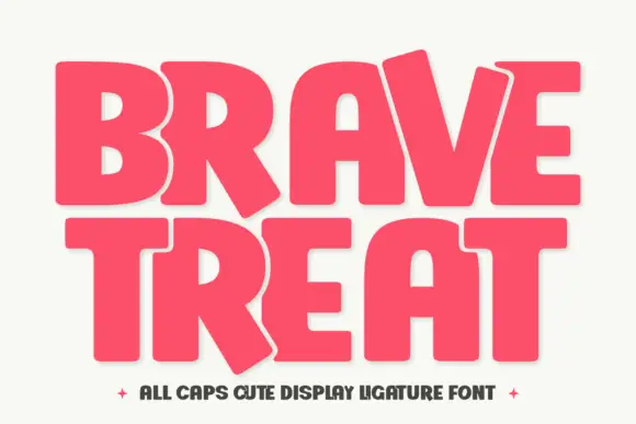
Think Loved is a bold sans in orange on a pale ground: wide geometric caps with flat terminals, a very high waist and tight spacing, with a ligature that fuses two letters into a single drawn shape, set in two lines with a small tracked note beneath naming the alternate.
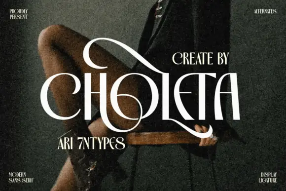
Contrasting capitals woven through a large upper loop and low circular sweep
Choleta builds tall white capitals and then lets thin strokes cross through them, so the counters open into slashes and the whole line reads as one sculpted ligature rather than six separate letters.
Ideas for this font
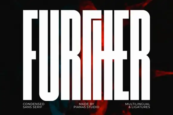
Extremely tall block capitals with narrow slots and a shared middle cross-stroke
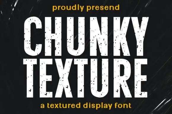
Further shows white capitals filling most of a dark portrait cover, where extremely tall heavy stems leave narrow vertical slot counters, the U rounds only at its base and a long middle cross-stroke connects the central letters into a dense architectural arrangement.
Ideas for this font
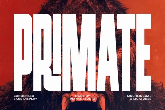
Ultra condensed display sans
Primate is an ultra condensed sans display in white on a red-tinted portrait: very tall narrow caps with flat terminals, a high waist and thin counters, set edge to edge so the letters nearly touch, with three small tracked labels along the foot.
Ideas for this font
Same independent foundry
Allow optional Google Analytics to measure visits and catalogue actions. Your search words and notes are not included. Privacy & storage