Editorial Serif Anchor

Snack Friend + Evoire
Anchors Snack Friend's fluid strokes with crisp Roman proportions on wedding suites, headers and packaging.
Inspect Evoire specimenDisclosure: MakerFileHub may earn a commission from qualifying purchases via paid links on this page. How our links work.
Heavy rounded hand display capitals
Snack Friend is a heavy rounded display hand in forest green on cream: fat uppercase letters with rounded ends, a slight lean and a companion set of drawn food doodles and swashes.
Paid link
Get this fontProject & layout blueprintsAt-a-glance maker compatibility
Weld or Unite overlapping script joins into one continuous vector path before sending to the blade.
Visual anatomy & craft review
The two words fill the sheet in bold capitals, and the face is a display hand: the S is a fat curve with rounded tips, the N and the K are wide with short diagonals, the C is almost a full circle and the letters lean by a few degrees, which keeps a very fat face from looking stamped. The stroke is even and thick with soft terminals, the spacing is tight and the counters are generous, so the words read at poster distance and still cut cleanly for vinyl or a die. Beside the lettering a drawn burger with arms and a smiling face waves from the right, and the foot of the sheet states that the set ships with extra doodles and a swash. Snack Friend is a display lettering for food packaging, menus, stickers and children's products, and it is at its best in two short words and one bold colour.
A fat friendly capital with drawn doodles
Two-font hierarchy recipes
Tested contrast partners — pairing Snack Friend with grounded secondary typography.
Snack Friend + Evoire
Anchors Snack Friend's fluid strokes with crisp Roman proportions on wedding suites, headers and packaging.
Inspect Evoire specimen
Snack Friend + Mansory
Keeps small-scale dates, URLs, nutrition facts and care instructions crisp and legible below script titles.
Inspect Mansory specimenPractical applications
Concrete hierarchy, scale and production guidance tailored to Snack Friend’s stroke geometry.
A fat friendly capital plus the drawn doodles gives a party banner its whole look, and the thick strokes stay separate on fabric at banner size.
Hierarchy & layout recipe
Print a 900 by 400 mm banner: set the greeting at 140 pt over two lines, keep 30 mm of clear ground beneath before the name at 44 pt, and hold 26 mm of border on all four sides.
Pre-production check
Fat letters merge when a fabric banner stretches; print one section at the final size and check the gaps before the order.
A bold rounded face reads from the pavement, and the doodles let a small van carry a menu and a logo in the same graphic language.
Hierarchy & layout recipe
Print a 300 by 200 mm panel graphic: set the name at 70 pt on two lines, keep 14 mm of bridge between letters, and leave 6 mm around the outline for the cutting path.
Pre-production check
Tight counters break when the vinyl is weeded; print one test cut and check every inner curve before the run.
A fat friendly capital on a late-night table sign reads at a glance after dark, and the humour suits a wedding that ends with fries rather than cake.
Hierarchy & layout recipe
Print a 400 by 250 mm board: set the message at 88 pt on two lines, keep 20 mm of clear ground beneath before the times at 20 pt, and hold 18 mm of border on all four sides.
Pre-production check
A playful face can look like a mistake next to formal stationery; print one sign in situ and check the tone before the set.
Technical & licence verification
Confirm included OTF/TTF/WOFF formats, full glyph tables and licence coverage on the live store page before batch production.
Closest visual alternatives
Matched across letterform anatomy, stroke behaviour and craft applications.
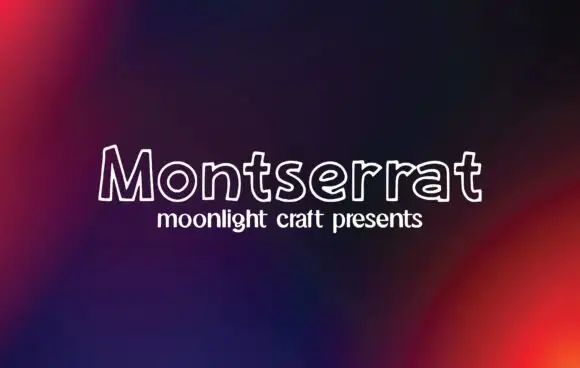
Outline handwritten sans
Montserrat is an outline handwritten sans in white on a dark gradient: unfilled letters drawn with a single rounded line, a small x-height and wide open counters that let the background read through the word.
Ideas for this font
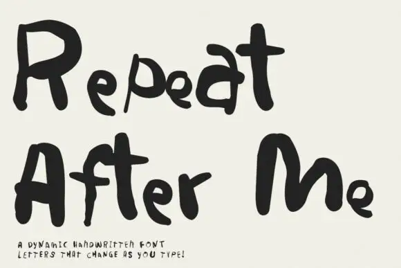
Irregular hand-lettered display
Repeat After Me is a dynamic handwritten display in black on cream: very irregular hand-drawn letters with different strokes for each character, uneven heights and a wobble that changes across a word, sold as a set whose letters vary as they are typed.
Ideas for this font
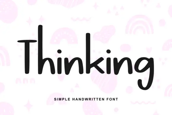
Heavy irregular mixed-case print
Thinking is a heavy hand-drawn print in near-black on pale pink: tall narrow letters, a very tall T with a wide arm, and a light irregular rhythm, over a scatter of drawn pastel doodles.
Ideas for this font
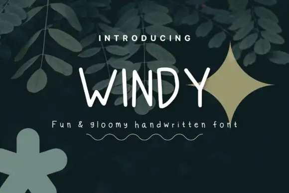
Thin irregular separate capitals
Windy is a set of tall thin hand-drawn capitals in white on a dark leaf background: uneven stems, open counters and slight spacing changes from letter to letter, drawn as a light display with a drawn squiggle beneath.
Ideas for this font
Same independent foundry
Allow optional Google Analytics to measure visits and catalogue actions. Your search words and notes are not included. Privacy & storage