 #1 · Best Overall
Disclosure: MakerFileHub may earn a commission from qualifying purchases via paid links on this page. How our links work.
Brush devotional scripts & swashed scripture display
21 Best Christian, Faith & Bible Journaling Fonts
Faith lettering splits between the devotional script used in journals and the display serif used on signage and verse prints. Bible Verse and Bible carry a chunky upright brush-marker weight, Christian and Faith keep the bouncy calligraphy register, and Jesus and Faith bring the swash-curled and copperplate display options. Celebrate Holiness supplies the tall marker print for signage.
Quick verdict
Bible Verse is the most usable devotional script for journals, Jesus is the strongest display serif for a verse print, and Celebrate Holiness handles church signage. Faith is the pick for a formal copperplate look.
Quick answer
Top 3 christian, faith & Bible journaling picks right now.
Short on time? Start with our three highest-rated christian, faith & Bible journaling standouts before scrolling the full breakdown.
#1 · Best Overall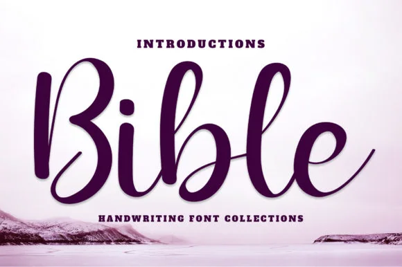 #2 · Runner-Up Pick
 #3 · Editor's Choice
How we tested & selected these 21 fonts
We kept 21 of 63 candidates, a narrow pool because the vocabulary is specific. Judged on legibility at 11 pt inside a journal, whether swash detail survives at 1 inch, and how the face reads on a projector slide where contrast drops sharply.
Side-by-side summary
Top 5 christian, faith & Bible journaling picks at a glance.
Compare specimens, OpenType/PUA traits and primary project roles side by side.
| Rank & Font | Style & File Specs | Best Project Fit | Store Listing |
|---|---|---|---|
| ScriptLanguage support | Scripture wall plaque, prayer-journal HTV & bookmark | Get fontPaid link | |
| ScriptClassic-brush | Devotional book cover, journal foil title & holiday print | Get fontPaid link | |
| ScriptSmooth | Faux-leather Bible cover HTV, church mug & tote bag | Get fontPaid link | |
| SerifBold | Holiday church banner, faith crewneck & coffee mug decal | Get fontPaid link | |
| ScriptPUA encoded · Alternates & swashes | Gold-foil wedding invitation, vow booklet & ceremony fan | Get fontPaid link |
Scripts & Calligraphy
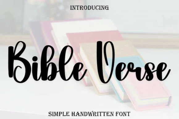
14 fonts#1 · Best OverallBible Verse
Bible Verse is a thick, upright modern brush script with tall rounded capitals ('B', 'V') and sturdy, easy-weeding lowercase strokes.
Bible Verse is a chunky upright brush-marker devotional script: a loaded marker stroke on a nearly vertical axis, joined letters, blunt squared ends and a small bounce that lifts the middle of a word. The upright axis reads as formal while the blunt ends keep it hand-made, and the bounce grows the word vertically. It needs roughly 26 mm for the marker edge and the bounce to read, and it is best in one deep ink on smooth card, or a single metallic on a dark ground where the blunt ends still register.
Recommended project & layout
Scripture wall plaque, prayer-journal HTV & bookmark — Use Bible Verse at 48–72 pt for 2-to-4-word focal phrases ('Grace Upon Grace') and set full verse references in a clean serif below.
Before you cut or print
Weld all overlapping cursive joins in Design Space before cutting HTV or matte wall vinyl; weeds cleanly down to 0.75 in.
Best paired with
Get fontPaid link
#2 · Runner-Up PickBible
Bible (by YanStudio) is a smooth, deeply shaded upright brush script with tall oval loops and clean, balanced baseline rhythm.
Bible is a deeply shaded upright brush calligraphy script with tall oval loops, thick vertical downstrokes and crisp hairline upstrokes, held to a calm rhythm rather than a bouncy one. The upright stance keeps it formal enough for a devotional cover, while the brush shading stops it from reading as copperplate. Contrast is strong, so the face wants about 20 mm before the hairlines hold, and it behaves best as a title or a name. The ending swash on the final letter gives a phrase a settled close, which is unusually useful for book titles.
Recommended project & layout
Devotional book cover, journal foil title & holiday print — Center 1 hero word at 64–110 pt in deep burgundy, navy, or gold foil flanked by bold sans headers/footers.
Before you cut or print
Works great in print, foil, sublimation, and 1.5 in+ HTV/vinyl decals once cursive overlaps are welded.
Best paired with
Get fontPaid link
#3 · Editor's ChoiceBible
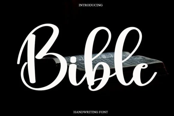
Bible (by Ganden Letter) is a clean, medium-bold rounded brush script with open circular loops and soft, approachable curves.
Bible is a clean rounded brush script in a medium weight, with open circular loops on the b and l shadows and a wide double-bellied B that opens a word generously. The strokes are smooth and evenly weighted, so the face reads at 14 mm on a card and at 60 mm on a sign without a change in character. It is friendlier and rounder than a formal calligraphy, which makes it useful for keepsakes and modern stationery, and it wants a single deep ink on a warm ground rather than a multi-colour treatment.
Recommended project & layout
Faux-leather Bible cover HTV, church mug & tote bag — Center 1 word at 4–6 inches wide across Bible cases, canvas totes, or journal covers.
Before you cut or print
Weld overlapping cursive connectors ('i-b-l-e') before cutting HTV; test low heat on faux leather.
Best paired with
Get fontPaid link
 #4 · Top Maker Utility
Jesus
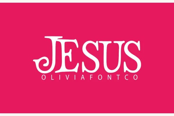
Jesus (by OliviaFontCo) is a bold, all-caps display serif (not a handwritten script) featuring coiled spiral tail hooks and bracketed Roman stems.
Jesus is a swash-curled storybook uppercase display serif: heavy bracketed caps with long curls running off the crossbars, a small ball terminal on the diagonal and a dense even texture that reads as an illuminated page. The curls extend the word sideways and the ball terminals are the finest element. It needs roughly 32 mm for the curl and the ball to read, and it is best in one deep ink on cream, or a fine gold on a dark ground where the curls print as bright lines.
Recommended project & layout
Holiday church banner, faith crewneck & coffee mug decal — Set 1 uppercase focal word at 5–9 inches wide in white or gold HTV above wide-tracked (+250) clean sans subtext.
Before you cut or print
Clean, solid single-layer vector outlines cut smoothly on HTV, permanent mug vinyl, and cardstock down to 0.8 inches.
Best paired with
Get fontPaid link
 #5 · Standout Silhouette
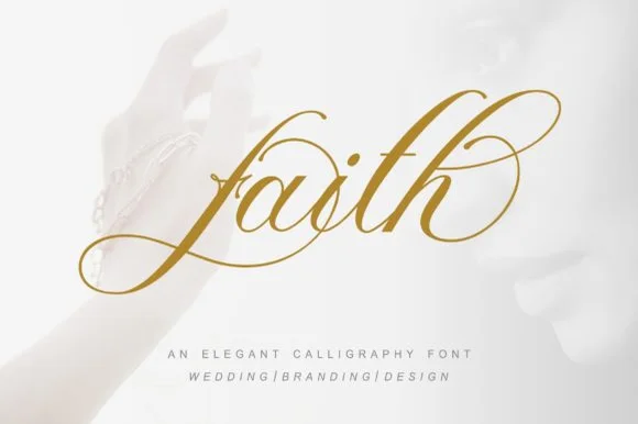
Faith
Faith (by pujalettering) is a formal slanted copperplate calligraphy script wrapped in multi-oval entry loops and figure-eight ascender flourishes.
Faith is a flourished copperplate bridal calligraphy in a gold-leaf treatment: a steep slope, strong thin-thick contrast, hairline exits that end in a flourish and long entry strokes that reach back over the word. The hairlines are the design and the first thing to lose on textured stock, and the flourishes need side and vertical clearance. It needs roughly 28 mm for the hairline and the flourish to read, and it is best in one fine gold on a deep ground or a dense ink on smooth ivory, and it must never be set small.
Recommended project & layout
Gold-foil wedding invitation, vow booklet & ceremony fan — Center 1 hero word or name at 54–88 pt in gold foil on white cotton paper above pipe-separated ('WEDDING | BRANDING') sans.
Before you cut or print
Hairline copperplate ovals require hot foil, letterpress, or flat printing rather than small vinyl weeding.
Best paired with
Get fontPaid link
 #6
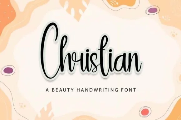
Christian
Christian (by Yoni Art) is a tall, narrow bouncy handwritten script with elongated vertical loops and compact horizontal word width.
Christian is a tall condensed calligraphy script with a bouncy baseline, a steep slant and loops that stack vertically instead of spreading sideways. The condensation keeps a long word inside a narrow banner or a tall board, and the bounce means the joins sit at uneven heights, so a two-line setting needs extra leading. The pen contrast is light, which is where the face fails first on cheap stock, and the vertical loops are the mark that separates it from a flat monoline script. It needs roughly 24 mm for the loop and the join to read, and it is best in one ink on white or cream, with foil reserved for sizes above 40 pt.
Recommended project & layout
Vertical wooden bookmark, skinny tumbler & baptism card — Center single focal words at 44–68 pt above wide-tracked sans captions ('A BEAUTY HANDWRITING' style).
Before you cut or print
Slender upstrokes work best in print, sublimation, laser engraving, or 1.5 in+ vinyl decals (weld touching joins first).
Best paired with
Get fontPaid link
 #7
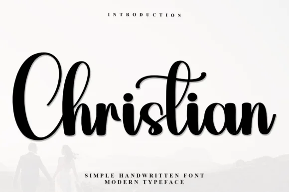
Christian
Christian (by Inermedia Studio) is a bold, high-contrast brush calligraphy script featuring thick velvety downstrokes and a curled overhead t-swash.
Christian by Inermedia Studio is a bold brush calligraphy script with thick velvety downstrokes, a large oval C, tall looped ascenders and a curled canopy over the t, so a name reads as a written blessing rather than a modern signature. The heavy downstroke is the design, which means the script holds on a garment and in vinyl but needs size on paper, and the canopy adds height above the word. It needs roughly 26 mm for the canopy to read, and it is best in rich black on a pale ground or in white on a deep colour.
Recommended project & layout
Faith-apparel hoodie chest, tote bag & framed home sign — Center 1 hero script word at 7–10 inches wide above two lines of tracked uppercase sans.
Before you cut or print
Weld all overlapping cursive joints in Cricut Design Space; thick brush bodies weed cleanly at 1.1 in+ height.
Best paired with
Get fontPaid link
 #8
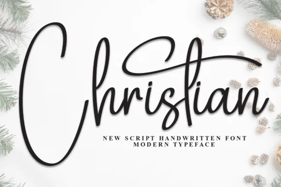
Christian
Christian (by andikastudio) is a slender, flowing monoline handwritten script defined by a tall narrow C-loop and an arching t-crossbar canopy.
Christian is an airy monoline pen script with a deep-bellied C loop and an arching t crossbar that curls back over the word like a canopy. The stroke is uniform, so the face plots and transfers predictably and holds at 12 mm on a card, while the canopy gives a short phrase a natural finishing gesture. Because the t-bar arches above the word, the layout needs headroom, and the looser connections mean a long phrase should be broken into lines rather than strung out. It is a card, keepsake and invitation face.
Recommended project & layout
Minimalist holiday card, Foil Quill tag & ornament print — Center 1 title-case word at 48–80 pt on white linen cardstock with wide-tracked sans subtitles tucked underneath.
Before you cut or print
Slender stroke weight excels in print, Foil Quill, and pen plotting; scale blade-cut vinyl above 1.8 inches.
Best paired with
Get fontPaid link
 #9
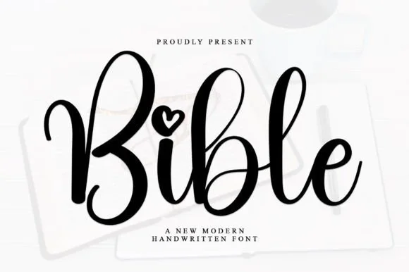
Bible
Bible is a smooth, medium-bold modern handwritten script featuring tall looped ascenders ('b', 'l') and an open heart-shaped dot over 'i'.
Bible is a bouncy modern calligraphy script with heart-shaped dots over the i and j: a light-to-medium contrast stroke, a wide oval axis, a soft bounce and a small heart where the tittle would be. The heart is the design and it fills first at small sizes, and the bounce grows the word vertically. It needs roughly 24 mm for the heart dot and the join to read, and it is best in one warm ink on smooth ivory, or a foil impression above 36 pt where the heart still holds its lobes.
Recommended project & layout
Bible-cover HTV name, baptism keepsake & prayer journal — Center a first name or short faith phrase at 3.5–5 inches wide in gold foil HTV on cream or cognac covers.
Before you cut or print
Weld overlapping lowercase connectors before cutting HTV, and scale above 1.2 in so the tiny open heart counter weeds cleanly.
Best paired with
Get fontPaid link
 #10
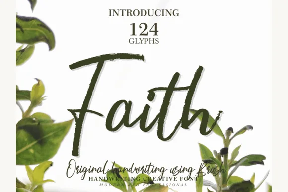
Faith
Faith (by Arief Indra Pratama) is a raw, hand-painted brush script (124 glyphs) preserving real bristle streaks and organic ink pooling.
Faith is a hand-painted brush script with 124 glyphs, keeping the bristle streaks inside each stroke and the ink pooling where the brush turned, so a word looks painted on paper rather than typeset. The italic axis is stable, the lowercase connects loosely, and the capital F carries a heavy top bar that anchors a phrase. Because the texture is real rather than applied, the face needs about 24 mm before the dry-brush edges read as paint, and it prints most convincingly as a single dark colour on a light stock. It is a heading and label face, best over short phrases.
Recommended project & layout
Botanical watercolor wall print, garden journal & card — Center 1 large brush word at 64–120 pt in olive, sage, or sepia surrounded by botanical border art.
Before you cut or print
Real bristle edge texture creates tiny semi-transparent/rough fibers—produce via print or sublimation rather than cut vinyl.
Best paired with
Get fontPaid link
 #11
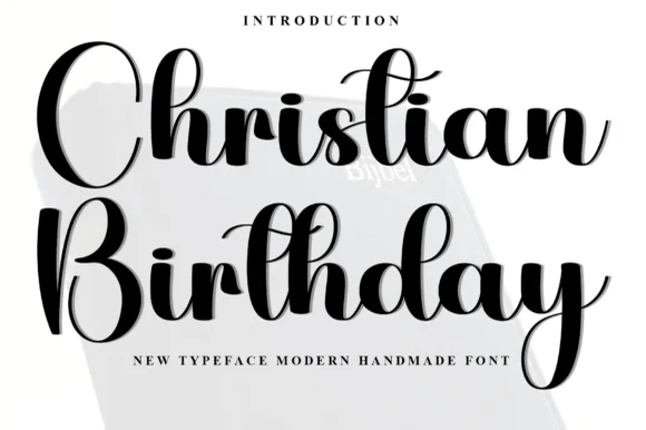
Christian Birthday
Christian Birthday is a cheerful, upright handwritten brush script balancing tall open ascender loops with steady, craft-friendly strokes.
Christian Birthday is a bouncy upright handwritten brush script with tall open ascender loops, curled t crossbars, a dancing baseline and PUA alternates, so a greeting reads as written with a brush pen rather than as calligraphy. The upright stance fits a long phrase in a narrow card, and the medium weight holds on a garment as well as in print. It needs roughly 20 mm for the loops to read, and it is best in crisp black on a pale ground or white on a deep colour.
Recommended project & layout
Milestone blessing card, baptism cake topper & party sign — Stack 2 title-case words centered at 48–76 pt with 1.05 leading over bright white cardstock.
Before you cut or print
Medium stroke thickness cuts reliably on cardstock toppers, HTV, and permanent vinyl—weld overlapping joins first!
Best paired with
Get fontPaid link
 #12
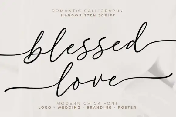
Blessed Love
Blessed Love is fine slanted script with long flat tails, a small x-height and letters spaced widely enough that a phrase reads as a calm, unhurried line.
The entry tail comes in from the left as a fine horizontal stroke before the b rises into a narrow loop, and the letters after it stay small and light: the l and the e close tightly, the two s letters repeat cleanly, the d flickers up at the stem and the final d exits into a long flat tail that runs out to the right. Weight is fine and even, with only a slight thickening where the pen turns, and the joins cross at a consistent low height. The spacing between letters is deliberate: the fit is loose, which keeps a phrase from feeling hurried and makes it easy to set at 20 pt on a wide measure. Ends taper to points. The pale ground, the soft folds and the two tracked caption blocks above and below are presentation; the script is the two words.
Recommended project & layout
A paired-name heading direction — Reserve a wide heading above plain event details with room below the b-like loop.
Before you cut or print
Test exact names, accents and tail combinations.
Best paired with
Get fontPaid link
 #13
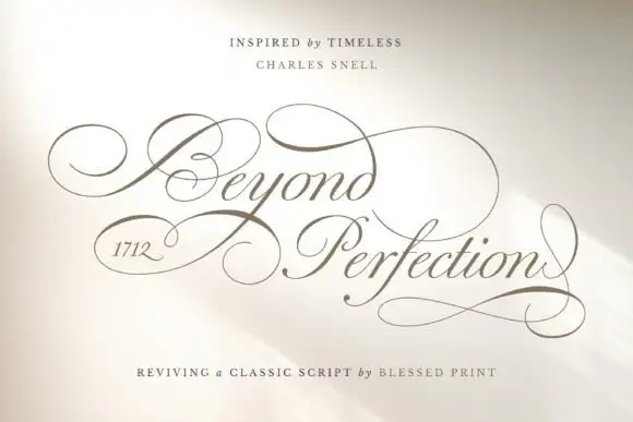
Beyond Perfection
Beyond Perfection is a delicate calligraphic script in which the capitals open into wide enclosing loops, the hairlines stay fine, the joins run unbroken and the final letter returns a stroke beneath the line, so a name reads as copperplate on an invitation.
The B wraps a broad left loop around its stem, the lowercase keeps a narrow body with fine ascending loops, the connectors hold one weight from letter to letter and the closing n sends a return stroke that travels under the whole word. The enclosing loop is the character: it wraps the first letter, which is why the sample sets one name and a second short line. The family ships over four hundred alternates, swashes and ligatures, so a maker can swap a terminal per project rather than accept the default. Because the hairlines are fine, the face wants 20 pt in print and welds before cutting from 1.1 inches of x-height. The pale field and the fine rules are presentation.
Recommended project & layout
A ceremonial programme cover — Leave broad outside margins around the title and put the running order on a plain interior page.
Before you cut or print
Check the selected alternates in the actual programme title.
Best paired with
Get fontPaid link
 #14
Bible
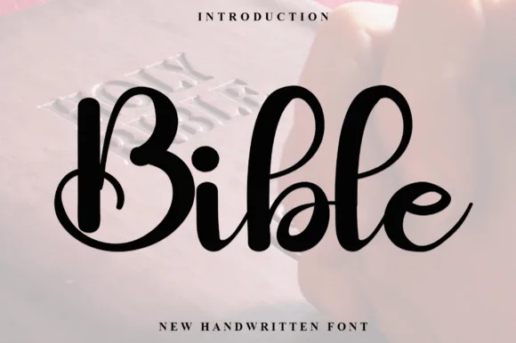
Bible (by PiPi Creative) is a thick, bouncy modern calligraphy script featuring plump brush downstrokes, tall loops, and a solid heart i-dot.
Bible is a heavy bouncy brush calligraphy script with a solid heart i-dot: a very wet loaded stroke, connected letters, a steep slant and a filled heart that sits above the x-height in place of the dot. The weight closes the loops early, and the heart is the finest element, so both need size. It needs roughly 26 mm for the heart dot and the brush edge to read, and it is best in one deep ink on cream and kraft, or a single dark red on buff stock where the heart stays solid.
Recommended project & layout
Cricut HTV faith sweatshirt, tote bag & acrylic bookmark — Set 1 focal word large (5–8 inches wide) centered above wide-tracked serif subcopy ('NEW HANDWRITTEN FONT' style).
Before you cut or print
Weld all touching cursive connectors before cutting HTV or permanent vinyl; weeds smoothly down to 0.8 inches.
Best paired with
Get fontPaid link
Clean Sans & Handwritten Print
3 fonts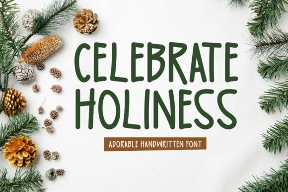 #15
Celebrate Holiness
Celebrate Holiness is a clean, tall all-caps hand-drawn marker font (not a cursive script) with softly rounded strokes and friendly upright rhythm.
Celebrate Holiness is a tall rounded all-caps marker print: disconnected letterforms with a soft rounded terminal, an even marker weight and a narrow proportion that stacks a word vertically on a banner. The rounding is drawn into the stroke, so a one-colour print keeps it, and the narrow bowl is what closes first at small sizes. It needs roughly 26 mm for the rounded terminal and the bowl to read, and it is best in one deep evergreen ink on cream and kraft, or white paint on a dark board where the rounded ends stay clean.
Recommended project & layout
Holiday porch leaner, Advent calendar tag & mug decal — Stack 2 centered uppercase lines at 48–84 pt in forest green or cranberry above a warm terracotta ribbon label.
Before you cut or print
Uniform solid marker thickness cuts and weeds cleanly on Oracal 651, HTV, and stencil film down to 0.55 inches.
Best paired with
Get fontPaid link
 #16
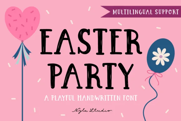
Easter Party
Easter Party is a crisp, upbeat handwritten marker font with gently flared stems, cute crossbar bounce, and full multilingual support.
Easter Party is a handwritten marker print with solid uppercase, gently flared stem ends, a bouncy crossbar line and full multilingual support, so a spring sign reads as fast hand lettering rather than a calligraphic script. The flare at the stem end is the character, and the solid fill keeps it legible at 10 mm on a small card. It needs roughly 20 mm for the flare to read as a pen entry, and it is best in black on blush or in one bright ink on white.
Recommended project & layout
Spring class-party banner, egg-carton label & invite — Stack 2 centered uppercase lines at 56–100 pt in black or berry plum over pastel pink/yellow.
Before you cut or print
100% smooth, solid single-layer shapes weed in seconds on Cricut HTV, permanent vinyl, and paper down to 0.6 inches!
Best paired with
Get fontPaid link
 #17
Easter
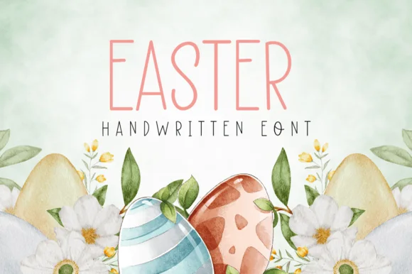
Easter (by Natchuta) is a tall, airy monoline handwritten print font built for sweet spring greeting cards, planners, and Cricut Pen drawing.
Easter is a tall, airy monoline print in caps, drawn with a single even stroke and generous spacing so a word reads as written with a fine pen rather than typeset. Because the stroke never varies, the face plots from a Cricut pen in one pass, prints cleanly at 10 mm on a card and holds up at 60 mm on a sign without thickening. The narrow proportions let a long greeting fit a single line in a portrait card, and the open counters keep small sizes crisp. It is a quiet, decorative hand for cards, planners and tags, not a face for dense copy.
Recommended project & layout
Cricut-penned Easter card, brunch place card & floral tag — Center 1 uppercase header at 48–84 pt with +8 tracking above wide-spaced smaller matching caps.
Before you cut or print
Slender pen weight shines with Cricut 0.4 Pens, Foil Quill, and flat cardstock printing; scale above 1.25 in for vinyl.
Best paired with
Get fontPaid link
Matched Font Duos & Packs
4 fonts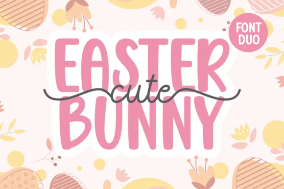 #18
Cute Easter Bunny
Cute Easter Bunny combines a tall, chunky hand-cut uppercase sans with a sweet monoline cursive accented by long side tails.
Cute Easter Bunny is a playful pair of a tall pastel sans with a tailed monoline script: the sans is a soft narrow block whose counters stay open, while the script finishes every word with a small bunny tail that lifts off the baseline. The pair is built for a soft spring palette, so it loses its charm in a single harsh ink. The tail is the finest element and it closes into a dot once the face is reduced. The sans needs roughly 22 mm and the script 26 mm for their detail to read.
Recommended project & layout
Personalized Easter basket tag & egg-hunt tote — Place two stacked uppercase words in pastel vinyl and overlay the dark tailed script across the seam between rows.
Before you cut or print
Use Print-Then-Cut with an offset white sticker border for multi-color tags, or layer smooth HTV pressing the chunky sans base first.
Best paired with
Get fontPaid link
 #19
Blissful Heartlight
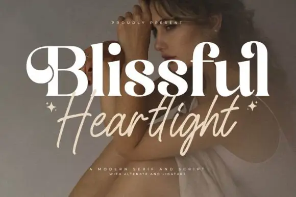
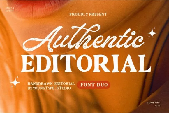
Blissful Heartlight shows a pale heavy Blissful line with round bowls and curled upper entries over a portrait, where the serifs swell into bulges at the joins and a thinner right-leaning Heartlight script sits beneath with long loose strokes and extended ascenders and descenders plus two small stars at the outer edges.
The serif stays heavy and soft, the script stays thin and leaning, the ascenders rise high and the descenders drop low while the two rows overlap slightly at the centre. That swelling serif is the character: the caps look inflated at the joins rather than cut, which is why the sample relies on a photographic ground for contrast. The stars are styling, and the cover notes alternates and ligatures without showing them. Keep 44 pt for the serif and 26 pt for the script, and check the overlap for contrast before printing.
Recommended project & layout
A serif-and-handwritten invitation pairing — Keep the handwritten line clear of the practical invitation text.
Before you cut or print
Verify both members and exact joins.
Best paired with
Get fontPaid link
 #20
Cupcake Handmade Duo
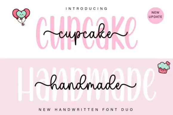
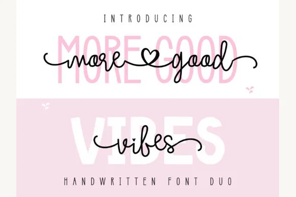
Cupcake Handmade Duo places tall narrow rounded letters in pale pink behind a smaller connected script line in black, twice on one cover, where the script carries long outer tails and looped k and h forms while a balloon pair, a cupcake drawing and an update badge sit in the corners.
The caps stay tall and narrow, the script stays compact and continuous, the loops open large and the tails run wide past the caps on both sides. That size gap is the character, because the script sits inside the cap row rather than under it. The balloons, the cupcake and the badge are separate sample elements, so do not count them as part of the type. Keep 34 pt for the caps and 16 pt for the script, and check the k and h loops against your margins before locking the lockup.
Recommended project & layout
A cupcake-table heading — Place the capital title above, not behind, the script; put flavours and dietary information in a plain panel below.
Before you cut or print
Check both supplied styles and essential food information separately.
Best paired with
Get fontPaid link
 #21
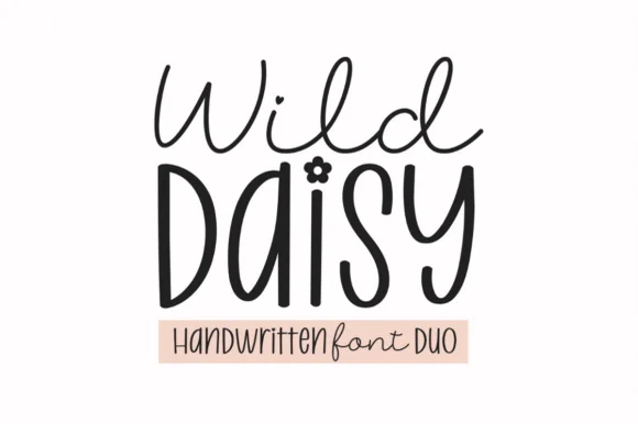
Wild Daisy Duo
Wild Daisy Duo pairs a breezy monoline cursive script with a tall quirky bohemian display font that tops lowercase 'i' with a 5-petal daisy flower!
Wild Daisy Duo is a duo of an airy monoline script and a daisy-dotted bohemian handwritten display: the script runs an even light stroke with wide loops and joined letters, while the display is a casual print face whose i dots are small drawn daisies and whose stems carry a light wobble. The daisies are the finest element and close first, and the monoline is the weaker element in print. The script needs roughly 24 mm and the display 20 mm for their detail to read.
Recommended project & layout
'Wildflower' nursery sign, toddler boho tee & Easter tag — Stack airy Wild Daisy Script (68 pt) above large mixed-case Display (96 pt) over a blush pill banner.
Before you cut or print
Display stems cut fast at 0.75 in+ (color the daisy 'i' dot gold/pink for extra pop!); Weld the thinner Script and cut at 1.2 in+!
Best paired with
Get fontPaid link
Practical buyer checklist
Frequently asked questions.
Key cutting, printing and pairing answers before choosing a christian, faith & Bible journaling typeface.
Which fonts suit Bible journaling in a notebook?
Chunky upright brush scripts and clean marker prints at 10 to 12 pt. Fine calligraphy bleeds into thin paper and swash display faces are too decorative for a page that already carries handwriting.
Can faith scripts be used on church signage?
Yes at 4 inches or more, with a heavier weight than a journal would use. Keep the lettering short and let the signage carry one line rather than a whole verse, which nobody can read from a pew.
Why do some Christian fonts look like wedding script?
Many copperplate and swash faces are shared between the two markets, because the formal register overlaps. What changes is the layout and ornament, not the typeface, so the same font can feel devotional or bridal depending on context.
Do these fonts include numerals for chapter and verse references?
Most include 0 to 9 and a colon. Test the colon specifically, since some display sets omit or misalign it and a verse reference without a clean colon looks unprofessional.
Keep exploring
Related collections & guides.
Explore adjacent maker roundups or check our practical pre-production checklists.
01 / Holidays & Seasons
Easter baskets & spring crafts
17 curated fonts · Previews & pairings
02 / Branding & Print
Quote prints, wall art & affirmations
26 curated fonts · Previews & pairings

03 / Cricut & Craft
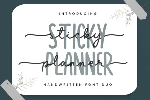
Modern farmhouse & wood signs
27 curated fonts · Previews & pairings
04 / Holidays & Seasons
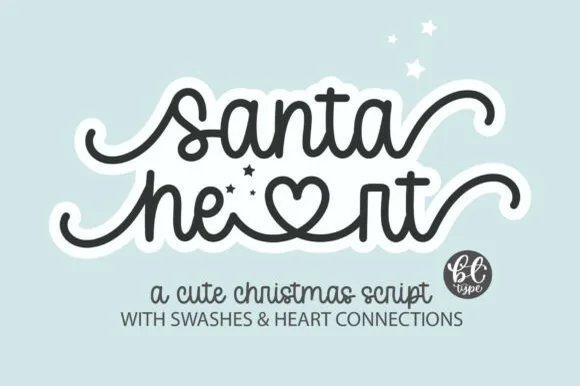
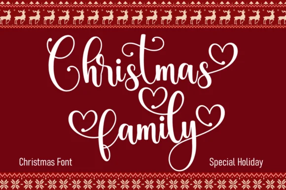
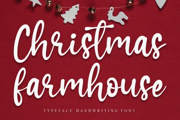
Christmas scripts & calligraphy
21 curated fonts · Previews & pairings
Guides: Invitation font checklist · Vinyl & cutting checklist · How to pair script & sans fonts