Modern Grotesque Body

Terminal + Swaraga
Creates crisp high-hierarchy contrast beneath Terminal headlines across menus, websites and labels.
Inspect Swaraga specimenDisclosure: MakerFileHub may earn a commission from qualifying purchases via paid links on this page. How our links work.
Eight-bit bitmap pixel serif with editorial brackets and terminals
Terminal is an eight-bit pixel serif in which the letterforms keep their editorial brackets and serifs while every curve is rebuilt from square blocks, so a title reads as a literary masthead on a vintage screen.
Paid link
Get this fontProject & layout blueprintsAt-a-glance maker compatibility
Crisp hairline serifs shine on stationery, foil stamping, and packaging; add slight offset for small decals.
Visual anatomy & craft review
The T keeps a wide serif on a stepped stem, the e closes a stair-stepped bowl, the r carries a pixel shoulder and the brackets of a classic serif survive as one- or two-block steps rather than as smooth transitions. The hybrid is the character: literary proportions on a computer grid, which is why the sample suits a tech zine or a game title. Because the grid is fixed, the face must be set at a multiple of the base module or the pixels distort, and it prints crisply from 10 pt upward with a hot-foil finish on signage. The dark field and the small caption are presentation; the pixel serif lines are the face.
Pixel · Serif hybrid · Retro-computing
Two-font hierarchy recipes
Tested contrast partners — pairing Terminal with grounded secondary typography.
Terminal + Swaraga
Creates crisp high-hierarchy contrast beneath Terminal headlines across menus, websites and labels.
Inspect Swaraga specimen
Terminal + Abigail
Adds a warm human signature touch for 1-to-3-word callouts without competing against structured serif capitals.
Inspect Abigail specimenPractical applications
Concrete hierarchy, scale and production guidance tailored to Terminal’s stroke geometry.
The pixel serif sets the theme of a computing feature, and the bracketed stems stay readable at 60 pt on a printed cover.
Hierarchy & layout recipe
Print an A5 cover: set the title at 60 pt on a pixel-aligned size, keep 18 mm of clear ground beneath, and set the issue line in a 9 pt pixel face at the foot.
Pre-production check
A pixel face set at an arbitrary size breaks its module; check the layout and set it at a multiple of the base grid.
The eight-bit lettering suits a gaming badge, and the stepped serifs stay clear at 24 mm on a 60 mm printed roundel in two inks.
Hierarchy & layout recipe
Print a 60 mm roundel: set the word at 24 mm, keep every step on a 2 mm module, and set the date in a 7 pt pixel line along the lower arc of the badge.
Pre-production check
A stepped serif printed under 1 mm loses a step; check the proof and keep the module at 2 mm or wider.
The retro-computing tone suits a club door, and the blocky serifs stay legible at 44 mm on a laminated sign in two colours.
Hierarchy & layout recipe
Print an A4 sign: set the club name at 44 mm, keep the pixel edges on a 2 mm module, and keep 20 mm of border all round the edges of the printed sheet.
Pre-production check
A laminate over fine pixel steps softens them; check the mounted sign and use a matte pouch.
Technical & licence verification
Confirm included OTF/TTF/WOFF formats, full glyph tables and licence coverage on the live store page before batch production.
Closest visual alternatives
Matched across letterform anatomy, stroke behaviour and craft applications.
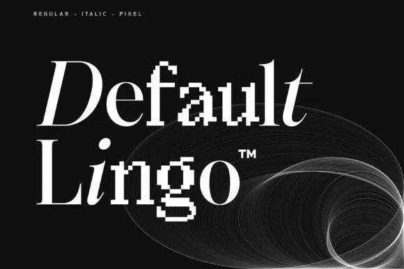
Hybrid serif family mixing smooth, italic and pixel-glitch cuts
Default Lingo is an experimental serif family in which a smooth regular, an italic and a pixel cut share one set of proportions, so a designer can glitch a letter or two inside a word and keep the baseline steady.
Ideas for this font
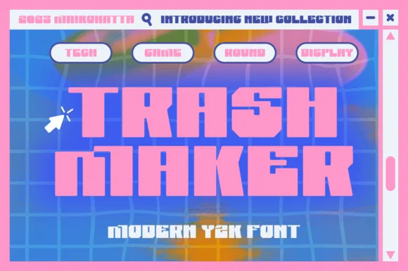
Heavy squared Y2K digital blocks with tiny pixel-notch cutouts
Trash Maker is a heavy squared display in which the letters form thick digital blocks, the counters shrink to slots and tiny pixel notches cut the corners, so a two-word headline reads as early-web graphics.
Ideas for this font

Display serif with slanted accent
The Lumina Awesome is a display serif in cream over a close portrait: a light slanted line in mixed case above, and a substantial upright caps line beneath at a larger size, with a tracked note at the top left and a bracketed line at the foot naming the count of cuts.

Substantial upright serif title paired with a bold slanted lower word
Editorial Revival shows pale two-line lettering over a dark portrait, where Editorial stands upright with broad bowls and sharp serif tips while Revival below leans strongly right and ends in a large full stop, and smaller slanted supporting text repeats the same direction beneath.
Same independent foundry
Allow optional Google Analytics to measure visits and catalogue actions. Your search words and notes are not included. Privacy & storage