Neutral Sans Workhorse

Pixel Zone + Kohilo
Lets Pixel Zone own the focal silhouette while handling secondary copy, sizing and subheads cleanly.
Inspect Kohilo specimenDisclosure: MakerFileHub may earn a commission from qualifying purchases via paid links on this page. How our links work.
Chunky sixteen-bit pixel lettering with bevelled corners
Pixel Zone is a chunky sixteen-bit display in which every stem is built from square blocks, the corners bevel slightly and the strokes carry mass, so a title reads as an arcade logo rather than as a modern squarish sans.
Paid link
Get this fontProject & layout blueprintsAt-a-glance maker compatibility
Sturdy stroke walls and open counters weed cleanly on adhesive vinyl, HTV apparel film, and cut cardstock.
Visual anatomy & craft review
The P stacks a block bowl over a straight stem, the Z steps a diagonal in even units, the O closes a square ring and the E sets three even arms, all on a shared pixel grid with a slight bevel on the outer corners. The grid is the character: every edge lands on the same module, which is why the sample sets two short rows on a dark ground. Because the modules are fixed, the face must be set at a multiple of the base size or the pixels distort, and it prints crisply at any scale as long as the grid is respected. The dark field, the small score line and the caption are presentation; the blocky letters are the face.
Pixel · Sixteen-bit · Game-UI
Two-font hierarchy recipes
Tested contrast partners — pairing Pixel Zone with grounded secondary typography.
Pixel Zone + Kohilo
Lets Pixel Zone own the focal silhouette while handling secondary copy, sizing and subheads cleanly.
Inspect Kohilo specimen
Pixel Zone + Grandeur – Elegant Classic Serif
Grounds bold display lettering with classic typographic authority on posters, badges and apparel.
Inspect Grandeur – Elegant Classic Serif specimenPractical applications
Concrete hierarchy, scale and production guidance tailored to Pixel Zone’s stroke geometry.
The pixel grid sets the theme instantly, and the chunky blocks stay readable at 40 pt on a small printed card in two inks.
Hierarchy & layout recipe
Print an A6 card: set the line at 40 pt on a pixel-aligned size, keep the pixels at 2 mm, and set the time and address at 10 pt in the same face beneath.
Pre-production check
A pixel face set at an arbitrary size produces uneven modules; check the proof and set it at a multiple of the base grid.
The arcade lettering suits a club door, and the blocky forms stay clear at 50 mm on a laminated sign in two flat colours.
Hierarchy & layout recipe
Print an A4 sign: set the club name at 50 mm, keep the pixel edges on a 2 mm module, and keep 20 mm of border all round so no block is clipped at the trim.
Pre-production check
A laminate over fine pixel details softens the edges; check the mounted sign and use matte film.
The sixteen-bit mass reads across a room, and the even blocks stay solid at 60 mm on a printed chest in one flat white ink.
Hierarchy & layout recipe
Print a 280 mm chest print: set the title at 60 mm, keep every block at 4 mm minimum, and keep 45 mm of clear shirt beneath the title for the date line.
Pre-production check
Blocks under 3 mm fill in on a screen print; check the film at full size and thicken the module.
Technical & licence verification
Confirm included OTF/TTF/WOFF formats, full glyph tables and licence coverage on the live store page before batch production.
Closest visual alternatives
Matched across letterform anatomy, stroke behaviour and craft applications.
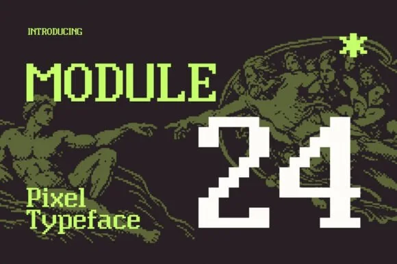
Crisp modular 8-bit retro-OS & numeral pixel font
Module 24 is a clean, modular pixel typeface pairing crisp uppercase/lowercase 8-bit text with bold arcade numerals ('24').
Ideas for this font
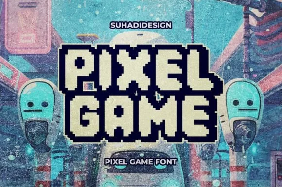
Double-outlined retro pixel arcade alphabet with a filled inner core
Pixel Game is an arcade alphabet in which every letter carries two outlines and a filled core, so a word reads as an eight-bit game logo rendered as a sticker.
Ideas for this font
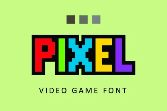
Clean uniform square-grid 8-bit block
Pixel constructs 8-bit arcade capitals from uniform square blocks, with no diagonal curves and no tiny notches, so every edge follows a crisp orthogonal pixel grid on a fixed unit.
Ideas for this font
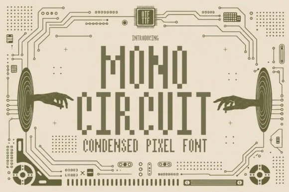
Condensed pixel font with a technical ground
Mono Circuit is a condensed pixel font in olive on cream: letters built from square blocks in a narrow grid, with circuit-board traces, hands reaching toward the type and small technical marks filling the page.
Ideas for this font
Same independent foundry
Allow optional Google Analytics to measure visits and catalogue actions. Your search words and notes are not included. Privacy & storage