Modern Grotesque Body

Default Lingo + Homies
Creates crisp high-hierarchy contrast beneath Default Lingo headlines across menus, websites and labels.
Inspect Homies specimenDisclosure: MakerFileHub may earn a commission from qualifying purchases via paid links on this page. How our links work.
Hybrid serif family mixing smooth, italic and pixel-glitch cuts
Default Lingo is an experimental serif family in which a smooth regular, an italic and a pixel cut share one set of proportions, so a designer can glitch a letter or two inside a word and keep the baseline steady.
Paid link
Get this fontProject & layout blueprintsAt-a-glance maker compatibility
Sturdy stroke walls and open counters weed cleanly on adhesive vinyl, HTV apparel film, and cut cardstock.
Visual anatomy & craft review
The regular holds even serifs and open bowls, the italic leans with the same stroke logic and the pixel cut rebuilds each stem from square blocks while keeping the serif footprint, so the three mix inside a single word. The mixing is the character: it is designed to be combined, which is why the sample sets one line with swapped letters rather than three specimens apart. Because the pixel blocks are small, the face wants 30 pt before the squares read as pixels and not as ragged print, and it weeds cleanly from three quarters of an inch of cap height. The plain ground, the small caption and the studio credit are presentation; the mixed line is the family.
Experimental · Hybrid · Pixel
Two-font hierarchy recipes
Tested contrast partners — pairing Default Lingo with grounded secondary typography.
Default Lingo + Homies
Creates crisp high-hierarchy contrast beneath Default Lingo headlines across menus, websites and labels.
Inspect Homies specimen
Default Lingo + Simple Handwriting
Adds a warm human signature touch for 1-to-3-word callouts without competing against structured serif capitals.
Inspect Simple Handwriting specimenPractical applications
Concrete hierarchy, scale and production guidance tailored to Default Lingo’s stroke geometry.
The matched cuts let one letter glitch without breaking the line, and the smooth serif keeps the name readable at 40 pt on a printed badge.
Hierarchy & layout recipe
Print a 90 by 55 mm badge: set the name at 40 pt, swap two letters into the pixel cut, and keep the swap away from the first letter so the word still reads at a glance.
Pre-production check
Too many swapped letters read as a rendering fault; check the badge and keep the pixel cut to two letters per word.
The hybrid cuts suit a course cover, and the pixel weight gives a short title a contemporary edge at 70 pt on an A4 sheet.
Hierarchy & layout recipe
Print an A4 cover: set the title at 70 pt, set the year in a 14 pt italic at the head, and keep 25 mm of clear ground beneath the title so the pixel blocks are not confused with the credit.
Pre-production check
A pixel title printed at 300 dpi from a low-resolution export shows stair-steps; check the file and export at 600 dpi.
The hybrid serif gives a hangtag a studio feel, and the compact forms hold a short mark at 18 pt on a 40 mm tag without the pixel blocks breaking apart.
Hierarchy & layout recipe
Print a 40 by 70 mm tag: set the mark at 18 pt, punch a 3 mm hole 8 mm from the top, and keep the pixel letter clear of the hole so the tag does not tear.
Pre-production check
A pixel letter next to a punched hole reads as damage; check the tag and keep 8 mm from the hole to the first stem.
Technical & licence verification
Confirm included OTF/TTF/WOFF formats, full glyph tables and licence coverage on the live store page before batch production.
Closest visual alternatives
Matched across letterform anatomy, stroke behaviour and craft applications.
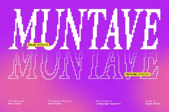
Pixelated oblique serif in solid and outline
Muntave is a pixelated oblique serif in white on a magenta gradient: letters stepped along a slanting grid with hollow serifs, shown twice, once solid and once as an outline, with small yellow labels naming each version.
Ideas for this font
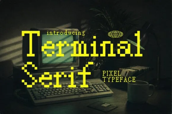
Eight-bit bitmap pixel serif with editorial brackets and terminals
Terminal is an eight-bit pixel serif in which the letterforms keep their editorial brackets and serifs while every curve is rebuilt from square blocks, so a title reads as a literary masthead on a vintage screen.
Ideas for this font
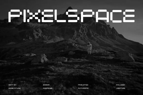
Pixelated futuristic stencil display
Pixel Space is a pixelated display in white on a dark mountain landscape: wide capitals assembled from square blocks with stencil gaps where the segments meet, a flat top and bottom on every letter, and a lowercase-sized x-height that keeps the line horizontal.
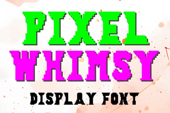
Pixel slab display
Pixel Whimsy is a pixel slab display in bright green and magenta on a pale speckled ground: letters built from square modules with slab-like feet, stepped curves and a dark pixel shadow, with a caption in a small pixel face below, so the plate reads as an arcade scoreboard.
Ideas for this font
Allow optional Google Analytics to measure visits and catalogue actions. Your search words and notes are not included. Privacy & storage