High-Contrast Display Serif

Family Farmhouse + Bulgary
Pairs sculptural editorial warmth with Family Farmhouse's clean modern geometry.
Inspect Bulgary specimenDisclosure: MakerFileHub may earn a commission from qualifying purchases via paid links on this page. How our links work.
Thin tall serif capitals with a fine script duo
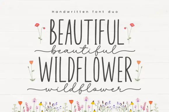
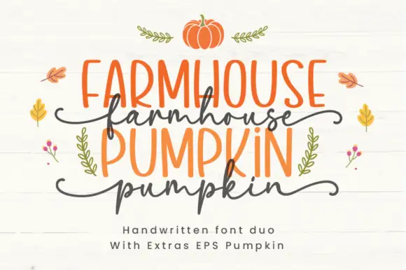
Family Farmhouse pairs very tall condensed serif capitals with a fine connected script, long side tails and a set of leaf-sprig ornaments sold as extras.
Paid link
Get this fontProject & layout blueprintsAt-a-glance maker compatibility
Weld or Unite overlapping script joins into one continuous vector path before sending to the blade.
Visual anatomy & craft review
The capital line is drawn thin and extremely narrow, with flat unbracketed serifs and even stem weight, so it reads as a farmhouse stencil rather than a classical roman. Above it the script is fine and fully connected, with long tails leaving both sides of the word, which is why the specimen stacks the two members instead of setting them on one line. The sprigs and small leaves are extras rather than glyphs, and they sit in the gaps without changing letter spacing. Height is doing most of the work here: the capitals reach unusually high for their width, which is what makes the pair feel hand-painted rather than typed, and it also means the face needs vertical room rather than horizontal.
Tall · Delicate · Rustic
Two-font hierarchy recipes
Tested contrast partners — pairing Family Farmhouse with grounded secondary typography.
Family Farmhouse + Bulgary
Pairs sculptural editorial warmth with Family Farmhouse's clean modern geometry.
Inspect Bulgary specimen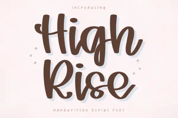
Family Farmhouse + High Rise
Introduces organic movement on pull-quotes, signatures and gift tags.
Inspect High Rise specimenPractical applications
Concrete hierarchy, scale and production guidance tailored to Family Farmhouse’s stroke geometry.
The tall thin capitals hold a long word on a narrow board while the script above supplies the personal line at the top, where a wider alphabet would wrap.
Hierarchy & layout recipe
Set the capitals at 5-inch height on a 30 cm board, then place the script at 30 percent of that height above them, keeping 20 mm between the two so the tails stay clear.
Pre-production check
Thin stems are fragile in wood routing, so if this is cut rather than painted, widen the stems or choose a different material.
The tall capitals give a home-published book a spine-worthy title and the script supplies the family voice on the cover.
Hierarchy & layout recipe
Set the title at 90 pt on A4 with 1.1 line spacing, run the script line above at 34 pt on a single baseline, and keep the leaf sprigs at 8 mm clear of both lines.
Pre-production check
At 90 pt the thin serifs still hold, but below 24 pt they break up, so do not use the capitals for chapter numbers.
A narrow capital line fits a small jar without wrapping, and the script can carry the flavour name in a single stroke above it.
Hierarchy & layout recipe
Keep the capitals at 10 pt across a 50 mm label, set the script at 18 pt above them, and leave 4 mm from the label edge to the script tails on both sides.
Pre-production check
Check the label's curve: on a cylindrical jar the script tails lift at the edges well before the capitals do.
Technical & licence verification
Confirm included OTF/TTF/WOFF formats, full glyph tables and licence coverage on the live store page before batch production.
Closest visual alternatives
Matched across letterform anatomy, stroke behaviour and craft applications.
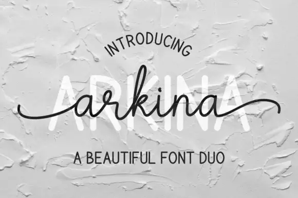
Tall sans capitals with a low looping script duo
Arkina Duo layers a very low looping connected script over tall narrow capitals that read as engraved lettering pressed into plaster, with entry strokes starting well left of the first letter.
Ideas for this font
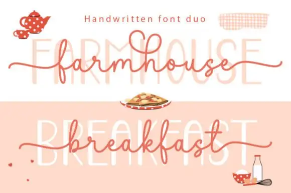
Long-tailed handwritten script layered over a faint tall printed line
Farmhouse Breakfast Duo sets a long-tailed handwritten script across a faint tall printed word, so the same phrase reads twice in the sample — once as a pen line and once as a ghosted block behind it.
Ideas for this font
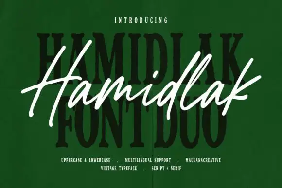
Brush signature script layered over a heavy vintage serif
Hamidlak layers a loose brush signature over a heavy vintage serif, so the same word appears twice in the sample — once as a signature and once as a stamped plate.
Ideas for this font
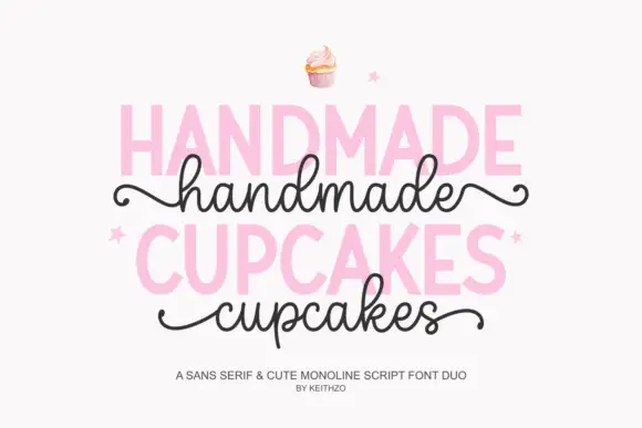
Bold sans serif paired with a monoline script with curled outer tails
Handmade Cupcakes pairs a bold sans serif in capitals with a light monoline script whose tails curl at both ends, so a label can carry a firm product word and a soft handwritten line.
Ideas for this font
Same independent foundry
Allow optional Google Analytics to measure visits and catalogue actions. Your search words and notes are not included. Privacy & storage