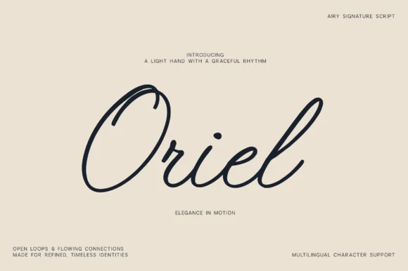
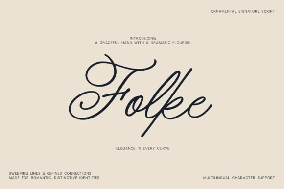
Editorial Serif Anchor

Ravel + The Lumina Awesome
Anchors Ravel's fluid strokes with crisp Roman proportions on wedding suites, headers and packaging.
Inspect The Lumina Awesome specimenDisclosure: MakerFileHub may earn a commission from qualifying purchases via paid links on this page. How our links work.
Fine architectural dip-pen signature script
Ravel is a slender, sweeping signature script featuring an oversized calligraphic canopy R-loop and delicate modern pen lines.
Paid link
Get this fontProject & layout blueprintsAt-a-glance maker compatibility
Weld or Unite overlapping script joins into one continuous vector path before sending to the blade.
Visual anatomy & craft review
Ravel is a slender dip-pen signature script with an oversized calligraphic canopy R-loop that arches over the word, delicate modern pen lines and a descending leg curve. The stroke is uniform and light, so it plots and foils predictably and holds at 14 mm on a card, while the canopy adds height that a layout must reserve. The looser connections mean a long phrase should be broken into lines rather than strung out, and it is at its best in one dark ink on a warm neutral ground.
Refined · Sweeping · Minimalist
Two-font hierarchy recipes
Tested contrast partners — pairing Ravel with grounded secondary typography.
Ravel + The Lumina Awesome
Anchors Ravel's fluid strokes with crisp Roman proportions on wedding suites, headers and packaging.
Inspect The Lumina Awesome specimen
Ravel + Furion
Keeps small-scale dates, URLs, nutrition facts and care instructions crisp and legible below script titles.
Inspect Furion specimenPractical applications
Concrete hierarchy, scale and production guidance tailored to Ravel’s stroke geometry.
A signature script reads as a maker's own hand rather than a logotype, which is what a small studio sells. The canopy loop gives a short name a graphic crown.
Hierarchy & layout recipe
Label 70 x 45 mm, name 10 mm with 6 mm headroom, 4 mm die margin. Card 85 x 55 mm, name 9 mm, 6 mm margins. Insert 105 x 148 mm, heading 16 mm, details 7/10 pt.
Pre-production check
The canopy arches above the cap line and gets clipped when a file is fitted to a label die. Measure from the top of the loop, not the stem, and check one printed label before the run.
A dip-pen signature reads as an authored mark, which suits a poetry or essay collection. Uniform weight prints cleanly on smooth stock at 20 pt.
Hierarchy & layout recipe
Cover 129 x 198 mm, title 34 pt with 8 mm headroom, author 14 pt, 15 mm margins. Opener 22 pt on a 12 mm baseline. Label 100 x 60 mm, poet 10 pt, data 7 pt.
Pre-production check
Gallery labels are read at 40 cm and a light signature at 10 pt is illegible. Keep the display face for the cover and set label data in a plain sans, checking one at its stated distance.
A delicate pen script reads as a written winter note, which separates it from the seasonal graphics on a shelf. Uniform strokes hold at 12 mm.
Hierarchy & layout recipe
Card 120 x 170 mm, greeting 20 mm, message 8/12 pt, 14 mm margins. Tag 50 x 90 mm, name 9 mm, hole 5 mm clear. Print 210 x 297 mm, greeting 46 mm, 30 mm margins.
Pre-production check
Seasonal cards are printed on textured stock more often than smooth, and a light pen line fills there. Print one proof on the intended card, and step up to a heavier cut if the line breaks.
Technical & licence verification
Confirm included OTF/TTF/WOFF formats, full glyph tables and licence coverage on the live store page before batch production.
Closest visual alternatives
Matched across letterform anatomy, stroke behaviour and craft applications.
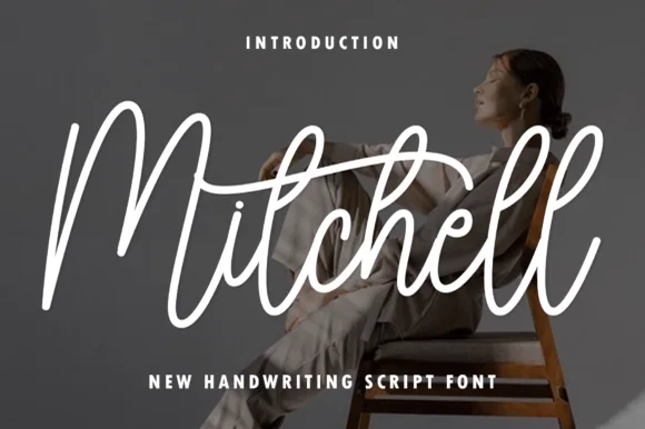
Tall upright brush-pen signature calligraphy script
Mitchell is a stylish, tall-looped brush-signature script pairing high editorial ascenders ('M', 't', 'h', 'l') with smooth, vinyl-friendly stroke weight.
Ideas for this font
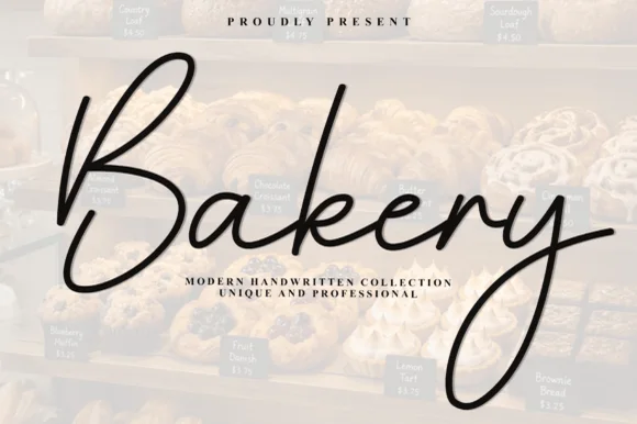
Airy elongated patisserie signature calligraphy script
Bakery (by Plafont store) is an airy, graceful fine-pen signature script sweeping tall 'B/k' loops and elongated 'y' descenders.
Ideas for this font
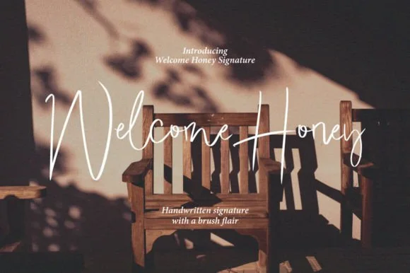
Brush signature script with a fine connector
Welcome Honey is a brush signature script in white over a warm sepia photograph of a wooden bench: monoline downstrokes that swell slightly at the entry, a W built from two long crossing strokes and a descender on the y that drops below the second word.
Ideas for this font
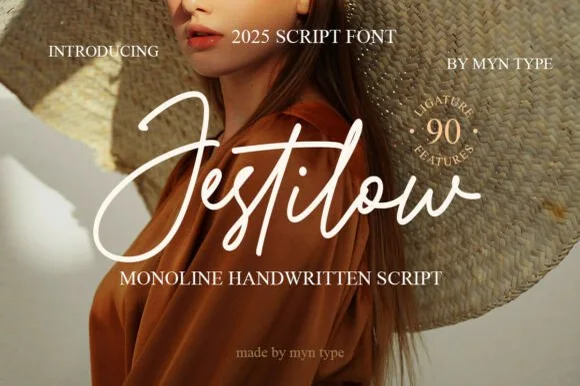
Flowing signature monoline script with 90 ligature features
Jestilow is an expressive monoline signature script packed with 90 custom ligatures, soaring t-crossbars, and sweeping initial loops.
Ideas for this font
Same independent foundry
Allow optional Google Analytics to measure visits and catalogue actions. Your search words and notes are not included. Privacy & storage