Editorial Serif Anchor

Halimun + Cronelo
Anchors Halimun's fluid strokes with crisp Roman proportions on wedding suites, headers and packaging.
Inspect Cronelo specimenDisclosure: MakerFileHub may earn a commission from qualifying purchases via paid links on this page. How our links work.
Fine low signature with a crossed capital and a wide flat baseline
Halimun is a fine signature script in which the capital crosses its own stem, the body stays low and the joins stay thin, so a name reads as something written on a photograph with a fine pen.
Paid link
Get this fontProject & layout blueprintsAt-a-glance maker compatibility
Weld or Unite overlapping script joins into one continuous vector path before sending to the blade.
Visual anatomy & craft review
The capital H draws as a long diagonal that crosses back through its own stroke before the body begins, the a closes a small bowl, the l rises into a narrow loop, the i carries a light dot and the n keeps a low shoulder, all at one even light weight with a flat baseline. The crossing stem is the character: it makes the first letter taller and wider than the rest, which is what gives the word its signed quality on a wide plate. Because the body is low, the face leaves room above and below for a caption, as the sample does. The fine stroke wants a smooth stock at 18 pt. The monochrome photograph, the black ink, the rules and the small credits are presentation; the script is the word shown.
Signature · Fine · Crossed
Two-font hierarchy recipes
Tested contrast partners — pairing Halimun with grounded secondary typography.
Halimun + Cronelo
Anchors Halimun's fluid strokes with crisp Roman proportions on wedding suites, headers and packaging.
Inspect Cronelo specimen
Halimun + Hermano
Keeps small-scale dates, URLs, nutrition facts and care instructions crisp and legible below script titles.
Inspect Hermano specimenPractical applications
Concrete hierarchy, scale and production guidance tailored to Halimun’s stroke geometry.
The low body leaves the image legible around it, and the crossed capital gives a credit line the look of a signature rather than a byline at 20 pt.
Hierarchy & layout recipe
Print an A4 cover: set the credit at 20 pt in the lower third, set the issue line in a 7 pt caps sans beneath, and keep 14 mm of clear image behind the word so the fine stroke still reads over the photograph.
Pre-production check
A fine stroke over a light area of a photograph disappears; check the printed cover and move the credit onto the darker part of the image.
The signature register suits a personal photography studio, and the fine even weight reproduces in one colour on a card at 16 pt.
Hierarchy & layout recipe
Print a 90 by 50 mm card: set the name at 16 pt across the upper half, set the contact lines in a 6 pt sans at the foot, and keep 10 mm of clearance below the descender so the mark does not crowd the block.
Pre-production check
A light signature on a matte card can print grey; check one card and specify a coated stock if the line loses density.
The crossed capital gives a small wedding card one gesture, and the low body leaves space for the details beneath at 26 pt.
Hierarchy & layout recipe
Print a 148 by 105 mm card: set both names at 26 pt on the centre line, set the date in an 8 pt caps serif below, and keep 18 mm of margin so the flat tail finishes inside the trim.
Pre-production check
A low tail printed close to the date line reads as a rule; check the proof and open the gap rather than shortening the stroke.
Technical & licence verification
Confirm included OTF/TTF/WOFF formats, full glyph tables and licence coverage on the live store page before batch production.
Closest visual alternatives
Matched across letterform anatomy, stroke behaviour and craft applications.
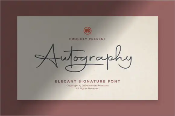
Sharp angled signature script
Autography is a signature script built on sharp angles: strokes turn at points rather than curves, the slant is consistent, and the ascenders are drawn as straight diagonal lifts.
Ideas for this font
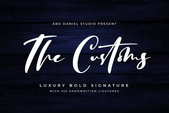
High-contrast signature strokes
The Customs is a high-contrast signature in white on navy timber: a capital T that runs above the line as a long bar, heavy shaded downstrokes, hairline joins, and a capital C drawn as a wide open oval.
Ideas for this font
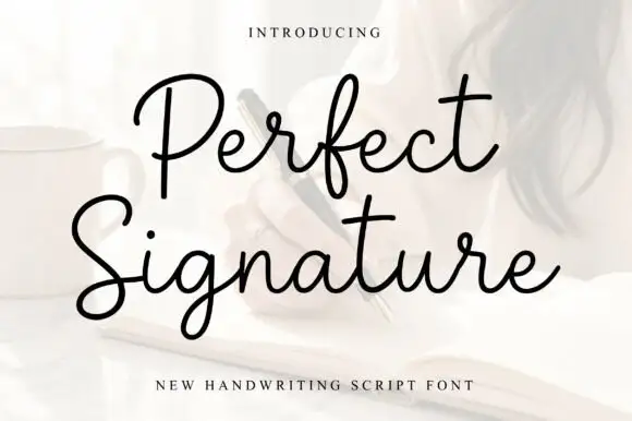
Open fine signature script
Perfect is an open handwriting script in black over a soft photograph: fine even strokes, wide loops on the ascenders and a level baseline, with a long exit stroke that runs out beneath the second line.
Ideas for this font
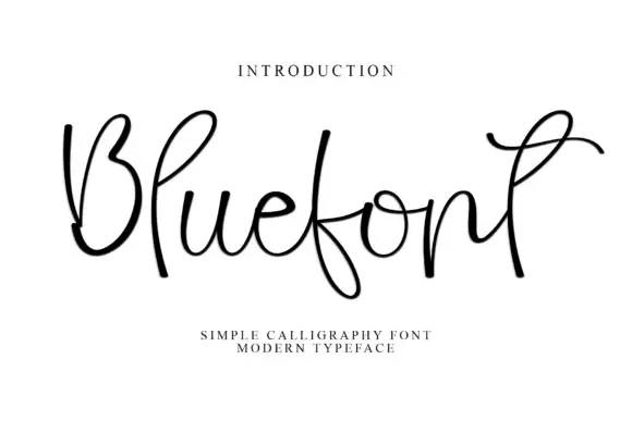
Open looping monoline script with exaggerated ascenders
Blue is an open monoline script whose ascenders and descenders run two or three times the x-height, with wide untouching loops and thin joins that make the word read as a loose ribbon rather than a solid line of text.
Ideas for this font
Same independent foundry
Allow optional Google Analytics to measure visits and catalogue actions. Your search words and notes are not included. Privacy & storage