High-Contrast Display Serif

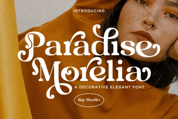
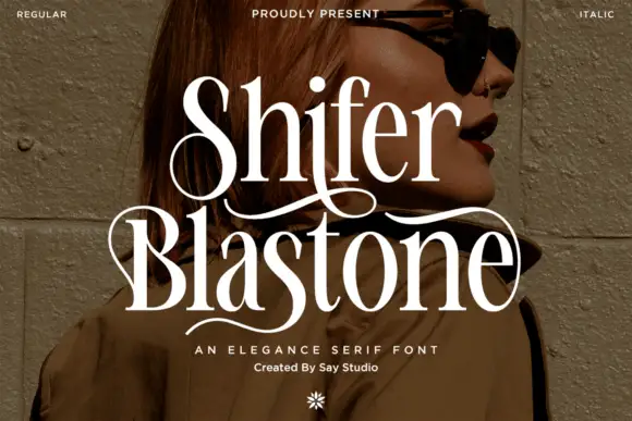
Noa Voren + Auretha
Pairs sculptural editorial warmth with Noa Voren's clean modern geometry.
Inspect Auretha specimenDisclosure: MakerFileHub may earn a commission from qualifying purchases via paid links on this page. How our links work.
Wide extended futuristic & aerospace display grotesk
Noa Voren is a bold, wide-stance extended sans serif featuring stretched horizontal proportions and subtle speed-sliced diagonal cuts.
Paid link
Get this fontProject & layout blueprintsAt-a-glance maker compatibility
Sturdy stroke walls and open counters weed cleanly on adhesive vinyl, HTV apparel film, and cut cardstock.
Visual anatomy & craft review
Noa Voren is a wide extended grotesk with stretched horizontal proportions and subtle angled terminal cuts that suggest speed without a literal slant. The caps are monolithic and evenly spaced, so a short word fills a wide banner as a solid graphic, and the diagonals keep the letters from looking like plain blocks. Width is the constraint: a word needs a wide container and a short letter count, and the face is at its best at 40 mm and above in one bright colour on a dark ground.
Extended · Aerospace · Sleek
Two-font hierarchy recipes
Tested contrast partners — pairing Noa Voren with grounded secondary typography.
Noa Voren + Auretha
Pairs sculptural editorial warmth with Noa Voren's clean modern geometry.
Inspect Auretha specimen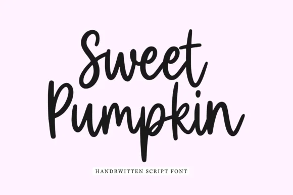
Noa Voren + Sweet Pumpkin
Introduces organic movement on pull-quotes, signatures and gift tags.
Inspect Sweet Pumpkin specimenPractical applications
Concrete hierarchy, scale and production guidance tailored to Noa Voren’s stroke geometry.
Extended grotesk capitals read as a machined wordmark, which is what a technical brand wants on a product face. Angled terminals give movement without a decorative device.
Hierarchy & layout recipe
Signage 900 x 300 mm, word 180 mm, 60 mm margins and 25 mm clear of any fixing. Box 300 x 150 x 100 mm, word 60 mm on the lid with 25 mm margins. Card 85 x 55 mm, word 12 mm, 6 mm margins, 3 mm trim.
Pre-production check
A word that fills the container has no optical margin left, and a wide face then looks cramped against a trim. Measure the artwork minus 8 percent per side before approving the layout, and check one printed sample.
Wide capitals read as a title sequence rather than a poster headline, which suits a documentary about engineering. The weight survives video compression where hairlines would shimmer.
Hierarchy & layout recipe
Title card 1920 x 1080, word 760 px wide on a 6 percent safe margin. Banner 2400 x 800 px, word 900 px, 100 px clearance top and bottom. Sleeve 312 x 312 mm, word 230 mm, credits 7 pt on an 8 mm baseline.
Pre-production check
An extended word scaled to a fixed banner width in a CMS gets squashed by the browser. Export at the final pixel size, and check one uploaded render for aspect distortion before publishing.
Machined capitals read as a facility sign, which is the register a science-fiction haunt wants over cobwebs. Heavy letters survive backlit and low-light viewing.
Hierarchy & layout recipe
Poster A2, word 300 mm, times 22/28 pt, 30 mm margins. Ticket 210 x 75 mm, word 26 mm, stub 40 mm and 15 mm clear of the perforation. Wayfinding 900 x 300 mm, word 150 mm, arrow 60 mm, 50 mm margins.
Pre-production check
Tickets are printed on card and torn at a perforation, and a word crossing the stub line will be destroyed. Keep the artwork 15 mm clear of the perforation, and check one torn ticket before the run.
Technical & licence verification
Confirm included OTF/TTF/WOFF formats, full glyph tables and licence coverage on the live store page before batch production.
Closest visual alternatives
Matched across letterform anatomy, stroke behaviour and craft applications.
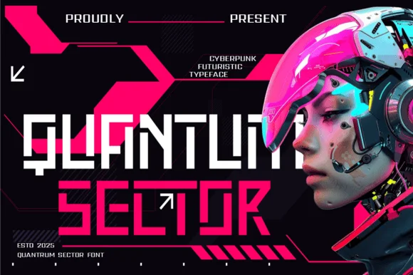
Modular stencil-cut cyberpunk & HUD techno display
Quantum Sector is a square-jawed cyberpunk techno sans featuring futuristic stencil cuts, directional arrow accents, and HUD geometry.
Ideas for this font
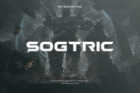
Wide geometric sans for futuristic display
Sogtric is a wide geometric sans in white caps over dark science-fiction city art: even stroke weight throughout, near-square counters and a flat-sided O that make it read as signage projected onto a night skyline rather than a text face.
Ideas for this font
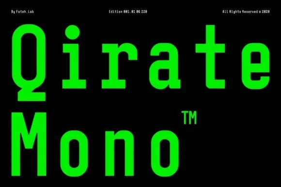
Condensed monospaced sans with square terminals
Qirate Mono is a condensed monospaced sans in neon green on black: tall narrow letters of even width, square terminals and short counters, set as two stacked words with small tracked credits in the corners.
Ideas for this font
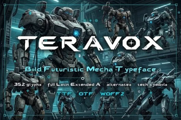
Futuristic mecha display
Teravox is a bold futuristic display in white on a mecha illustration: wide caps with cut corners, split strokes, small circular counter details and an X with a square notch, set across the plate with three tracked lines beneath listing the glyph count, the language support and the formats.
Ideas for this font
Same independent foundry
Allow optional Google Analytics to measure visits and catalogue actions. Your search words and notes are not included. Privacy & storage