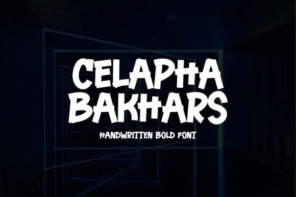
Modern Grotesque Body

Gandisient + Prime Nordic
Creates crisp high-hierarchy contrast beneath Gandisient headlines across menus, websites and labels.
Inspect Prime Nordic specimenDisclosure: MakerFileHub may earn a commission from qualifying purchases via paid links on this page. How our links work.
Tall condensed architectural & techno-editorial slab-serif
Gandisient is a towering, ultra-condensed techno-serif blending monolithic industrial vertical pillars with crisp flat bracketed serifs.
Paid link
Get this fontProject & layout blueprintsAt-a-glance maker compatibility
Crisp hairline serifs shine on stationery, foil stamping, and packaging; add slight offset for small decals.
Visual anatomy & craft review
Gandisient is an ultra-condensed techno serif that stacks monolithic vertical pillars with crisp flat bracketed serifs, so a word reads as a corporate monolith rather than a magazine headline. The extreme condensation fits a long name in a narrow column, which is its purpose, and the very narrow counters need size to stay open. It needs roughly 32 mm for the brackets to read, and it is best in white on a dark marbled ground or a single flat ink on a pale one.
Techno-editorial · Monolithic · Tall
Two-font hierarchy recipes
Tested contrast partners — pairing Gandisient with grounded secondary typography.
Gandisient + Prime Nordic
Creates crisp high-hierarchy contrast beneath Gandisient headlines across menus, websites and labels.
Inspect Prime Nordic specimen
Gandisient + Simple Handwriting
Adds a warm human signature touch for 1-to-3-word callouts without competing against structured serif capitals.
Inspect Simple Handwriting specimenPractical applications
Concrete hierarchy, scale and production guidance tailored to Gandisient’s stroke geometry.
Monolithic condensed serifs read as an institutional report, which is what a corporate publication prints. The narrow pillars fit a full company name in one column at 90 pt, and the flat brackets stay crisp in a two-colour run.
Hierarchy & layout recipe
Cover 210 x 297 mm, title 90 pt, subtitle 12/16 pt, 18 mm margins and 10 mm trim. Index column 60 mm wide, entries 9 pt on an 11 pt leading. Opener 420 x 297 mm, headline 110 mm, body 9/13 pt.
Pre-production check
An index at 9 pt in this face reads as a vertical grey ribbon and the numerals stop aligning. Set index text in a wider companion, and check one printed column at final measure.
Condensed techno serifs read as a specification plate, which is what a hardware brand prints on a carton. The narrow stance fits a model number and a version on one 60 mm edge, and the flat fill holds in one ink.
Hierarchy & layout recipe
Carton 60 x 140 x 30 mm, name 18 mm, spec 5 pt, 8 mm margins. Panel 2000 x 800 mm, word 400 mm, 150 mm margins. Label 120 x 40 mm, word 10 mm, 3 mm die margin.
Pre-production check
A 5 pt spec line in an ultra-condensed serif closes its counters and becomes a barcode a scanner cannot read. Keep fine print in a wider sans, and check one assembled carton before the order.
Monolithic serif caps read as a technical summit, which is what a winter conference prints on a banner. The pillars hold at 420 mm in vinyl, and the narrow measure fits a long event name on one line.
Hierarchy & layout recipe
Banner 3000 x 800 mm, word 420 mm, 200 mm margins with eyelets every 600 mm and 60 mm clear. Screen 1920 x 1080, word 400 px, safe area 80 percent. Badge 100 x 140 mm, name 9 mm, role 5.5 pt, 8 mm margins.
Pre-production check
A badge at 9 mm closes the narrow counters and the name reads as a solid bar on a lanyard. Use a companion face for badges, and check one printed badge at final size.
Technical & licence verification
Confirm included OTF/TTF/WOFF formats, full glyph tables and licence coverage on the live store page before batch production.
Closest visual alternatives
Matched across letterform anatomy, stroke behaviour and craft applications.
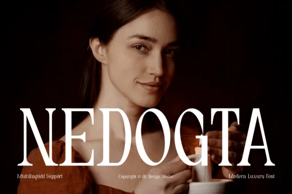
High-contrast luxury didone caps
Nedogta is a modern luxury didone in white over a portrait: very high contrast caps with hairline serifs, a narrow waist on the stems, and tight tracking, so the name reads as a fashion masthead laid across a photograph.
Ideas for this font

Flamboyant coiled-swash couture editorial serif
Alerigue is a high-contrast luxury editorial serif distinguished by dramatic coiled spiral terminals and sweeping calligraphic ascender loops.
Ideas for this font

Art-Nouveau ligature & celestial-sparkle editorial serif
Resquel is an expressive high-contrast editorial serif featuring sweeping ribbon under-tails, interlocked ligatures, and star-sparkle counters.
Ideas for this font

Crisp contemporary editorial serif duo (Regular + Italic, OTF/TTF/WOFF)
Svara is a sharp modern editorial serif family pairing an upright Regular with a lively true Italic across OTF, TTF & WOFF formats!
Ideas for this font
Same independent foundry
Allow optional Google Analytics to measure visits and catalogue actions. Your search words and notes are not included. Privacy & storage