High-Contrast Display Serif

Chronex + Vanielst Elegant Serif Display Stylistic
Pairs sculptural editorial warmth with Chronex's clean modern geometry.
Inspect Vanielst Elegant Serif Display Stylistic specimenDisclosure: MakerFileHub may earn a commission from qualifying purchases via paid links on this page. How our links work.
Towering ultra-condensed industrial sci-fi block sans
Chronex is an imposing, ultra-condensed sci-fi sans serif built with heavy monolithic pillars and chamfered geometric corners.
Paid link
Get this fontProject & layout blueprintsAt-a-glance maker compatibility
Sturdy stroke walls and open counters weed cleanly on adhesive vinyl, HTV apparel film, and cut cardstock.
Visual anatomy & craft review
Chronex is a towering ultra-condensed industrial sans: very narrow squared stems, a tall cap height, a small flat notch cut into the shoulders and a machined regularity that reads as stencilled steel. The condensation packs a long word into a tall block, and the notch is the only detail, so it vanishes when the face shrinks. It needs roughly 24 mm for the notch and the squared corner to read, and it is best in one dense ink on metal-grey stock, or a single white on a dark ground where the notch prints as a cut.
Monolithic · Sci-fi · Armored
Two-font hierarchy recipes
Tested contrast partners — pairing Chronex with grounded secondary typography.
Chronex + Vanielst Elegant Serif Display Stylistic
Pairs sculptural editorial warmth with Chronex's clean modern geometry.
Inspect Vanielst Elegant Serif Display Stylistic specimen
Chronex + Coastal Honey
Introduces organic movement on pull-quotes, signatures and gift tags.
Inspect Coastal Honey specimenPractical applications
Concrete hierarchy, scale and production guidance tailored to Chronex’s stroke geometry.
An ultra-condensed sans stacks a long project title in a narrow column that a wider face could not hold. The notch holds at 26 pt, and the tall cap height keeps a two-line title inside a tight grid.
Hierarchy & layout recipe
Cover 210 x 297 mm, title 26 pt over two lines with 6 mm notch clearance, body 9/13 pt in two columns of 82 mm, 18 mm margins. Data table 8/11 pt with 40 mm columns.
Pre-production check
At 8 pt in the data table the notch fills and the figures read as a solid column. Set tables in the body face and keep the display at 20 pt and above, then proof one page at 1:1.
A condensed industrial sans reads as a machined plate rather than a printed logo, which is what a fabrication studio wants at its door. The stems hold at 20 mm on a card, and one ink prints the plate and the card in one order.
Hierarchy & layout recipe
Door plate 300 x 80 mm, word 40 mm with 8 mm notch clearance, 10 mm margins. Card 85 x 55 mm, word 18 mm, 5 mm margins. Letterhead 210 x 297 mm, word 26 mm, 20 mm margins.
Pre-production check
On an 85 x 55 mm card the condensed stems fill the counters and the name reads as a barcode. Raise the card word to 22 mm, and check one card before the run.
A tall condensed sans fits a long stall name on a narrow board, which is what a winter market actually needs. The tall caps hold at 60 mm on a board, and one white ink prints the board from a dark ground.
Hierarchy & layout recipe
Board 600 x 900 mm, word 100 mm with 12 mm notch clearance, items 26 mm, 30 mm margins. Price card 105 x 75 mm, item 18 mm, price 24 mm. Bag print 200 x 250 mm, word 50 mm, 15 mm margins.
Pre-production check
A 105 x 75 mm price card at 18 mm loses the notch and the item reads as a plain bar in low winter light. Raise the item to 24 mm, and check one card under the market lamp.
Technical & licence verification
Confirm included OTF/TTF/WOFF formats, full glyph tables and licence coverage on the live store page before batch production.
Closest visual alternatives
Matched across letterform anatomy, stroke behaviour and craft applications.
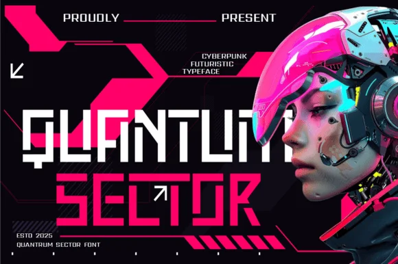
Modular stencil-cut cyberpunk & HUD techno display
Quantum Sector is a square-jawed cyberpunk techno sans featuring futuristic stencil cuts, directional arrow accents, and HUD geometry.
Ideas for this font
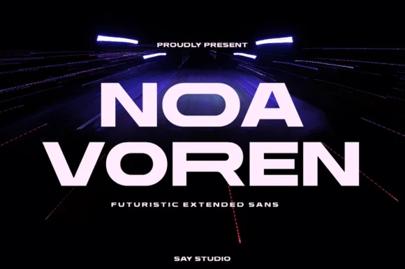
Wide extended futuristic & aerospace display grotesk
Noa Voren is a bold, wide-stance extended sans serif featuring stretched horizontal proportions and subtle speed-sliced diagonal cuts.
Ideas for this font
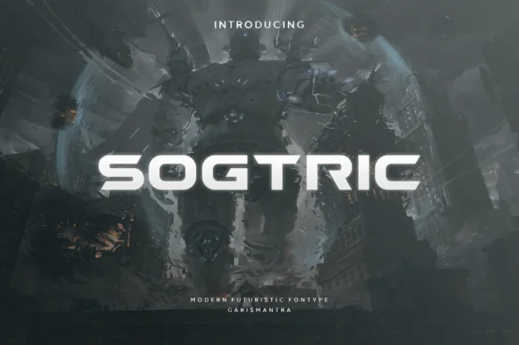
Wide geometric sans for futuristic display
Sogtric is a wide geometric sans in white caps over dark science-fiction city art: even stroke weight throughout, near-square counters and a flat-sided O that make it read as signage projected onto a night skyline rather than a text face.
Ideas for this font
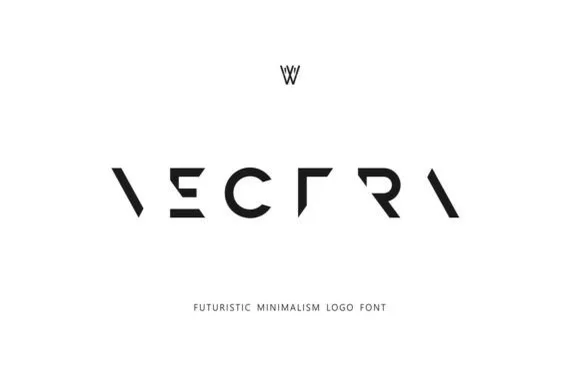
Deconstructed minimalist stencil & puzzle logo font
Vectra is an experimental futuristic logo font that strips each capital down to minimalist geometric strokes and negative-space angles.
Ideas for this font
Same independent foundry
Allow optional Google Analytics to measure visits and catalogue actions. Your search words and notes are not included. Privacy & storage