Editorial Serif Anchor

Bible + Raffined
Anchors Bible's fluid strokes with crisp Roman proportions on wedding suites, headers and packaging.
Inspect Raffined specimenDisclosure: MakerFileHub may earn a commission from qualifying purchases via paid links on this page. How our links work.
Deeply shaded upright brush-pen calligraphy script
Bible (by YanStudio) is a smooth, deeply shaded upright brush script with tall oval loops and clean, balanced baseline rhythm.
Paid link
Get this fontProject & layout blueprintsAt-a-glance maker compatibility
Weld or Unite overlapping script joins into one continuous vector path before sending to the blade.
Visual anatomy & craft review
Bible is a deeply shaded upright brush calligraphy script with tall oval loops, thick vertical downstrokes and crisp hairline upstrokes, held to a calm rhythm rather than a bouncy one. The upright stance keeps it formal enough for a devotional cover, while the brush shading stops it from reading as copperplate. Contrast is strong, so the face wants about 20 mm before the hairlines hold, and it behaves best as a title or a name. The ending swash on the final letter gives a phrase a settled close, which is unusually useful for book titles.
Classic-brush · Poised · Bold
Two-font hierarchy recipes
Tested contrast partners — pairing Bible with grounded secondary typography.
Bible + Raffined
Anchors Bible's fluid strokes with crisp Roman proportions on wedding suites, headers and packaging.
Inspect Raffined specimen
Bible + Borsen
Keeps small-scale dates, URLs, nutrition facts and care instructions crisp and legible below script titles.
Inspect Borsen specimenPractical applications
Concrete hierarchy, scale and production guidance tailored to Bible’s stroke geometry.
Upright shaded brush reads as a considered inscription rather than festive decoration, which separates a devotional title from the Christmas shelf. Steady rhythm keeps a long subtitle readable beneath a large word.
Hierarchy & layout recipe
Cover 135 x 216 mm, title 40 pt, subtitle 14 pt, 15 mm margins. Journal 145 x 210 mm, foil title 26 mm, 20 mm margins. Print 300 x 400 mm, word 70 mm, 40 mm margins.
Pre-production check
Deep brush shading under gold foil bridges the hairline upstrokes, so the word looks like a solid bar. Specify flat foil without fine detail, or keep the hairline contrast for ink printing and use blind emboss on the journal.
A formal upright script suits a confirmation or a milestone of faith, where warmth matters but decoration does not. The settled final swash gives a short phrase a proper end.
Hierarchy & layout recipe
Card 120 x 170 mm, greeting 22 mm, message 8/12 pt, 14 mm margins. Box lid 180 x 120 mm, name 18 mm, engraved 0.3 mm deep. Tote panel 280 x 280 mm, verse 40 mm, 25 mm to the seam.
Pre-production check
Laser engraving on a wooden box lid burns about 0.2 mm wider than the file, closing hairline upstrokes. Test one lid, and engrave the name without the swash if the joins merge.
The upright brush script carries ceremony weight without the copperplate look used at every wedding, which helps a couple who want tradition with a lighter hand. Strong shading reads at 12 pt on a folded programme.
Hierarchy & layout recipe
Programme A5, names 22 mm, order of service 9/12 pt, 15 mm margins. Ring box lid 80 x 80 mm, initials 16 mm engraved. Card 105 x 148 mm, blessing 16 mm, message 8/12 pt.
Pre-production check
Programmes are folded and stapled, and a swash crossing the fold cracks along the spine. Keep the names 15 mm above the fold, score before folding, and check one stapled copy for ink loss.
Technical & licence verification
Confirm included OTF/TTF/WOFF formats, full glyph tables and licence coverage on the live store page before batch production.
Closest visual alternatives
Matched across letterform anatomy, stroke behaviour and craft applications.
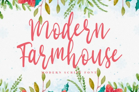
Monoline brush script with bouncy baseline
Modern Farmhouse is a monoline brush script in coral on a watercolour wash: rounded strokes of even weight, tall looping ascenders on the M and the F, and a bouncing baseline that lifts and falls through both words.
Ideas for this font
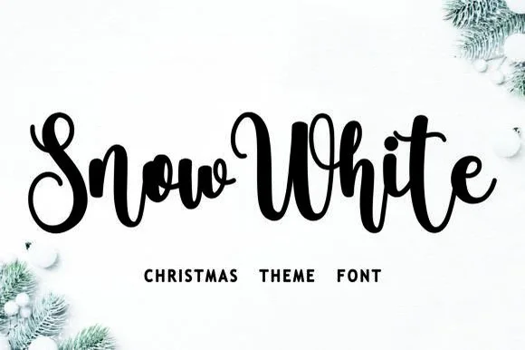
Bouncy Christmas script
Snow White is a Christmas script in black on a snowy white ground: a connected monoline hand with a pronounced bounce, tall loops on the S and the h, and a w in the first word that lifts above the cap line, framed by fir branches and baubles.
Ideas for this font
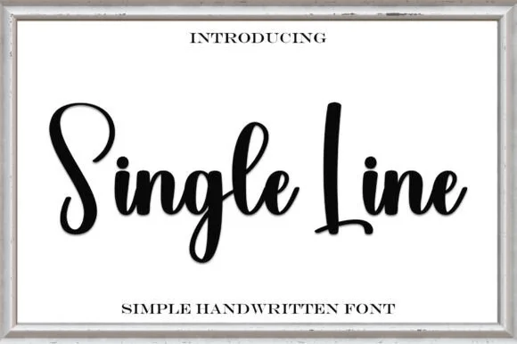
Monoline signature script
Single Line is a monoline signature script in heavy black on cream: a thick even stroke, tall open loops, blunt entry and exit points, a slight forward slant and a bounce across the two words, with a tracked caption beneath in a small roman.
Ideas for this font
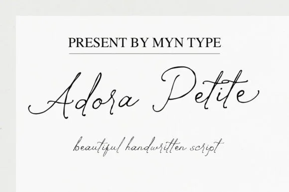
Fine coiled-loop classical & modern handwritten script (OTF & TTF)
Adora Petite is a delicate, airy handwritten calligraphy script accented with petite inward-coiled spiral tips on capitals and terminal hooks.
Ideas for this font
Same independent foundry
Allow optional Google Analytics to measure visits and catalogue actions. Your search words and notes are not included. Privacy & storage