Editorial Serif Anchor

Easter + Bulgary
Anchors Easter's fluid strokes with crisp Roman proportions on wedding suites, headers and packaging.
Inspect Bulgary specimenDisclosure: MakerFileHub may earn a commission from qualifying purchases via paid links on this page. How our links work.
Tall slender watercolor-card monoline print
Easter (by Natchuta) is a tall, airy monoline handwritten print font built for sweet spring greeting cards, planners, and Cricut Pen drawing.
Paid link
Get this fontProject & layout blueprintsAt-a-glance maker compatibility
Weld or Unite overlapping script joins into one continuous vector path before sending to the blade.
Visual anatomy & craft review
Easter is a tall, airy monoline print in caps, drawn with a single even stroke and generous spacing so a word reads as written with a fine pen rather than typeset. Because the stroke never varies, the face plots from a Cricut pen in one pass, prints cleanly at 10 mm on a card and holds up at 60 mm on a sign without thickening. The narrow proportions let a long greeting fit a single line in a portrait card, and the open counters keep small sizes crisp. It is a quiet, decorative hand for cards, planners and tags, not a face for dense copy.
Delicate-spring · Tall-monoline · Calm
Two-font hierarchy recipes
Tested contrast partners — pairing Easter with grounded secondary typography.
Easter + Bulgary
Anchors Easter's fluid strokes with crisp Roman proportions on wedding suites, headers and packaging.
Inspect Bulgary specimen
Easter + Cenura
Keeps small-scale dates, URLs, nutrition facts and care instructions crisp and legible below script titles.
Inspect Cenura specimenPractical applications
Concrete hierarchy, scale and production guidance tailored to Easter’s stroke geometry.
A slender monoline reads as a greeting written by hand, which is what a spring card is competing on. Narrow capitals keep a two-word greeting on one line inside a portrait card.
Hierarchy & layout recipe
Card 105 x 148 mm, greeting 14 mm caps, message 7/10 pt in a plain sans, 12 mm margins. Label 60 x 40 mm, word 8 mm, 4 mm die margin. Sign 400 x 600 mm, word 60 mm, 40 mm margins.
Pre-production check
A monoline printed at 14 mm on a textured card fills into the fibre and the stroke looks uneven. Print one card on the intended stock, and if the line mottles, move the greeting to a smooth card and keep the texture for the envelope.
Thin caps read as a teacher's careful labels rather than decoration, and the plotter-friendly stroke lets a school make tags without a printer. The even weight survives lamination.
Hierarchy & layout recipe
Display letters 60 mm caps on 160 gsm, 30 mm margins, 50 mm pitch. Name tags 80 x 30 mm, name 8 mm, 3 mm border. Log header 18 pt on a ruled A4 sheet with 8 mm lines.
Pre-production check
Laminating a thin monoline behind a glossy film creates glare that hides the stroke. Use a matt laminate for anything displayed at a child's eye level, and check one laminated tag under classroom lighting.
A quiet hand suits a thank-you that should not shout, and the monoline holds at 9 mm on a small tag where a brush script would vanish. Narrow caps fit a full name inside a certificate line.
Hierarchy & layout recipe
Card 105 x 148 mm, greeting 12 mm, message 7/10 pt, 12 mm margins. Tag 45 x 80 mm, name 8 mm, hole 5 mm clear. Certificate A4 landscape, name 16 mm, body 10/14 pt.
Pre-production check
Certificates are printed on 160 to 200 gsm and rolled, and a thin monoline scuffs along the roll edge. Print one copy, roll and unroll it, and inspect the greeting before the run.
Technical & licence verification
Confirm included OTF/TTF/WOFF formats, full glyph tables and licence coverage on the live store page before batch production.
Closest visual alternatives
Matched across letterform anatomy, stroke behaviour and craft applications.
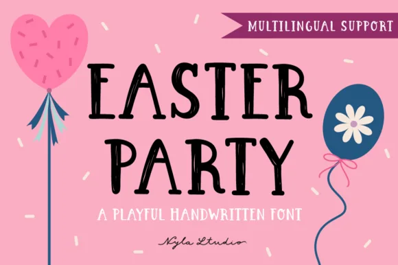
Playful tapered-marker spring classroom print (Multilingual)
Easter Party is a crisp, upbeat handwritten marker font with gently flared stems, cute crossbar bounce, and full multilingual support.
Ideas for this font
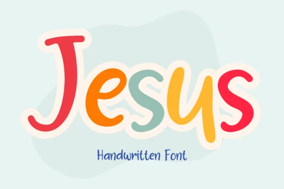
Chunky joyful rainbow-pastel disconnected marker print (NOT cursive!)
Jesus (by Brown Cupple Fonts) is actually a plump, cheerful disconnected marker print font (zero cursive joins!) built for VBS, Sunday school, and kids' stickers!
Ideas for this font
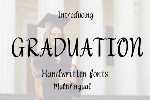
Tall whimsical spiral-hooked disconnected display (Multilingual)
Graduation (by Bassoonartwork) is a tall, whimsical disconnected handwritten font (NOT a heavy slab!) tipping slender capitals with cute inward spiral curls (Multilingual)!
Ideas for this font
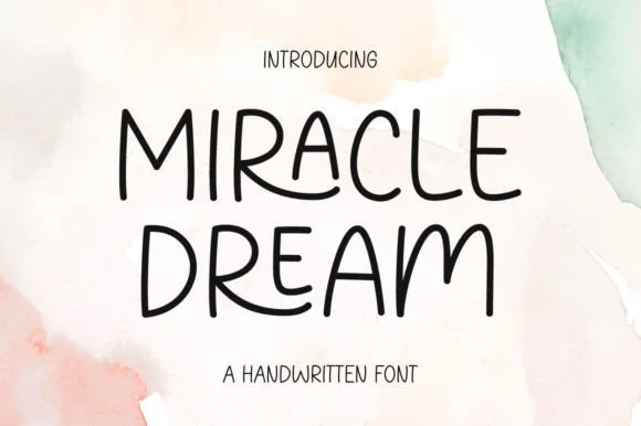
Rounded handwritten capitals with playful variants
Miracle Dream is a handwritten face in black on watercolour washes: rounded monoline capitals with playful variants, a tall waist, uneven heights and no joins, set as two stacked words with a tracked line beneath.
Ideas for this font
Same independent foundry
Allow optional Google Analytics to measure visits and catalogue actions. Your search words and notes are not included. Privacy & storage