Neutral Sans Workhorse

Whitechalk + Miniplate
Lets Whitechalk own the focal silhouette while handling secondary copy, sizing and subheads cleanly.
Inspect Miniplate specimenDisclosure: MakerFileHub may earn a commission from qualifying purchases via paid links on this page. How our links work.
Tall slab-serifed chalkboard font shaded with diagonal chalk hatch
Whitechalk is a tall, structured chalkboard display font pairing crisp slab-serifed outlines with diagonal white-chalk interior shading.
Paid link
Get this fontProject & layout blueprintsAt-a-glance maker compatibility
Fine grain and micro-texture excel in 300 DPI print, sublimation, and screen print rather than small vinyl weeding.
Visual anatomy & craft review
Whitechalk is a tall display alphabet that pairs slab-serifed outlines with diagonal chalk hatching inside the strokes, so a word looks drawn on a board with a squared chalk stub rather than printed with a chalk texture. The serifs give the letters structure, which keeps a long heading legible at a distance, and the hatch density is even enough that it survives being seen from across a room. It needs roughly 25 mm before the hatch reads as chalk rather than as grey fill, and it works best in white on a slate or green ground.
Serifed-chalk · Classroom-slate · Neat
Two-font hierarchy recipes
Tested contrast partners — pairing Whitechalk with grounded secondary typography.
Whitechalk + Miniplate
Lets Whitechalk own the focal silhouette while handling secondary copy, sizing and subheads cleanly.
Inspect Miniplate specimen
Whitechalk + Amor Hadena
Grounds bold display lettering with classic typographic authority on posters, badges and apparel.
Inspect Amor Hadena specimenPractical applications
Concrete hierarchy, scale and production guidance tailored to Whitechalk’s stroke geometry.
Squared chalk hatching reads as a board written before a lesson, which is the register a teacher's presentation wants. Slab serifs hold a long heading legible on a projector blown up to 100 inches.
Hierarchy & layout recipe
Slide 1920 x 1080 px, title 140 px cap-height, 120 px margins, body 40 px in a plain sans. Syllabus header 30 pt on a 12 mm baseline. Poster A2, heading 120 mm, details 24/30 pt, 30 mm margins.
Pre-production check
Projectors wash out a mid-grey fill and the hatching disappears entirely at low brightness. Check one slide on the actual classroom projector, and if it greys out, use white with a dark ground rather than a hatch on light.
A chalk-look headline gives a café a permanent board that still looks freshly written, which saves re-lettering every morning. Tall slab forms fit a column of drinks without wrapping.
Hierarchy & layout recipe
Board 600 x 900 mm, header 110 mm, items 40 mm on a 60 mm pitch, 45 mm margins. Bakery sign 900 x 300 mm, word 140 mm. Specials panel 400 x 300 mm, header 60 mm, chalk area 320 x 200 mm clear.
Pre-production check
A printed chalk-look header sits beside real chalk writing, and any tonal mismatch makes the print look dirty. Test a chalk sample on the printed surface before the board is finished, and match the white rather than the texture.
Chalk hatching suits a seasonal menu that changes often, because the printed header carries the look while the detail is written by hand. White lines on dark ground stay readable in low winter light.
Hierarchy & layout recipe
Board 500 x 700 mm, header 90 mm, six items at 34 mm, 40 mm margins. Market sign 800 x 400 mm, word 120 mm, 60 mm margins. Library display 900 x 600 mm, heading 100 mm, 50 mm margins.
Pre-production check
Winter boards are often placed near a door where condensation dulls a laminated print. Use a matt anti-glare laminate on interior panels, and mount outdoor panels on foamex rather than card.
Technical & licence verification
Confirm included OTF/TTF/WOFF formats, full glyph tables and licence coverage on the live store page before batch production.
Closest visual alternatives
Matched across letterform anatomy, stroke behaviour and craft applications.
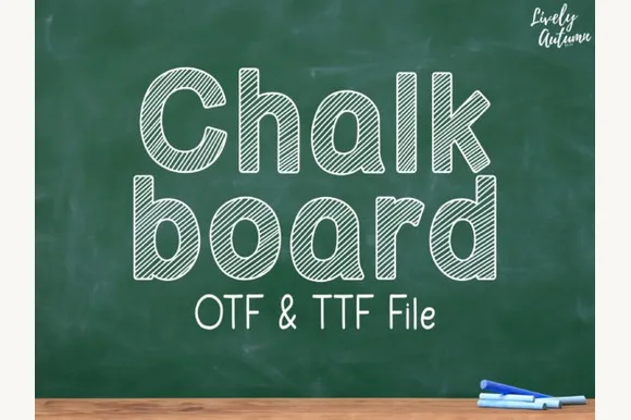
Neat rounded mixed-case font striped with parallel sketch lines (OTF & TTF)
Chalkboard (by LivelyAutumn 11.11) is a tidy, rounded mixed-case classroom font filled inside clean outlines with even diagonal sketch stripes (OTF & TTF).
Ideas for this font
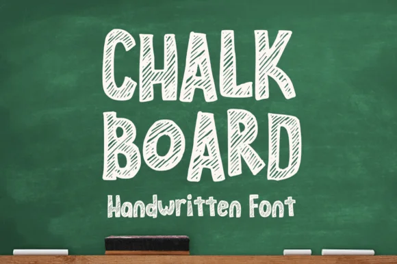
Hollow-outlined cartoon block font hatched with diagonal chalk lines
Chalkboard (by MVMET) is a cheerful classroom display font outlining bouncy uppercase/lowercase blocks filled with diagonal chalk-sketch stripes.
Ideas for this font
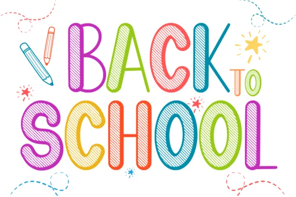
Tall playful rainbow-crayon & chalk-hatched school display
Back to School is a tall, lively classroom display font outlining narrow hand-drawn capitals filled with multi-angle colored-pencil/chalk hatching.
Ideas for this font
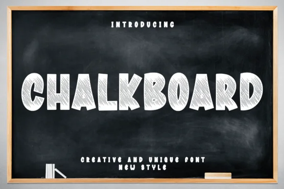
Chunky comic-block display shaded with dense chalk strokes
Chalkboard (by andikastudio) is a wide, chunky cartoon-block display font densely shaded inside with diagonal white-chalk strokes.
Ideas for this font
Allow optional Google Analytics to measure visits and catalogue actions. Your search words and notes are not included. Privacy & storage