Neutral Sans Workhorse

Chalkboard + Cultivo
Lets Chalkboard own the focal silhouette while handling secondary copy, sizing and subheads cleanly.
Inspect Cultivo specimenDisclosure: MakerFileHub may earn a commission from qualifying purchases via paid links on this page. How our links work.
Hand-shaded classroom chalk capitals with hatched texture
Chalkboard is a classroom display alphabet in capitals, drawn with a hatched interior so each stroke reads as chalk dragged across a board rather than a solid fill.
Paid link
Get this fontProject & layout blueprintsAt-a-glance maker compatibility
Fine grain and micro-texture excel in 300 DPI print, sublimation, and screen print rather than small vinyl weeding.
Visual anatomy & craft review
Every letter is built from clean geometric shapes and then textured with diagonal hatching inside the stroke: the C is a wide open crescent, the H is two stems and a bar, the A closes to a rounded apex and the K splays two arms from a single stem. Weight is uniform across the word, and the corners are slightly rounded, as if drawn with the flat end of a chalk stick. Because the texture sits inside the letters rather than on their edges, a word still resolves as solid at a distance and becomes grainy only up close, which is what makes the face work for a sign and for a label. Counters are wide and open. The green board, the timber frame and the small caption lines in the sample are presentation; the lettering is the words.
Chalk · Hatched · Classroom
Two-font hierarchy recipes
Tested contrast partners — pairing Chalkboard with grounded secondary typography.
Chalkboard + Cultivo
Lets Chalkboard own the focal silhouette while handling secondary copy, sizing and subheads cleanly.
Inspect Cultivo specimen
Chalkboard + Aureline
Grounds bold display lettering with classic typographic authority on posters, badges and apparel.
Inspect Aureline specimenPractical applications
Concrete hierarchy, scale and production guidance tailored to Chalkboard’s stroke geometry.
The hatched fill reads as chalk at a glance, and because the texture sits inside the strokes the heading still reads from the back of a classroom where a light script would fail.
Hierarchy & layout recipe
Set the heading at 60 pt on an A2 notice, keep the details in a plain 14 pt sans, and hold 25 mm between the heading and the first line of the notice.
Pre-production check
Photocopied notices thin a hatched fill unevenly; print one copy on the classroom machine and confirm the letters still read as solid shapes.
Chalk-style caps fit the classroom register and the solid skeleton stays legible on a small label where a textured script would clot.
Hierarchy & layout recipe
Set the subject name at 16 pt on a 60 by 25 mm label, keep the teacher's name at 7 pt, and leave 4 mm of margin so the rounded corners stay inside the cut.
Pre-production check
Labels on plastic trays peel at the corners; print a sheet, apply one to a real tray and check the hachure survives the edge trim.
The hand-shaded caps carry the school register in a warm way, and the open counters keep a short message readable at the size of a small card.
Hierarchy & layout recipe
Set the message at 20 pt on a 105 by 148 mm card, keep the class and year in a 7 pt sans beneath it, and leave the lower half of the card clear for a handwritten note.
Pre-production check
Cards that go into a school bag crease; print on a heavier card and check the hatched fill does not crack along the fold.
Technical & licence verification
Confirm included OTF/TTF/WOFF formats, full glyph tables and licence coverage on the live store page before batch production.
Closest visual alternatives
Matched across letterform anatomy, stroke behaviour and craft applications.
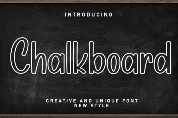
Hollow outlined school print with rounded counters and even strokes
Chalkboard is a clean hollow-outline print in which every letter is drawn as a double contour, so a word reads as chalk lettering on a board without the texture of real chalk.
Ideas for this font
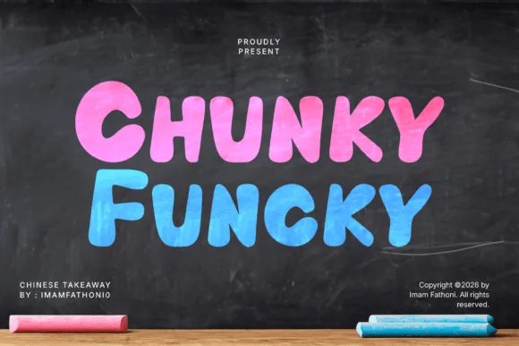
Extra-heavy bouncy block with chalk texture and rounded corners
Chunky Funky is an extra-heavy block alphabet with a chalk texture, rounded corners and a bounce across the baseline, so a word reads as something drawn thick on a blackboard.
Ideas for this font
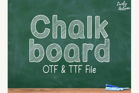
Neat rounded mixed-case font striped with parallel sketch lines (OTF & TTF)
Chalkboard (by LivelyAutumn 11.11) is a tidy, rounded mixed-case classroom font filled inside clean outlines with even diagonal sketch stripes (OTF & TTF).
Ideas for this font
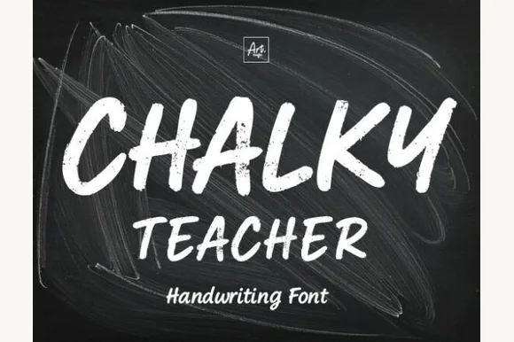
Streaky dust-textured blackboard chalk marker font
Chalky Teacher is an authentic blackboard handwritten font streaked internally with realistic dry-chalk grain across bold slanted strokes.
Ideas for this font
Allow optional Google Analytics to measure visits and catalogue actions. Your search words and notes are not included. Privacy & storage