Modern Grotesque Body

Chalk Varsity + Taught
Creates crisp high-hierarchy contrast beneath Chalk Varsity headlines across menus, websites and labels.
Inspect Taught specimenDisclosure: MakerFileHub may earn a commission from qualifying purchases via paid links on this page. How our links work.
Diagonal chalk-hatched varsity slab with a rough fill
Chalk Varsity is a varsity slab alphabet in which the letters are hatched diagonally as if drawn with chalk, the slabs stay flat and the fill is rough, so a word reads as a school board sign.
Paid link
Get this fontProject & layout blueprintsAt-a-glance maker compatibility
Fine grain and micro-texture excel in 300 DPI print, sublimation, and screen print rather than small vinyl weeding.
Visual anatomy & craft review
The C opens a wide crescent with a flat slab, the H keeps two even stems, the A carries a low crossbar and the Y forks with chalk lines running through every stroke, all at a heavy even weight with unbracketed slabs. The hatching is the character: the lines run in one direction at a consistent angle and stop short of the contour, which is what keeps the face reading as drawn rather than as textured print. Because the hatch is fine, the face needs 30 pt minimum and belongs on classroom and gym applications. The green chalkboard ground, the white chalk, the small doodles and the two caption lines are presentation; the slab face is the two words.
Chalk-shaded · Collegiate · Nostalgic
Two-font hierarchy recipes
Tested contrast partners — pairing Chalk Varsity with grounded secondary typography.
Chalk Varsity + Taught
Creates crisp high-hierarchy contrast beneath Chalk Varsity headlines across menus, websites and labels.
Inspect Taught specimen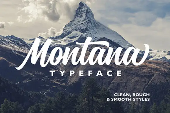
Chalk Varsity + Montana
Adds a warm human signature touch for 1-to-3-word callouts without competing against structured serif capitals.
Inspect Montana specimenPractical applications
Concrete hierarchy, scale and production guidance tailored to Chalk Varsity’s stroke geometry.
The hatched slabs read as chalk lettering at 30 mm, and the face gives a printed sign the look of a real board without the dust.
Hierarchy & layout recipe
Print a 250 by 100 mm door sign: set the class name at 30 mm, set the room number in a 12 mm slab at the right, and keep 12 mm of margin so the hatch fill is not cut by the plate edge.
Pre-production check
Hatch lines under 0.5 mm fill in on a matte print; check the proof and keep the face above 28 mm on paper.
The varsity weight reads at 15 cm from the field, and the chalk hatching gives a printed banner the look of a hand-lettered board.
Hierarchy & layout recipe
Print a 2 by 0.6 m banner: set the event name at 15 cm, set the date in a 5 cm slab below, and keep 12 cm of clear banner at each end so the eyelets fall on blank ground.
Pre-production check
Banner vinyl holds a hatch fill well but fades in sun; check an installed banner after a season and print a larger hatch if it greys out.
The hatched slabs hold at 14 pt on a printed cover, and the chalk treatment ties a stationery item to the classroom register.
Hierarchy & layout recipe
Print a 60 by 90 mm cover label: set the subject at 14 pt, set the pupil's name in a 6 pt sans beneath, and keep 5 mm of margin so the hatch is not cut by the rounded corner of the label.
Pre-production check
A hatch at 14 pt reads as a broken fill; check the printed label and use a plain slab cut on small stationery.
Technical & licence verification
Confirm included OTF/TTF/WOFF formats, full glyph tables and licence coverage on the live store page before batch production.
Closest visual alternatives
Matched across letterform anatomy, stroke behaviour and craft applications.
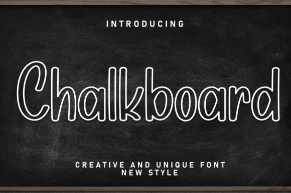
Hollow outlined school print with rounded counters and even strokes
Chalkboard is a clean hollow-outline print in which every letter is drawn as a double contour, so a word reads as chalk lettering on a board without the texture of real chalk.
Ideas for this font
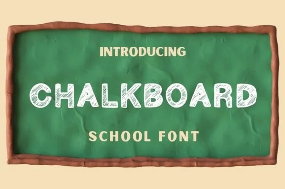
Hand-shaded classroom chalk capitals with hatched texture
Chalkboard is a classroom display alphabet in capitals, drawn with a hatched interior so each stroke reads as chalk dragged across a board rather than a solid fill.
Ideas for this font
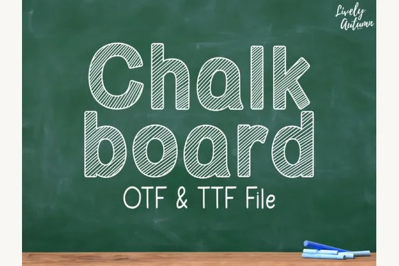
Neat rounded mixed-case font striped with parallel sketch lines (OTF & TTF)
Chalkboard (by LivelyAutumn 11.11) is a tidy, rounded mixed-case classroom font filled inside clean outlines with even diagonal sketch stripes (OTF & TTF).
Ideas for this font
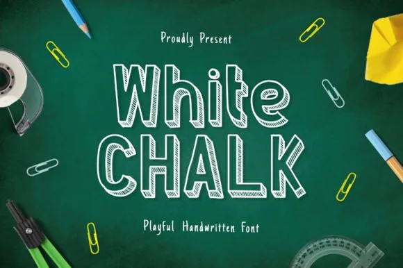
Tall slab-serifed chalkboard font shaded with diagonal chalk hatch
Whitechalk is a tall, structured chalkboard display font pairing crisp slab-serifed outlines with diagonal white-chalk interior shading.
Ideas for this font
Same independent foundry
Allow optional Google Analytics to measure visits and catalogue actions. Your search words and notes are not included. Privacy & storage