Modern Grotesque Body

Harven Christmas + Prime Nordic
Creates crisp high-hierarchy contrast beneath Harven Christmas headlines across menus, websites and labels.
Inspect Prime Nordic specimenDisclosure: MakerFileHub may earn a commission from qualifying purchases via paid links on this page. How our links work.
High-contrast festive serif with curling swashes
Harven Christmas is an upright high-contrast serif whose long swashes curl above the first line, below the second and across the space between the two words.
Paid link
Get this fontProject & layout blueprintsAt-a-glance maker compatibility
Crisp hairline serifs shine on stationery, foil stamping, and packaging; add slight offset for small decals.
Visual anatomy & craft review
Hairlines are very fine against thick stems, with sharp bracketed serifs and a tall narrow waist, so the face reads as a classic roman until the swashes arrive. Those swashes start at the first and last letters and travel in wide arcs, crossing the space between words, which means the lockup needs deliberate vertical room rather than default leading. Two lines are used in the sample: the upper line sets one word in mixed case with its swash rising, the lower line lets a descender curl below the baseline. The pale photograph behind the specimen is context only. At small sizes the hairlines thin out much faster than the swashes do.
Festive · Elegant · Curled
Two-font hierarchy recipes
Tested contrast partners — pairing Harven Christmas with grounded secondary typography.
Harven Christmas + Prime Nordic
Creates crisp high-hierarchy contrast beneath Harven Christmas headlines across menus, websites and labels.
Inspect Prime Nordic specimen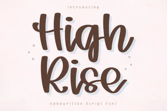
Harven Christmas + High Rise
Adds a warm human signature touch for 1-to-3-word callouts without competing against structured serif capitals.
Inspect High Rise specimenPractical applications
Concrete hierarchy, scale and production guidance tailored to Harven Christmas’s stroke geometry.
The roman structure keeps a formal invitation formal while the swashes supply the seasonal gesture inside the same typeface.
Hierarchy & layout recipe
Set the names or event line at 32 pt with 1.4 line spacing so the upper swash clears the line above, and keep the details in a small caps sans at 9 pt.
Pre-production check
Proof the hairlines at final size, because ink spread on uncoated card can close them and letterpress needs a heavier impression than you expect.
A high-contrast serif reads as engraved at small sizes, and a single curl gives a plain name card one point of interest without a border.
Hierarchy & layout recipe
Keep the name at 16 pt on a 90 by 50 mm card, add a swash letter at one end only, and leave 8 mm below the baseline so the descending curl never meets the table number.
Pre-production check
The descending curl is the first element a trimmer will clip, so keep it well inside the safe area.
The face can carry a magazine opener's headline and a decorative flourish in one setting without a second typeface or a rule.
Hierarchy & layout recipe
Set the headline at 48 pt in a single column, allow the swash to occupy the outer third of the measure, and start body copy two lines below the lowest curl.
Pre-production check
Long swashes on a narrow measure collide with the following column, so set the measure first and then choose the words.
Technical & licence verification
Confirm included OTF/TTF/WOFF formats, full glyph tables and licence coverage on the live store page before batch production.
Closest visual alternatives
Matched across letterform anatomy, stroke behaviour and craft applications.
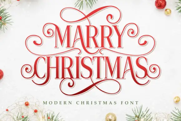
Narrow festive serifs with tall proportions and extended curled loops
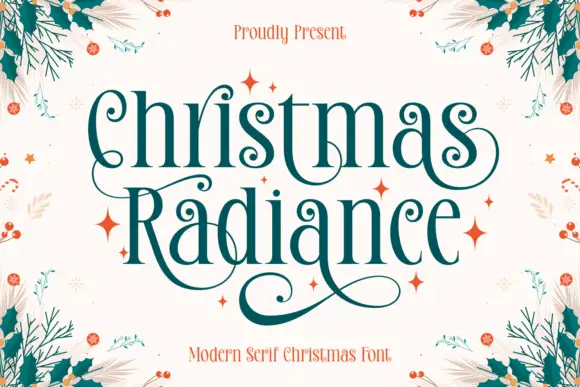
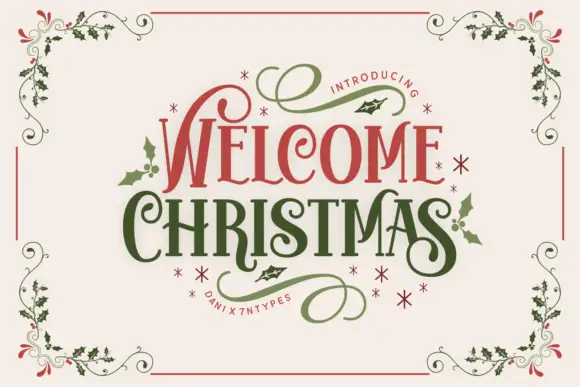
Marry Christmas is a narrow festive serif in which the letters run tall and lean, the capitals carry extended loops and the descenders curl into long tails, so a greeting reads as an engraved seasonal plate.
Ideas for this font
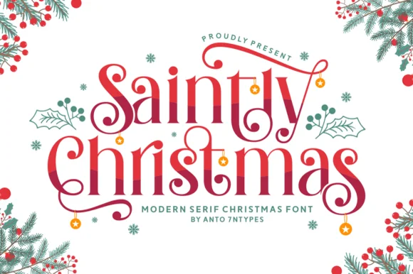
Swashed romantic holiday display serif with dangling ornaments
Saintly Christmas is a festive display serif in which the capitals throw long swashes, the serifs are fine and small ornaments hang from the ends, so a greeting reads as a decorated holiday plate.
Ideas for this font
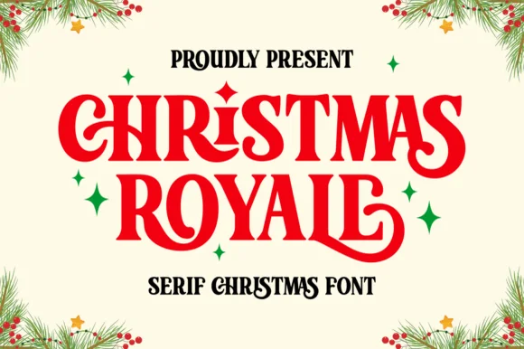
Ornate Christmas serif with curled stems and sparkle ornaments
Christmas Royale is an ornate serif display in which the stems curl at the foot, a few letters carry a dropped swash and the bars hold drawn diamonds, so a two-word greeting reads as engraved seasonal stationery.
Ideas for this font
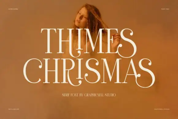
High-contrast display serif
Thimes Christmas is a high-contrast display serif in cream over a warm portrait photograph: very fine hairlines, tall stems, sharp bracketed serifs and small ball terminals, set in two lines with tracked labels at the corners naming the studio and the language support.
Ideas for this font
Same independent foundry
Allow optional Google Analytics to measure visits and catalogue actions. Your search words and notes are not included. Privacy & storage