Editorial Serif Anchor

Cold Snowfall + Brenco
Anchors Cold Snowfall's fluid strokes with crisp Roman proportions on wedding suites, headers and packaging.
Inspect Brenco specimenDisclosure: MakerFileHub may earn a commission from qualifying purchases via paid links on this page. How our links work.
Textured slanted seasonal brush script
Cold Snowfall is a slanted thick-thin seasonal script whose dark strokes look worn at the edges, whose tittles are drawn as snowflakes and whose tall f and l loops crowd the centre line.
Paid link
Get this fontProject & layout blueprintsAt-a-glance maker compatibility
Weld or Unite overlapping script joins into one continuous vector path before sending to the blade.
Visual anatomy & craft review
The C begins with a wide curled entry hook and the S opens into a shallow bowl, while the tall f and l loops in the second word crowd the centre of the line and leave only a narrow gap between them. Weight shifts noticeably inside single strokes, which is what gives the lettering a brushed rather than a drawn feel, and the stroke edges carry a fine speckled texture instead of a clean contour. Snowflake marks sit in place of dots, and the small round badge after the last letter is part of the cover composition rather than an ornament you can type. A lighter sub-line names the style in the same family and confirms that the seasonal intent comes from the ornaments, not the letterforms.
Weathered · Curled · Festive
Two-font hierarchy recipes
Tested contrast partners — pairing Cold Snowfall with grounded secondary typography.
Cold Snowfall + Brenco
Anchors Cold Snowfall's fluid strokes with crisp Roman proportions on wedding suites, headers and packaging.
Inspect Brenco specimen
Cold Snowfall + Mansory
Keeps small-scale dates, URLs, nutrition facts and care instructions crisp and legible below script titles.
Inspect Mansory specimenPractical applications
Concrete hierarchy, scale and production guidance tailored to Cold Snowfall’s stroke geometry.
A brushed seasonal script reads warmly on fabric bunting and painted board, and the wear in the strokes suits a hand-made stall.
Hierarchy & layout recipe
Set the headline at 2-inch cap height across a 60 cm board, then keep the smaller sub-line at 25 percent of that size so the f and l loops do not collide with the line above.
Pre-production check
Weathered edges cut unevenly in vinyl, so if this is going onto a blade, test the thinnest wear points before the full sheet.
The speckled stroke texture holds up at cover scale while the curls give a quiet title some movement without extra ornament.
Hierarchy & layout recipe
Place the title at 40 pt on a 12 cm square, add the snowflake tittles through the alternate set, and keep 8 mm clear below the descenders for credit text.
Pre-production check
Proof the worn strokes at final size: on a matte cover the speckle can print lighter than it appears on screen.
The slanted rhythm suits a temporary board where perfectly even spacing would look out of place and slightly too corporate.
Hierarchy & layout recipe
Write the headline once at 3-inch height, set the item lines in a plain hand-printed face at half that size, and leave all the texture to the script alone.
Pre-production check
Do not rely on the texture for effect at small sizes; below 24 pt the speckle disappears and the strokes simply look ragged.
Technical & licence verification
Confirm included OTF/TTF/WOFF formats, full glyph tables and licence coverage on the live store page before batch production.
Closest visual alternatives
Matched across letterform anatomy, stroke behaviour and craft applications.
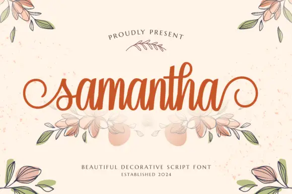
Heavy decorative script with curled entries
Samantha is a heavy decorative script in warm orange on speckled cream: thick even strokes, a tall loop on the h, curled entry and exit strokes on the s and the a, and an illustrated bouquet of leaves and flowers drawn beneath the word.
Ideas for this font
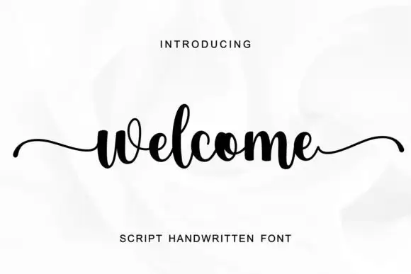
Compact script with long side tails
Welcome is a compact script in black on a white rose photograph: tight round letters, a high x-height, and two long horizontal tails, one entering from the left and one leaving to the right.
Ideas for this font
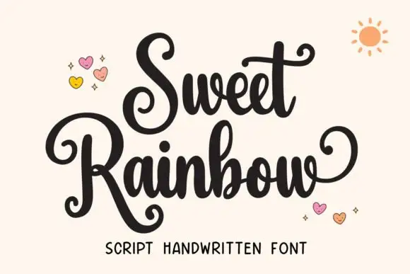
Rounded script with curled capitals
Sweet Rainbow is a rounded script in black on cream: curled capitals that spiral inward, fat even strokes and lollipop terminals, with drawn hearts and a small sun around the words.
Ideas for this font
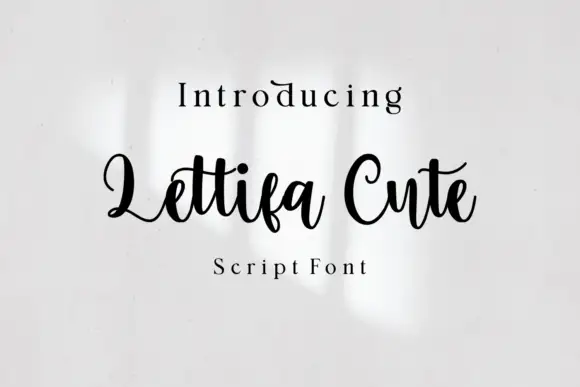
Bold upright looping script
Lettifa Cute is a bold upright script in black on white: fat even strokes, tall loops on the ascenders, a nearly vertical axis and a small circular badge noting the style.
Ideas for this font
Same independent foundry
Allow optional Google Analytics to measure visits and catalogue actions. Your search words and notes are not included. Privacy & storage