Modern Grotesque Body

Nova Stencil + Kohilo
Creates crisp high-hierarchy contrast beneath Nova Stencil headlines across menus, websites and labels.
Inspect Kohilo specimenDisclosure: MakerFileHub may earn a commission from qualifying purchases via paid links on this page. How our links work.
Luxury stencil display serif with broken stems and high contrast
Nova Stencil is a luxury stencil serif in which every stem is interrupted by a narrow bridge, the contrast stays high and the feet flatten, so a word reads as a couture stencil rather than as a military one.
Paid link
Get this fontProject & layout blueprintsAt-a-glance maker compatibility
Open counter bridges hold interior islands intact on laser-cut wood, acrylic, and mylar stencils.
Visual anatomy & craft review
The N carries two bridges, the O opens at the top and the bottom, the V splits at the apex, the S breaks its spine twice and the E cuts both arms, all at a high contrast with flat serifs and bridges about a tenth of the stem width. The bridges are the character: they are cut where a stencil would weaken a bowl, which is why the face keeps its elegance instead of turning industrial. Because the bridges are narrow, the face needs 50 pt before they read as cuts and not as print faults, and it wants a smooth ground. The crumpled beige backdrop, the small caps line above and the category line below are presentation; the black stencil word is the face.
Stencil · Luxury · Editorial
Two-font hierarchy recipes
Tested contrast partners — pairing Nova Stencil with grounded secondary typography.
Nova Stencil + Kohilo
Creates crisp high-hierarchy contrast beneath Nova Stencil headlines across menus, websites and labels.
Inspect Kohilo specimen
Nova Stencil + Thick Black
Adds a warm human signature touch for 1-to-3-word callouts without competing against structured serif capitals.
Inspect Thick Black specimenPractical applications
Concrete hierarchy, scale and production guidance tailored to Nova Stencil’s stroke geometry.
The stencil bridges let a sign be cut from a single panel, and the luxury contrast keeps it from looking like a shipping crate at 90 mm.
Hierarchy & layout recipe
Cut a 600 by 250 mm panel: set the boutique name at 90 mm, keep every bridge at 4 mm, and keep 30 mm of panel around the word so the bridges have material on both sides.
Pre-production check
A bridge narrower than 4 mm breaks when the panel is routed; check the cutting file and widen the bridges rather than the letters.
The stencil cuts give a section page a graphic edge, and the high contrast holds a single word at 120 pt on uncoated stock.
Hierarchy & layout recipe
Print an A4 opener: set the section word at 120 pt across the upper third, keep the bridges open by 3 mm at final size, and set the standfirst in a 9 pt sans 24 mm beneath.
Pre-production check
At 120 pt a stencil bridge printed on textured stock fills in; check the proof and keep the word below 110 pt or specify a smoother sheet.
The bridges suit a die-cut label that has to hold together on a curved bottle, and the luxury contrast prints in one colour at 24 pt.
Hierarchy & layout recipe
Print a 60 by 40 mm label: set the house name at 24 pt, keep 5 mm of border, and make sure each bridge sits at least 1 mm from the die line so the cut does not open it.
Pre-production check
A bridge falling on the die line turns into a notch; check the imposed label and shift the word 2 mm off centre to clear it.
Technical & licence verification
Confirm included OTF/TTF/WOFF formats, full glyph tables and licence coverage on the live store page before batch production.
Closest visual alternatives
Matched across letterform anatomy, stroke behaviour and craft applications.

Elegant feminine serif
Olivia Serif is an elegant serif in black on warm cream: high contrast, bracketed serifs, a large x-height and round bowls, set in title case on one line with a smaller serif line beneath, two tracked caps lines under that, and a fine ornamental frame with fleurons at the corners.
Ideas for this font

Fine serif title with large upper and lower loops
Amilea shows pale yellow high-contrast letters with fine tapered serifs and broad rounded lowercase over a dark portrait, where a thin loop curves below the capital A and a tall upper flourish crosses the central ascender before sweeping right.

Modern combination serif with italic
Things is a modern serif in blue on white: moderate-high contrast, a wide f with an overhanging arm, a g whose descender loops fully closed, and tall ascenders, presented with a note that the family includes an italic and a paragraph of small text.
Ideas for this font
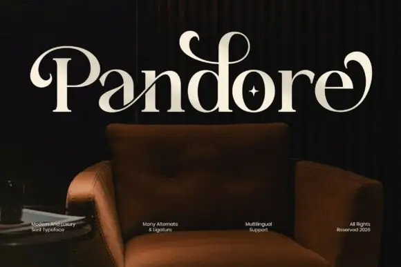
Broad serif with enclosing loops
Pandore is a broad serif in cream on a dark interior photograph: heavy stems with fine serifs, and curled strokes that leave the P and the final e and loop back over the word, with a star set inside the o and a row of small tracked notes along the foot.
Same independent foundry
Allow optional Google Analytics to measure visits and catalogue actions. Your search words and notes are not included. Privacy & storage



