Neutral Sans Workhorse

Battle Army Stencil + Mango Dream
Lets Battle Army Stencil own the focal silhouette while handling secondary copy, sizing and subheads cleanly.
Inspect Mango Dream specimenDisclosure: MakerFileHub may earn a commission from qualifying purchases via paid links on this page. How our links work.
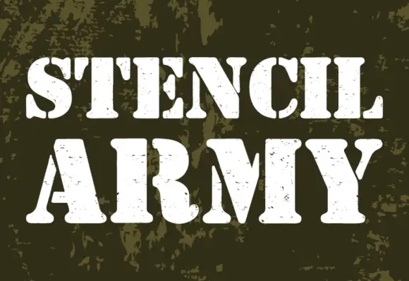
Heavy stencil capitals with vertical breaks and fine scattered surface marks
Battle Army Stencil shows three lines of pale and tan capitals on a riveted dark metal-like panel. Heavy plain strokes are interrupted by vertical breaks through bowls and crossbars, small speckled marks appear across several letter faces, the A and M use broad angled sections and the S is split near its upper and lower centres.
Paid link
Get this fontProject & layout blueprintsAt-a-glance maker compatibility
Open counter bridges hold interior islands intact on laser-cut wood, acrylic, and mylar stencils.
Visual anatomy & craft review
The stems stay heavy and plain, the breaks cut vertically, the speckles scatter unevenly and the diagonals on A and M open wide. That break pattern is the character: the letters look cut from plate steel rather than stencilled on paper, which is why the sample sits on a riveted ground. Check which letters carry breaks, keep 40 pt before the bridges close and confirm that the speckles are part of the file rather than the panel photograph. The breaks are the risk: the bridges close at about 30 pt and the letter then prints as a plain block, and the scattered speckles may come from the panel rather than the file.
Heavy stencil capitals with vertical breaks and fine scattered surface marks
Two-font hierarchy recipes
Tested contrast partners — pairing Battle Army Stencil with grounded secondary typography.
Battle Army Stencil + Mango Dream
Lets Battle Army Stencil own the focal silhouette while handling secondary copy, sizing and subheads cleanly.
Inspect Mango Dream specimen
Battle Army Stencil + Grandeur – Elegant Classic Serif
Grounds bold display lettering with classic typographic authority on posters, badges and apparel.
Inspect Grandeur – Elegant Classic Serif specimenPractical applications
Concrete hierarchy, scale and production guidance tailored to Battle Army Stencil’s stroke geometry.
The plate-cut caps give a workshop authority, and the heavy strokes hold a two-word name at 22 pt on a 60 by 40 mm sticker, where the vertical breaks stay distinct in one ink.
Hierarchy & layout recipe
Print a 60 by 40 mm sticker: set the name at 22 pt on one row, keep 9 mm of clear ground beneath before the phone at 6 pt, and keep one flat ink so the bridges do not fill.
Pre-production check
Speckles printed at small size become noise; check the proof and keep the name at 20 pt or above.
The broken caps set a heavy poster, and the broad strokes hold a two-word title at 58 pt on an A2 sheet, where the vertical cuts read as damage at a distance.
Hierarchy & layout recipe
Print an A2 poster: set the title at 58 pt on one row, keep 26 mm of clear ground beneath before the times at 15 pt, and keep the background dark and flat so the breaks stay visible.
Pre-production check
Two broken rows on one poster exhaust the eye; check the layout and keep the second line in a plain slab.
The stencilled caps read on a plate, and the heavy forms hold a short label at 46 mm on a painted steel sign, where the vertical breaks survive the spray.
Hierarchy & layout recipe
Spray a 400 by 200 mm steel sign through a mask: set the label at 46 mm on one row, keep the bridges at 7 mm, and keep 20 mm of border so the rivets do not cut the letters.
Pre-production check
Rivets placed through a broken letter destroy the shape; check the fixing plan before the sign is drilled.
Technical & licence verification
Confirm included OTF/TTF/WOFF formats, full glyph tables and licence coverage on the live store page before batch production.
Closest visual alternatives
Matched across letterform anatomy, stroke behaviour and craft applications.
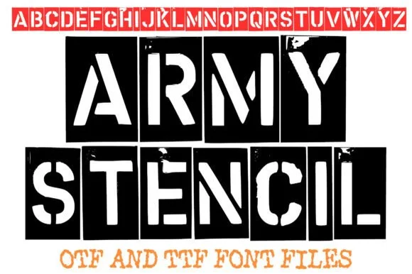
Distressed real-metal military stencil
Army Stencil captures stamped metal military stencils across a full A to Z uppercase set with organic weathered edges, and the red alphabet banner along the top of the cover confirms clean stencil bridges across every enclosed letter from A through Z.
Ideas for this font
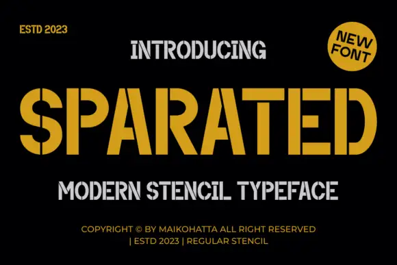
Angular stencil display
Sparated is an angular stencil display in mustard on black: heavy condensed caps with narrow vertical breaks through the bowls and the upright joins, squared corners and flat terminals, with a grey secondary line beneath and tracked credits at the foot.
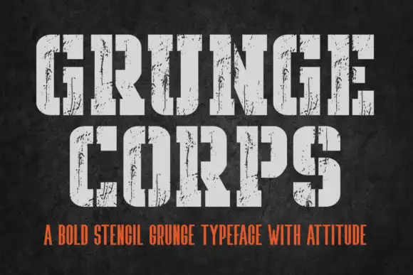
Condensed stencil blocks with irregular chipped surfaces
Grunge Corps shows light-grey stencil capitals on charcoal, where broad vertical cuts separate sections of bowls and crossbars while thin dark scuffs and chips roughen the remaining heavy strokes.
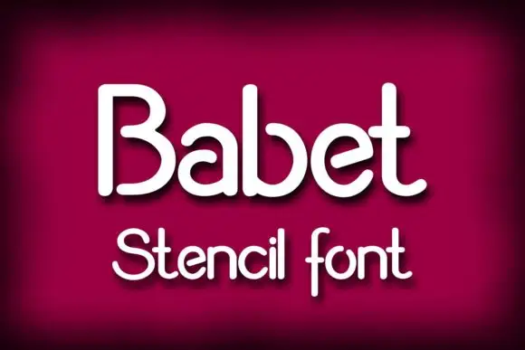
Rounded monoline mixed case with deliberate breaks in B, a, b and e bowls
Babet shows pale rounded lettering on burgundy with a black lower-right shadow: several bowls open through narrow breaks, so the B separates its upper and lower curves, the a and b keep gaps near their upper sides and the e turns through an open diagonal stroke.
Ideas for this font
Same independent foundry
Allow optional Google Analytics to measure visits and catalogue actions. Your search words and notes are not included. Privacy & storage