Modern Grotesque Body

Stencora + Nyxar
Creates crisp high-hierarchy contrast beneath Stencora headlines across menus, websites and labels.
Inspect Nyxar specimenDisclosure: MakerFileHub may earn a commission from qualifying purchases via paid links on this page. How our links work.
High-contrast editorial & industrial bridged stencil serif
Stencora is a bold, refined mixed-case stencil display serif pairing classic ball terminals and thick vertical stems with razor-clean stencil bridges.
Paid link
Get this fontProject & layout blueprintsAt-a-glance maker compatibility
Open counter bridges hold interior islands intact on laser-cut wood, acrylic, and mylar stencils.
Visual anatomy & craft review
Stencora is a bold stencil display serif that keeps classical ball terminals and thick vertical stems while cutting razor-clean bridges through the letters, so it reads as industrial signage rather than military stencil. The bridges are narrow and precise, which means they close below roughly 22 mm, and the mixed case keeps a line readable at 30 mm. Contrast is high enough to look editorial, and the face is best in one flat colour on concrete, board or a dark garment, where the cut bridges stay visible as light.
Editorial-stencil · High-contrast · Crisp-bridged
Two-font hierarchy recipes
Tested contrast partners — pairing Stencora with grounded secondary typography.
Stencora + Nyxar
Creates crisp high-hierarchy contrast beneath Stencora headlines across menus, websites and labels.
Inspect Nyxar specimen
Stencora + I Heart You
Adds a warm human signature touch for 1-to-3-word callouts without competing against structured serif capitals.
Inspect I Heart You specimenPractical applications
Concrete hierarchy, scale and production guidance tailored to Stencora’s stroke geometry.
Bridged serifs read as a stencil struck onto a crate, which is the material language of a workshop or brewery. High contrast keeps the letter legible while the bridges tell the story.
Hierarchy & layout recipe
Signage 800 x 300 mm, word 160 mm, 60 mm margins and 20 mm from the frame. Crate stencil 300 x 150 mm, word 70 mm, 20 mm margins. Label 90 x 110 mm, name 18 mm, abv 4.5 pt, 5 mm top arc clearance.
Pre-production check
Stencil bridges under 2 mm at a bottle-label size close on a litho press, and the word looks solid. Keep bridge gaps proportional to size, and check one 1:1 proof before the run.
A stencil serif reads as a drawn technical mark, which suits a monograph about construction. Ball terminals keep the page from looking like plain signage.
Hierarchy & layout recipe
Cover 210 x 297 mm, title 64 pt, author 14 pt, 20 mm margins. Caption 10/14 pt, hanging indent 6 mm. Poster A1, title 260 mm, details 24/30 pt, 40 mm margins.
Pre-production check
At 10 pt a stencil bridge is under 0.2 mm and disappears; the caption then reads as a solid serif. Use the display face for the title only, and set captions in a companion text serif.
Bridged letters read as workshop marking, which is the tone of a maker space rather than a classroom. The bold weight holds at distance on a safety board.
Hierarchy & layout recipe
Safety sign 600 x 400 mm, word 90 mm, rules 16/22 pt, 40 mm margins. Tool label 120 x 40 mm, word 14 mm, 4 mm border. Banner 1500 x 400 mm, word 260 mm.
Pre-production check
Workshop signs are mounted on ply and read under poor light, where a high-contrast stencil at 90 mm holds but a 14 mm tool label does not. Keep small labels in a plain bold sans, and check one sign in situ.
Technical & licence verification
Confirm included OTF/TTF/WOFF formats, full glyph tables and licence coverage on the live store page before batch production.
Closest visual alternatives
Matched across letterform anatomy, stroke behaviour and craft applications.
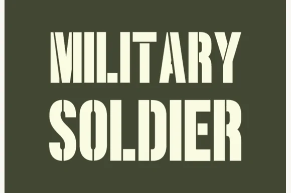
Condensed military stencil sans
Military Soldier is a condensed stencil sans in cream on olive: very tall narrow caps with squared corners, bridges cutting through the closed letters, and flat terminals, set in two lines with the second line lighter in weight, so the pair reads as a stencilled crate marking rather than a decorative display.
Ideas for this font
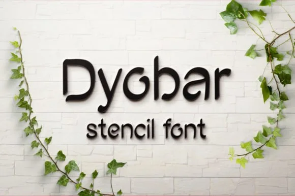
Clean open-loop rounded geometric stencil sans
Dyobar is a tidy, modern rounded sans serif crafted without closed loops so every counter stays naturally bridged for stencil and laser cutting.
Ideas for this font
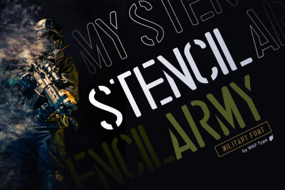
Military stencil display
Stencil Army is a military stencil display in white and olive over a dark photograph: square counters, bridge gaps through the stems, an angular cut on the S and a contrasting line weight, shown in two treatments with a small bordered badge, so the plate reads as a technical marking.
Ideas for this font

Crisp contemporary editorial serif duo (Regular + Italic, OTF/TTF/WOFF)
Svara is a sharp modern editorial serif family pairing an upright Regular with a lively true Italic across OTF, TTF & WOFF formats!
Ideas for this font
Same independent foundry
Allow optional Google Analytics to measure visits and catalogue actions. Your search words and notes are not included. Privacy & storage



